


6500K |
|
||||||||||||
| see white point | |||||||||||||
|
See Also
|
|||||||||||||
Displays |
|
||||||
| see monitors | |||||||
|
See Also
|
|||||||
Drum scanners |
|
||||||
| see scanners | |||||||
|
See Also
|
|||||||
EMR |
|
||||||
| Electromagnetic Radiation. Visible light is one subset of a whole range of radiation called EMR. | |||||||
|
See Also
|
|||||||
ProfileMaker Editor 4.1 |
|
||||||
| Provides ability to edit all types of profiles, including multi-color. Works on Mac and Windows, utilizing a dual-platform USB dongle. |

|
||||||
|
See Also
|
|||||||
CHROMiX ColorNews Issue #21 - The Color Key |
|
||||||
|
Welcome to ColorNews, a periodic update on things related to Color Management. We are striving for a regular consistent newsletter of high value to our customers. Please let us know what your interests are so we can address these concerns in our coming issues. ============================================================= C H R O M i X C O L O R N E W S
Issue #21 ============================================================= A few Quick Notes of Interest: ** GretagMacbeth and CHROMiX have launched the Eye-One Customer Loyalty Program (CLP) to help past Eye-One Pro customers upgrade to the new RevB Eye-One Pro (shipping since April 2005), and allow users of past Eye-One Pro packages to acquire the additional software modules not previously available in their original Eye-One Pro purchase. See details below in CHROMiX News. ** The CHROMiX Color Management Utility Kit special continues. Here's the deal: when you buy either an Eye-One Pro solution or an X-Rite Pulse ColorElite solution, CHROMiX will send you a FREE Color Management Kit. See ad for details below. ** TRADE in your old measurement device and get up to $200 off your next GretagMacbeth Eye-One purchase! See details in ad below. ** "The color Key" - an article by CHROMiX President Steve Upton
** X-Rite Free Accessory Kit promotion ends October 31st. If you are considering an X-Rite Pulse we suggest you act quickly as the free promotion ends soon!
Table of Contents =================
1. CHROMiX News
CHROMiX News ================ Since our last ColorNews Issue #20 on September 7th, 2005, here's what's been happening at CHROMiX:
We are pleased to be working closely with GretagMacbeth on the Eye-One CUSTOMER LOYALTY PROGRAM. Regardless of where you bought your Eye-One Pro, this program allows you to upgrade to the newest hardware and software at substantial savings. For example, if you bought your old Eye-One Pro solution in year:
CHROMiX's President, Steve Upton will be demonstrating ColorThink Pro at PHOTO PLUS EXPO 2005 at Javits Convention Center, New York from October 20-22. He'll be in the Eizo booth # 775. Using ColorThink Pro, Steve will be giving presentations regarding workflow, advanced profiling tool concepts, and profile evaluation. Come by and talk with him or get a demonstration of our newest software if you are attending the Expo.
Color, Product & Industry News ====================
GretagMacbeth Customer Loyalty Program is here! The Loyalty Program is designed to help Eye-One Pro owners to upgrade to the new RevB Eye-One Pro (shipping since April 2005), and acquire the additional software modules not previously available in their original Eye-One Pro purchase. Users can enjoy savings from 30%, 40% to 50% off the new Eye-One Pro packages. For more information go to: GretagMacbeth has released Eye-One Match v3.3 for Windows and Mac. The new version adds the long-awaited profile editing module to the software. A new scanning ruler, a new backing board and a new soft case will be bundled with the Eye-One.
Beginning week October 31: Eye-One Ruler and Softcase upgrade kits will be available for use with any Eye-One. You can order them now here: Rumor has it that the Eye-One IO from GretagMacbeth may actually start shipping early November. This has been a long awaited X/Y scanning table that will automate scanning target charts using the ever popular Eye-One Pro spectrophotometer. CHROMiX has been testing this baby, and we must say that it is so fast using the new RevB Eye-One Pro device that we were amazed. We've done some tests, and found that the IO scanned an IT8 target a little over 2 minutes - almost noiselessly!! The iO can be used with any Eye-One Pro device but to obtain this speed, the rev B version is required - see the GretagMacbeth Customer Loyalty Program for details about upgrading your Eye-One. The Eye-One IO is set to be priced at $2000. Epson has developed an application called ColorBase v1.1 for the Stylus Photo R2400 and Stylus Pro 4800/7800/9800 printers that allows color output to be calibrated to match that of Epson's reference printer for each model. ColorBase has Mac and Windows versions and is a free download from various Epson web sites. Adobe released v3.2 of the Camera Raw plug-in for Photoshop CS2. Version 3.2 adds support for the Nikon D2Hs, D70s and D50, Leica's Digital-Module-R back and the Hasselblad H2D. Also, Camera Raw now fully honors the 'As Shot' white balance (WB) for D2X, thanks to cooperation from Nikon. Microsoft and Canon announced joint implementation of some of the core technologies inside the Windows Color System (WCS), which is the ambitious new color management architecture in the upcoming Vista operating system. The technology has features promising "better screen-to-print matching, better overall color appearance, and support for higher fidelity printing..."
SHOWS & EVENTS ================
October 20 - 22, 2005, PhotoPLUS EXPO Photography & Design Conference, Javits Convention Center, New York, NY. This is the largest and most comprehensive expo in the photographic and imaging industries. CHROMiX will be exhibiting in the Eizo booth #775. Steve Upton will be demonstrating CHROMiX's newest product, ColorThink Pro. Using ColorThink Pro, he will be giving presentations regarding workflow, advanced profiling tool concepts, and profile evaluation. Come by and talk with him and get a demonstration of our newest software if you are attending the Expo.
November 1 - 4, 2005, The Creative Suite Conference, Sydney, Australia, offers training and conferences specific to Adobe Creative Suite products (Adobe Photoshop, InDesign, Illustrator, Acrobat or GoLive). Looking for an excuse to get to Australia? This is the one.
November 29 - December 2, 2005, Seybold San Francisco at The Palace Hotel, San Francisco, CA.
December 4-6, 2005, PIA/GATF Color Management Conference at The Pointe Hilton Tapatio Cliffs Resort, Phoenix, AZ. This is the largest US show with exclusive focus on color management technology. Hear about the latest tools, workflows, and trends in producing high-quality color. Steve Upton of CHROMiX is speaking in sessions and labs ranging from 'Photoshop Usage' to 'Profile Verification Tools and Analysis' and 'Tools of the Trade-Under the Hood'. Hear Steve and other great speakers at the only conference focusing entirely on color management. For more details:
January 9 - 13, 2006, MacWorld Conference and Expo at San Francisco's Moscone Center, San Francisco, CA.
Tech & Education Notes =============================================================
Since many of our readers are photographers, we thought we would mention a very good article at Creative Pro titled 'Digital Photography How-To: The Pros and Cons of Lens Flare', from Cambridge in Colour, by Sean T. McHugh. Although this excerpt doesn't focus on color management science specifically, this is relevant information for a common photography problem.
Not sure where else to put this one.... Enjoy! ============================================================= "The color Key" - an article by CHROMiX President Steve Upton ============================================================= The color Key If you work long enough in or near the print industry you start to take CMYK for granted. Especially K. In looking over my previous articles I noticed that I had yet to cover the topic of K so it seemed like it was time. The K in CMYK stands for "Key", NOT black as many might have you believe. The Key plate, in traditional color separations, is the plate that holds the detail in the image. In CMYK this is usually done with black ink. In the modern color-managed workflow, an RGB image has an associated profile so each RGB number combination can be converted to a defined Lab color. This is fairly straight-forward and repeatable. When creating a CMYK combination to represent that color on output, things get considerably more complicated. Lets talk a bit about how color is created using CMYK. If you apply yellow ink to paper, your color range starts at paper white and then becomes more yellow and saturated with the more ink you apply. But once you get to 100% yellow there's nothing more you can do without adding other inks. If you are looking for a medium-dark yellow you now have a whole host of choices to get it. First, you can add cyan and magenta ink. They are both required in order to offset each ink's tendency to move the color toward green or red. The addition of cyan and magenta does darken the yellow but they are also, together, blue - which is anti-yellow. So this addition of blue desaturates the yellow ink quickly, limiting the range of dark yellow colors available. A second choice is to add black ink. As black is added, the yellow darkens but is not desaturated nearly as quickly. This can result in a greater gamut of dark yellows. When CMYK colors are created in normal workflows, either or both of these techniques are used. In fact, for a single original RGB color, many different combinations of CMYK can be used to (theoretically) create the same color on press. So how do we decide which one to use? How much black should be used instead of CMY? The answer, as you should already guess, is the classic color management answer: "It depends". Lets cover a bit more technique and terminology first. Cyan, magenta and yellow inks used for offset printing are not pure enough colorants to be mixable in equal amounts for gray. The SWOP standard expects 50% cyan and 40% each magenta and yellow inks to produce a neutral gray. So let's say we had a CMY color of 60, 50, 40. In theory, if we removed the components of the color that produced gray (50,40,40) we would then be left with (10,10,0). If we then add enough black ink to bring us down to the same darkness (about 54% K), we have the CMYK combination of 10,10,0,54 that should appear very close to the original color yet is composed of VERY different amounts of ink! The total ink used drops from 150% to 74% AND changes from the more expensive color inks to black ink. This kind of color replacement is called Gray Component Replacement (GCR). If the color range affected by this replacement is limited to dark, near-neutral colors, then it is called Under Color Removal (UCR). GCR, on the other hand, can be applied to neutral and non-neutral colors that are either light or dark. That brings us back to the "how much?" and "when?" questions. It's probably best to cover this next section in point form:
Black start / max / width In ICC profiles, the black generation method and amount is chosen at the time the profile is calculated and "baked" into the profile. For flexibility, we suggest calculating several profiles from the same measurements; each with different black generation settings (this is what we do with our ColorValet press profiling service). Black Start is the amount of cyan ink where black starts replacing other inks. For instance, a black start of 10 means that when cyan ink is less than 10%, CMY will be the only inks used to create colors, but for any colors where cyan is greater than 10%, K will replace some component of the color. Black Max is how high you want the K level to get in the resulting color. If you find your shadows are plugging, reducing Max K can help. Finally, black width is how far "out" into the saturated colors you want black to be substituted. A low black width will limit K substitution to near-neutral colors (similar to UCR). A high black width will allow substitution much farther out into the saturated colors. If you find your saturated colors look muddy, try lowering your black width.
Dot Gain vs color stability
Print job stability on press VS adjustment on press
Ink Speckling
Ink costs & drying time
Gamut ColorThink Pro has a new graphing feature, Constrain Channels, which features sliders that allow you to "pull back" color channels individually. Pulling the K channel back to 0 is an interesting demonstration of how important black is to the gamut of a press. The gamut size is reduced by 20 to 30%.
Muddying saturated colors
UCR vs GCR
Rich black
Standard vs Custom separation profiles As you can see, the subject of black is large and I haven't really scratched the surface. Suffice to say that "that extra channel" adds a lot of depth to color printing both in the color sense and in the number of choices we have and the number of topics there are to study. I hope I've at least opened your eyes to some of the effects of black and black generation. As always, I'm open to comments and more information if you have it. Thanks for reading,
Steve Upton
For previous ColorNews articles follow this link: =-=-=-=-=-=-=-=-=-=-=-=-=-=-=-=-=-=-=-=-=-=-=-=-=-=-=-=-=-=-=-=
Entire Contents of CHROMiX ColorNews (c)2005 CHROMiX, Inc. --
|
|||||||
|
|
|||||||
CHROMiX ColorNews Issue #22 - Color Times 7 - a summary of the seven ICC profile types |
|
||||||
|
Welcome to ColorNews, a periodic update on things related to Color Management. We are striving for a regular consistent newsletter of high value to our customers. Please let us know what your interests are so we can address these concerns in our coming issues. ============================================================ C H R O M i X C O L O R N E W S Issue #22 December 7th, 2005 ============================================================= A few Quick Notes of Interest: ** GretagMacbeth is having a 50% off ONE-DAY ONLY sale on ProfileMaker v5.0.5 Publish Plus TODAY ONLY and then for ProfileMaker v5.0.5 Photostudio on 12/14. See details below. ** CHROMiX is releasing ColorThink Pro!! See details in CHROMiX News below. ** GretagMacbeth is offering a 50% savings off ProfileMaker v5.0.5 UPGRADE until December 20, 2005. See Ad below. ** CHROMiX is offering an INCREDIBLE deal on the X-Rite Monaco Optix XR Pro. See ad below. ** TRADE in your old measurement device and get up to $200 off your next GretagMacbeth Eye-One purchase! For more details or the coupon: Click here **The Eye-One Customer Loyalty Program (CLP) will end January 31st, 2006 so, if you've thought about upgrading, better act fast! This program is designed to help Eye-One Pro customers upgrade to the new RevB Eye-One Pro (shipping since April 2005), and the new software modules. Depending on when purchased, you could get 30%, 40% or 50% off your upgrade. Give Sales a call for details, or go to: Click here ** "Color Times 7 - a summary of the seven ICC profile types" - an article by CHROMiX President Steve Upton ==================================================================== Table of Contents ==================================
1. CHROMiX News
CHROMiX News =================================== Since our last ColorNews Issue #21 on October 18th, 2005, much has been happening at CHROMiX: * At last, the moment you've all been waiting for - ColorThink Pro is shipping December 16! Special thanks to all of our trusted friends and beta testers who have helped us bring this amazing product to the market. This product takes profile analysis to a new level. Here are the highlights:
ColorThink Pro is available for $399. Upgrades are available for previous versions of ColorThink. See website later this week for details.
Color, Product & Industry News ==========================
The Eye-One IO from GretagMacbeth is due to start shipping (from Europe) the week of December 5th. This is the long awaited X/Y scanning table that will automate scanning target charts using the ever popular Eye-One Pro spectrophotometer. CHROMiX has been testing the IO, and we were amazed at the speed when using the new RevB Eye-One Pro device. In our tests, we found that the IO scanned an IT8 target in just over 2 minutes - and was so quiet you couldn't even hear it running!! The IO can be used with any Eye-One Pro device but, to obtain this speed, the rev B version is required - see the GretagMacbeth Customer Loyalty Program for details about upgrading your Eye-One. The Eye-One IO is compatible with the latest version of Match and the soon to be released ProfileMaker v5.0.5. List price is $1995. CHROMiX has a Pre-Order special of $1795 UNTIL IT SHIPS, at which time the price settles in at $1895. GretagMacbeth has released ProfileMaker v5.0.5, a free upgrade to v5 owners. The new version boasts unmatched profile quality with new and improved gamut mapping! The new features include: new perceptual and colorimetric rendering intents, improved details and modulations, improved handling of out-of-gamut colors, increased smoothness for color transitions, 5 times faster calculations for multicolor profiles, supports NEW Eye-One iO automated scanning table, and more. To highlight the new version, GretagMacbeth is also offering TWO ONE-DAY SALES in December on two v5.0.5 versions: Publish Plus on 12/7 (TODAY!) and Photostudio 12/14. See details below. Integrated Color Corporation, suppliers of ColorEyes products, is the worldwide exclusive distributor of stand-alone display software created by Integrated Color Solutions (ICS). This means that you will see ColorEyes Display and not basICColor Display marketed and sold in the US market according to a recent press release. For more details Click here ColorBurst Systems has started shipping the Windows versions of their popular X-Proof and X-Photo RIP software. The Windows version includes the queue-based workflow from their Mac software, plus a few extras, including image preview and crop, Firewire support, and support for Epson, Encad, HP, and Roland printers with full 8 channel printing. ColorBurst Systems has extended their support and SWOP Certification beyond the Epson Stylus Pro 4000, 7600, and 9600 to now include the Epson Stylus Pro 4800, 7800, and 9800 printers. Epson has posted new, improved ICC profiles for the Stylus Photo R1800, the Stylus Photo R2400, and the Stylus Photo 2200. According to Epson, these new print profiles are free and provide more accuracy for both Color and B&W than the profiles that originally shipped with these printers. Eizo has started shipping a new FlexScan model that may be of great interest to many graphics professionals. The FlexScan S2410W is a 24.1" model that boasts 14-bit color processing and much more. For more: Click here GretagMacbeth Customer Loyalty Program is a huge success! The Loyalty Program is designed to help Eye-One Pro owners upgrade to the new RevB Eye-One Pro (shipping since April 2005), and acquire the additional software modules not previously available in their original Eye-One Pro purchase. Users can enjoy savings from 30% to 50% off the new Eye-One Pro packages. For more information go to: Click here Adobe has posted update v1.0.3 to both the Windows and Macintosh editions of Adobe Bridge. According to Adobe, the new version delivers improved reliability. Mac version: Click here Win version: Click here Digital Domain has released v2006.200 of Qimage, the company's RAW conversion/printing/browsing application for Windows. Improvements include a new look for the thumbnail browser and an instant preview feature. Apple has begun shipping Aperture, Digital Photography software. Aperture supports the RAW formats from leading digital camera manufacturers (Canon, Nikon) and provides optimized support specifically for Canon EOS 1Ds Mark II, Canon EOS 20D, Canon Digital Rebel, Nikon D2x , and the Nikon D50. Key features of Aperture are: advanced RAW workflow, professional project management, powerful compare and select tools, nondestructive image processing, versatile printing and publishing, and more. For more: Click here
SHOWS & EVENTS ======================= December 8-10, 2005, SGIA Digital Expo and Conferences, Phoenix Civic Center/Convention Center (Halls A&B), Phoenix, AZ. The SGIA Digital Expo will showcase the best digital imaging suppliers have to offer for equipment, consumables, technologies and ideas so you bring home new applications and techniques, and even new approaches to the marketplace. This show is for you if you are a user of digital imaging technology to print and/or produce end products such as POP, displays, signage, outdoor advertising, labels/decals, banners, posters, textiles, garments, interior design items, nameplates/dials/panels or fine art/serigraphs. Click here January 9 - 13, 2006, MacWorld Conference and Expo at San Francisco's Moscone Center, San Francisco, CA. This is the #1 event for Mac users and devotees in the world. Click here ============================================================= Tech & Education Notes ============================================================= It seems everyone has a forum or a blog to tune into for more information. Some are good and some are overwhelming. Here is a list of the ones we watch the most, if it helps: CHROMiX ColorForums (our favorite) Click here ColorSync Users Forum Click here Rob Galbraith Photography Forum Click here Edmund Ronald's Monitor-Calibration Photofeedback Click here ============================================================= "Color Times 7 - a summary of the seven ICC profile types" - an article by CHROMiX President Steve Upton ============================================================= Though we tend to use three different profile types - those for scanners, monitors and printers, the ICC has actually created a total of 7 different profile types. Each has its own capabilities and situations for best use. Here's a quick summary of the 7 profile types and how they may be useful in your workflow: First there's the device profiles. These are the profiles we typically think about when we think of ICC profiles. This includes: Input Profiles: eg RGB->Lab Monitor Profiles: eg RGB<->Lab Print Profiles: eg Lab<->CMYK Device profiles perform 1/2 of the conversion when converting from one device to another. For instance, a scanner Input profile converts from RGB->Lab and then a press Print profile converts the rest of the way from Lab->CMYK. Used together they convert your scanner RGB file to press CMYK. Monitor and Print profiles can convert color in each direction. So if you have a Lab color value you want to output on a printer, the Lab->CMYK portion of the profile gets used. If you have a CMYK value that you want to convert into a color (eg proofing CMYK values) then the CMYK->Lab portion of the profile is used. You may have noticed that the Input profile is the only profile listed with a single-direction arrow ->. Input profiles have the distinction of containing only device->Lab capabilities. When you think about it this make sense as you'll want to convert from a scanner's RGB values to Lab values but you won't have a need to convert from Lab colors to the scanner's RGB - there's no ability to output anything on a scanner after all. If you are confused about the difference between device values (like RGB and CMYK) and colors (like Lab) please see my "Color of Toast" story in the ColorSmarts section of our website. Click here There are several other profile types that don't get used as often but can be quite powerful. They are: Device Link profiles (eg CMYK->CMYK) Abstract profiles (eg Lab->Lab) Space profiles (eg Lab->LCH) Named Color Profiles (eg Pantone 256 = Lab(x,x,x)) Device Links Device link profiles are a unique and power type of profile with their ability to convert directly from device colors to device colors. This means a direct conversion from CMYK to CMYK can be performed by one link profile and so they are not applied in pairs like normal device profiles. Typical link profiles are created by permanently combining the two device profiles from a transformation into a single hard-coded link file. This link performs the same transformation in the same way as the original two-profile combination and it also contains the CMM's (hopefully) correct math that was used to create it. This additional component can make link profiles effective in RIPs that do not convert color reliably due to some flaw or limitation in their internal CMM. Device link profiles left in this basic condition are quite useful but if additional processing is applied to them they become essential to certain conversions and effects. One common effect is to tune the portion of the profile responsible for K-only conversions so they produce K-only results. This black-preservation ability is coveted by those who have the need to convert from one CMYK space to another but do not want to have K-only colors converted into 4-color grays. ColorThink Pro is able to create device link profiles with clean K conversions. Other device-link effects take advantage of the device to device capability of a link profile. This capability means a "null" profile can be created that does absolutely nothing to the CMYK data that flows through it. Then, certain device-space edits such as individual channel curve bumps or ink-reduction effects can be added to the link. One ink-reduction effect we built into a client's profile converts any colors that have total ink levels over a certain amount to K=100, C=30. Any files sent through this profile have no conversion applied if their inking is OK but as soon as pixels are discovered with high ink levels they are corrected. It's fast, simple and it's effect can be created in no other way with no other kind of profile. A few other points about device links: - only one rendering intent is available, that which was selected at the time the link was created. - links cannot be embedded into images - the rendering intent encapsulated in the link is selected in the 'default intent' field in the profile's header. - a profile sequence tag in link profiles documents the profiles used to create the profile. Abstract Profiles: If device links convert from device to device then abstract profiles are the opposite; they convert from Lab to Lab. Where the device link's domain is device-space edits, abstracts are all about Lab-space (color) edits. Contrast bumps, increasing saturation, and gray or sepia effects are just a few examples of simple color edits than can be captured within an abstract profile. But, like link profiles, a little ingenuity and number crunching and the real power behind abstract profiles can be released. The complex effect of a photographic process such as cross-processing can be captured in an abstract and applied to any image. Color differences between two systems can be also be captured and used to either correct one of the systems or recreate the effect somewhere else (such as the feel of a certain photographic film type). We are just beginning to scratch the surface of the powerful capabilities of these profiles. Unfortunately Photoshop does not support the use of either abstract or device link profiles. Luckily, in the case of abstracts, we have a solution in ColorThink Pro's new ColorCast technology. ColorCast allows an abstract profile's effect to be embedded into another profile such as the Adobe RGB working space. The result is a "normal" RGB device profile that Photoshop can apply to any image, performing the function of the original abstract profile. sneaky! Abstract profiles are also not allowed to be embedded into images. Space Profiles: Sometimes there's a need to convert between a non-device color space and Lab. An example of this would be the converting of Lab colors to an alternate color space that warped colors for some effect or other purpose. These profiles are quite rare, you are not likely to come across them in normal workflows. Named Color Profiles: If all other profiles are like math formulas, Named Color Profiles (NCPs) are like lists or palettes. The NCP profile stores a list of colors where each color contains a name, Lab color value and (optionally) device values. NCP profiles are supported in some color utilities and also in Mac OS X as palettes in the color picker. Unfortunately they are not supported in the major publishing applications from Adobe, Quark etc. Perhaps some day NCP profiles will gain wider support and we will finally have a standard method of storing and using color palette lists. ColorCast Profiles: OK, you caught me. ColorCast profiles are not part of the ICC standard. In fact, ColorCast profiles are 'normal' device profiles (typically printer) which have been altered with a special color effect such as proofing a 6-color press. ColorThink Pro uses our patent-pending ColorCast technology to build profiles that allow many profiles to be used in places where they are not typically supported such as 6-channel profiles in Photoshop. ColorThink calculates the effect of proofing with a complex profile and then embeds this effect into either a working space or print profile. The profile appears to the system as a normal RGB or CMYK profile so it can be applied for soft and hard proofing in Photoshop without the need for any additional software plug-ins. In Summary Though the three types of device profiles are the most commonly created and used in photographic and graphic arts workflows it is worth learning more about the extra profile types as they have capabilities that can solve some sticky color problems easily and with high quality results. Thanks for reading,
Steve Upton
For previous ColorNews articles follow this link: ==-=-=-=-=-=-=-=-=-=-=-=-=-=-=-=-=-=-=-=-=-=-=-=-=-=-=-=-=-=-=-=
Entire Contents of CHROMiX ColorNews (c)2005 CHROMiX, Inc.
--
|
|||||||
|
|
|||||||
CHROMiX ColorNews Issue #23 - The ins and outs of GRACoL 7 and G7 |
|
||||||
|
Welcome to ColorNews, a periodic update on things related to Color Management. We are striving for a regular consistent newsletter of high value to our customers. Please let us know what your interests are so we can address these concerns in our coming issues.
============================================================ C H R O M i X C O L O R N E W S Issue #23 June 28th, 2006 ============================================================= Notes of Interest: ** Have you noticed that it's been a while since we sent out our last newsletter? We have been involved with many new projects we think you'll find quite interesting. We mention a couple developments below in 'CHROMiX News', and look forward to telling you more in the future. ==================================================================== Table of Contents =================
1. CHROMiX News ==================================================================== CHROMiX News ================ Since our last ColorNews, we have been very, very busy: * CHROMiX has been selected to create the new GRACoL/SWOP G7 plate-curving and gray balancing software IDEALink Curve, we have been certified as a G7 Expert and we are also now able to qualify G7 Master Printers. More information below. * For some time now, customers have asked for ColorThink training. Wait no longer! CHROMiX is now offering web-based training specifically for ColorThink Pro!! Steve Upton, designer and developer of the award-winning ColorThink & ColorThink Pro software, will personally conduct the training. The WebEx class will consist of one two-hour session, and one one-hour session. The first two hours will cover fundamental and intermediate use, and touch on some advanced concepts. The second session, to be held at a later date to allow for student experimentation beforehand, will cover advanced concepts and questions. All you need is a current browser and ColorThink Pro. The price for the training is $450. If you don't have ColorThink Pro, the above training plus ColorThink Pro is $725 (new version), or $625 (upgrade from ColorThink standard version). For more information or to register, call Sales at 866-CHROMiX x1 or email sales(at)chromix.com. * ColorThink Pro was released in December and is doing well. There is a bug-fix beta (3.0.1) now available. You will need to download and install the full version of Pro before using the beta, as this beta package does not contain the entire installation. Also, beta versions do not run in Demo mode. * Looking for an older version of ColorThink? You will now be able to find select past versions of ColorThink and ColorThink Pro in a new area titled: 'Older Versions' on the ColorThink page (catchy title, huh?). Currently we have ColorThink v2.1.2 posted. Click here * CHROMiX would like to officially welcome Pat Herold to our team. Pat manages our technical support and profile production, and comes to us with a long history of color QA experience. We're glad to you have with us! ==================================================================== Color, Product & Industry News ==================== The International Digital Enterprise Alliance (IDEAlliance) announced that leading color management and on-press consultants have been certified as GRACoL Experts. According to Don Hutcheson, Chair of the GRACoL Committee and President of Hutcheson Consulting, "The G7 methodology is not an attempt to create new standards, but a way of utilizing existing ISO (International Standards Organization) Standards in a more efficient and effective way. The G7 methodology is revolutionary because it is the first specification designed to reliably and efficiently match the visual appearance of multiple devices by defining gray balance and NPDC (neutral print density curves) instead of the traditional method of measuring TVI (dot gain) for each color." For more : Click here In 2003 the International Color Consortium (ICC) and Technical Committee 130 (TC130) of the ISO entered into a cooperative agreement through which specifications initiated or developed by the ICC could be jointly pursued and put forward as International Standards by TC130 and the ICC. This agreement provides for simultaneous publication and distribution by both groups. The first International Standard Profile Specification developed under this agreement was published as ISO 15076-1:2005. This International Standard provides both a cross-platform device profile format and a color management system architecture defined by the ICC. Such device profiles can be used to translate color data created on one device into another device's native color space. The acceptance of this format by operating system vendors allows end users to transparently move profiles, and images with embedded profiles, between different operating systems. The availability of this document as an International Standard facilitates its use in many venues, such as the widely used family of PDF/X file exchange standards, and the newly published International Standard for variable data printing. IDEAlliance also announced a cooperative effort with other members of the ISO TC130 community to propose a unified international characterization data set for commercial offset printing. For more: Click here EIZO has a White Paper available on the subject of 'Uniformity Compensation' regarding new technology available in the ColorEdge CG221, due out in early August. The new CG221 has sophisticated Uniformity Regulation & Control algorithm technology to reduce uniformity disparities across the screen face. The CG221 will be replacing the ColorEdge CG220 at or near the same price. The white paper is at Click here EFI announced End of Life Support for ColorProof v5 end-users as of June 1st, 2006. ColorProof v5, a transition product from BestColor ColorProof to EFI Colorproof, was officially discontinued by EFI December 31, 2005. EFI is transitioning its customer base to Colorproof XF, a more enhanced and more modular product line. The current cost to upgrade from ColorProof v5 to EFI Colorproof XF 3.0 is $1200 per license, but we have heard rumors of an imminent price increase. EFI Colorproof XF versions now incorporate 3D Optimizer, a new easy-to-use tool that optimizes printer output to a specific reference, whether it be a printing press or other output printer. Optimizer supports the Gretag Macbeth Eye-One iO automated measurement device, providing fast, accurate reading of test charts. It also supports the linearization tool of the basic Colorproof XF package, the Color Manager Option, and the Color Verifier Option. Colorproof XF can also process six-color input and simulation profiles. The Color Manager Option, now available for Mac OS X, further enhances RGB workflows for photographic applications, and allows the creation of device link profiles based on up to three different ICC profiles. Also new in the Color Manager Option is support for multi-color profiles for inkjet printers (i.e.: CMYK + orange + green). DuPont recently selected GretagMacbeth's Eye-One Pro spectrophotometer as the color measurement instrument of choice for its new digital proofing and UV Cure printing system, DuPont Cromalin Largo and DuPont Cromaprint 22UV. DuPont currently embeds the Eye-One Pro spectrophotometer into the Cromalin b series and new Cromalin blue proofing solutions to enable automated robotic calibration for color measurement and accuracy. DuPont also uses the Eye-One device in it's iCertification product, which does local & remote proofing color verification. TrendWatch Graphic Arts recently released a special report, "Proofing: The Customer is Always Right?Right?". Earlier versions of this study suggested that online and/or PDF-based proofing would start displacing halftone dot-based proofing methods. The current update shows how those trends are starting to reach their logical conclusion. The 150-page report ($995) and other TWGA reports are available for online purchase at the TWGA eStore in PDF format: Trend watch graphic arts or by phone at 66-873-6310. GretagMacbeth released Eye-One Match v3.6 software, which updates the software for current Eye-One device usage. Match can be downloaded at Click here Adobe updated Camera Raw plug-in for Photoshop CS2 and Photoshop Elements (3.0 & 4.0), which extends Raw file support to eight additional digital camera models, including Canon, Epson, Leaf, Olympus, Pentax and Samsung.
The Rob Galbraith Photography Forum has been sold to new owners and will be fee based. It is now called the Pro Photo Community and registration is at http://www.prophotocommunity.com/. For more information from Rob on this transition go to
Apago announced an upgrade to their Cluster Workflow 2.0, an innovative network server solution for creating reliable and highly scalable workflows for prepress, printers, and magazine and newspaper publishers. Featuring sophisticated scheduling capabilities and fault tolerance, this system maximizes the available computing resources of a networked collection, or cluster, of servers. Combined with workflow production application modules that perform common prepress tasks--such as PDF distilling, ripping, file conversion, preflighting and correction, document assembly, ICC color management, cropping, and repurposing--Cluster Workflow helps users eliminate real-world production bottlenecks.
Epson has selected GretagMacbeth's ProfileMaker v5 to develop and distribute premium ICC profiles for the Epson Stylus Photo R800 printer. The Epson R800 printer uses eight individual ink cartridges to create archival quality glossy and matte photo prints. The new premium ICC profiles are available for download at:
Click here
====================================================================
SHOWS & EVENTS
================
June 20, 2006, The initial meeting of the Seattle chapter of the Pacific Northwest Color Management Users Group took place last Tuesday with CHROMiX, Eizo, Apple, Adobe, and other vendors in attendance. If you missed it, be sure to keep an eye on the following link for notification of the next meeting. Click here
June 27-30, 2006, The InDesign Conference is being held in London June 27-30, and in Stockholm October 3-4, 2006. Join the leading InDesign experts, developers and authors for 3 days of InDesign focused information. The InDesign Master Class Conference will be in Seattle November 6-8.
July 30 - August 3, 2006, SIGGRAPH 2006 will be held at the Boston Convention & Exhibition Center; GRAPHITE 2006 will be held November 29-December 2 in Kuala Lumpur, Malaysia. ACM SIGGRAPH is dedicated to the generation and dissemination of information on computer graphics and interactive techniques.
September 7-9, 2006, Photoshop World, Mandalay Bay Resort & Casino, Las Vegas, NV. This conference brings together photographers, designers, artists, educators, motion graphics designers, and Photoshop users of every kind for a three-day Photoshop love fest of training, learning, and fun. Click here
December 3-5, 2006, The GATF/PIA Color Management Conference. This is the largest and best conference dedicated to managing color in photo, production and print. Keep an eye on this link for more information:
Click here
January 7 - 13, 2007, Macworld Conference and Expo, San Francisco, CA. The definitive show for Mac everything.
Click here
================================================================
Standard, Spec or Method: The ins and outs of GRACoL 7 and G7 by CHROMiX President Steve Upton
================================================================
Perhaps I've spent too much time gazing at color in three dimensions, but I continue to think of color and color concepts in relation to the 3D color wheel from early school days, and in relation to the 3D color gamuts of more recent ICC profiles and the devices they represent. One of the first things I notice about a 3D gamut is the central peak, which represents the paper white in a print profile and, to me, resembles the peak of a tent.
Click here
If the white point of a printer's paper represents the peak of a tent, then the neutrals - grays flowing from black up to paper white - are the tent pole holding the whole color structure up. It is interesting to find that human color perception follows this analogy closely. The eye adapts quickly to the most dominant white in a scene - paper, in the case of printing - and the other colors "fall out" relative to this white. Only slightly less important than white, however is gray. The neutrals in a scene are also an important perceptual reference that our visual system uses to help 'position' the relative saturation of other colors.
Indeed, basic image correction techniques involve first adjusting where the white and black points of an image should lie (the footing and angle of the tent pole), and then click-balancing a known-gray element in the image. This pulls the tent pole tight and true, and is often 95% of the correction any image requires. I never cease to get gasps of amazement from the digitally inexperienced when I perform these three simple operations on a seemingly dead image, and it springs to life with a new depth and breadth of color, and, in many cases, it's all the correction the image needs.
Our pro photographer customers, aware of this important color relationship, often apply this principle as a stress test to a color system by first printing a grayscale image. They correctly realize that if the color printer is incapable of handling the first three important parts of image reproduction, then they needn't bother testing its color output. Why bother venturing into a tent that appears ready to topple over at any moment?
So what does this have to do with press output and printing standards? Well, we gray balance cameras, we gray balance monitors, and we gray balance images. Should it not follow that we could gray balance presses? Naturally. Does this mean it hasn't been done up to now? No, gray balancing presses has been done for many years - but differing methods have been used, and some print standards have been based on systems that were not necessarily gray balanced.
So what's different today? In a word, CTP.
Computer-to-plate imaging, the ability to create a printing plate directly from a digital file, has opened up new frontiers in print control. Once printers realized that their new plate making system could be curved to reduce or even eliminate dot gain on press, all sorts of different printing methods ensued. Unfortunately, it was not clear which was the best technique for plate control. Should printers follow the dot gain that their older film-to-plate systems produced? It certainly helped when reprinting older jobs. Should they reduce dot gain to zero? Should they shoot for somewhere in the middle?
When plate curving is combined with modern ICC profile-based color management, the decision is confused further. Profiles can compensate for a wide range of printing conditions so, in some ways, the curving decision is irrelevant once a profile is made for the press. But what if you don't want to profile each and every press condition? What if you receive files that have already been separated to CMYK? Then profiles may not be the solution to regulating press behavior. What do you do?
Wise people who have been considering this problem for some time now have observed that having presses run in their natural state makes for a more stable printing system and happier press operators. It would follow that whatever press condition is selected for a standard should follow the natural behavior of a well maintained press.
Printing experts realize that with the power and flexibility of CTP, we now have the ability to gray balance a press. Wouldn't it be nice to have a standard AND a methodology for press-friendly printing curves that were gray balanced? It would also make sense that the mid-tone gray level of both the black and combined CMY curves were measured for density and gray. This doesn't mean that monitoring solid ink density and TVI (dot gain) numbers should stop. They are important indicators of press behavior, and many diagnostic tools and techniques are based on using them as indicators. What should happen is a reprioritization of measurements' relative importance on press.
In simpler wording, if gray balance is so important in every other stage of imaging, and in color perception, it should be one of the most important things to aim for, and monitor, on press.
There is one massive side benefit of using this technique - press to press consistency. It turns out that gray balance and consistent tone curving is so important to image perception that a print job separated for one printing condition (say SWOP) will look VERY SIMILAR when printed using a different printing system (such as sheet fed GRACoL) when both presses have been gray balanced and toned using the same method. This is huge. I cannot tell you how many times I've heard printers say that profiles and color management can't help them with one of their everyday problems - that of CMYK being created before the paper, press, and even printing company has been chosen. What can we do to help them get their different presses looking as similar as possible so that they can survive the last minute decisions their clients continue to throw at them? The answer lies in gray balance and toning to a standard. (This does not remove the need to use profiles if printing conditions vary in certain important ways, such as ink colors)
This brings us to the topic of standard vs specification vs methodology.
Standard - a standard is a set of measurement aim points and tolerances to be used as an aim point and a means of exchanging data. Things become standards when standards bodies such as the ISO accept them and publish their numbers and methods. Two specific standards that affect printing in gray balance and toning are ISO-12647-2 and ISO-2846-1. I'll discuss these more later.
Specification - a specification is a body of numbers and methods that is put forth as a working technique and may be in line for submission to a standards body for acceptance as a standard. It often doesn't have the strict tolerances of a standard. Specifications we're familiar with in the print world include SWOP and GRACoL. Sometimes specifications are considered an implementation of a standard, where other implementations that use different techniques but also adhere to the standard may also exist.
Methodology - a methodology is, quite simply, a way of doing things. In the case of gray balancing and toning a press, the methodology I'm talking about in this article is called G7 (I bet you were wondering when I would finally get around to it).
So, G7 is NOT GRACoL, and GRACoL is NOT a standard. BUT, both G7 and GRACoL operate within the published tolerances of several ISO printing standards. The G7 gray-balance and toning technique can be applied to GRACoL, SWOP and other printing conditions. As it was formalized at the same time as GRACoL 7, it is often talked about in the same context and is sometimes confused with it. GRACoL 7 is due to be available electronically early 4th quarter of this year, with printed publication in January 2007. G7 is available NOW from the GRACoL website. (Sure it adds to the confusion but it's also the best place to put it for now.)
Make sense? I hope so. If not, please refer to the list of references I have gathered at the end of this article for further reading and reference.
So how does this all affect things? And how (in case you're curious) is CHROMiX involved?
Well, first, GRACoL 7 includes a set of press measurement data to be used to create profiles for sheetfed printing, which will be a considerable improvement over what's available today. Probably the most widely used sheedfed profiles are available in Photoshop and other Adobe software, and are actually based on the Matchprint proofing system rather than an actual press run. Good profiles based on actual press behavior are long overdue. CHROMiX will be creating a full set of profiles based on the beta data soon so stay tuned...
As the data are finalized, we will recreate the profiles from the final release data and update the profiles on our website. The profiles contain our new serial number and versioning tags, and you will be able to tell when yours need to be updated using upcoming software from CHROMiX... stay tuned on that one.
This data is also useful as a reference for evaluating the performance of proofing systems. For instance, it can be combined with profiles - or actual measurements - from your proofing system to illustrate how close your proofing system is to the standard and where its problems or deficiencies may lie. ColorThink Pro can be used for this purpose, and its ColorSmarts Guide includes a technique for just such a comparison.
Second, G7 really is as good as it sounds. There's an entire document describing the step-by step procedure for gray balancing your press or proofing system available on the GRACoL site. It describes a method using measurements and graph paper that determines the best curves for your CTP system. Which brings us to...
Third. CHROMiX has been chosen by IDEALiance, the umbrella organization for both GRACoL and SWOP and Don Hutcheson, the source of the current G7 technique and mathematics, to write a software package to streamline and simplify the application of the G7 method. This package is available this week and is called IDEALink Curve. IDEALiance is the reseller for the software here:
And we are also selling it with our G7 bundle specials mentioned above.
Once again, I have produced a fairly lengthy article, but I felt it was necessary to cover the benefits, strategy and state of the new print capabilities that are emerging today. This is an exciting time for printing in the US, and other markets, as we color geeks finally have a standard and method that works well with color management which also actually creates many benefits for the press room.
The truth is, there's more to cover on G7 and GRACoL, but it will have to wait for a future article. If you want to discuss it, feel free to pose questions and offer opinions in the Print & Press forum on ColorForums.com.
Colorforums
Thanks for reading,
Steve Upton CHROMiX
References:
GRACoL: www.gracol.org G7 Process: www.gracol.org SWOP: www.swop.org IDEAlliance: www.idealliance.org ISO: www.iso.org
For previous ColorNews articles follow this link:
Click here
=-=-=-=-=-=-=-=-=-=-=-=-=-=-=-=-=-=-=-=-=-=-=-=-=-=-=-=-=-=-=-=
In a visit to CHROMiX.com or profilecentral.com, you opted to receive this newsletter. You may have also heard Steve Upton speak and requested more information. If you have received this message in error, we apologize. We value our relationship with you and do not want to spam you. See below for details on how to provide feedback, how to unsubscribe, or how to become a sponsor.
FEEDBACK and FAQs To submit questions or feedback to CHROMiX, email us at colornews(at)CHROMiX.com. Please include your name, email address, and phone number in all correspondence.
SUBSCRIPTIONS To unsubscribe from CHROMiX ColorNews, reply to this message with "unsubscribe" in the subject.
To subscribe, emailcolornews(at)chromix.com with "subscribe" in the subject.
Entire Contents of CHROMiX ColorNews (c)2006 CHROMiX, Inc. CHROMiX, ColorThink, ColorNews, ColorSmarts, ColorGear, ColorForums and Profilecentral.com are trademarks of CHROMiX Inc. All other trademarks are property of their respective owners. CHROMiX ColorNews is intended as an informative update to CHROMiX customers and business associates. We are not responsible for errors or omissions.
--
--
|
|||||||
|
|
|||||||
CHROMiX ColorNews Issue #24 - How Do I Get My Printer to Match My Screen? |
|
||||||
|
Welcome to ColorNews, a periodic update on things related to Color Management. We strive for a periodic newsletter of high value to our customers. Please let us know your interests so we can address these concerns in future issues. C H R O M i X C O L O R N E W S
Issue #24 ============================================================= Table of Contents =================
1. Shows and Events ==================================================================== SHOWS & EVENTS ================ October 15th - 18th, 2006, NAPL GraphEXPO and Converting Expo 2006 USA, McCormick Place, Chicago, IL. Regarded as the USA's most comprehensive prepress, printing, converting, and digital equipment trade show and conference, it is estimated that over 40,000 industry professionals will attend this event. Click here November 2nd - 4th, 2006, PhotoPlus Expo, Javits Convention Center, New York, NY. This show has become the premiere event for professional photography. Click here November 6th - 8th, AdTech, New York Hilton, New York, NY. This is an advertising and technology conference focusing on brand marketing. Click here
December 3rd -5th, 2006, GATF/PIA Color Management Conference, Pointe Hilton Tapatio Cliffs Resort, Phoenix, AZ. This is the largest and best conference dedicated to color management in photography, design, production, and print.
December 7th, 2006, Pacific Northwest Color Management Users Group, 'Color Management of InDesign CS2'. The featured speaker, back by popular demand, is Steve Laskevitch; 6:30 to 9:00 PM, The Oregonian Conference Center, Portland, OR.
January 7 - 13, 2007, MacWorld Conference and Expo, San Francisco, CA. THE show for everything Mac.
CHROMiX News ================ ColorValet Client
CHROMiX announces the release of ColorValet Client, the first free downloadable software to simplify remote printer profiling. ColorValet Client automates printing the target and download of the custom profile when available. Simply download the software, follow the instructions for printing the target, and send the target to CHROMiX. CHROMiX then creates a high-quality profile, which the Client software automatically downloads and installs in the proper location on the customer's computer, ready to use with every application, printer driver, and RIP that supports profiles. CHROMiX stores user's profiles in a secure private area on their servers so they are available for download at any time. Check it out:
PANTONE has partnered with CHROMiX to make ColorValet Client available to Pantone customers worldwide. For more details see ColorWiki
CHROMiX is excited to introduce ColorWiki.com, the first open-source, open-forum wiki devoted exclusively to color management information. With ColorWiki, you can find information about color management topics and tools, and contribute your own knowledge to help develop this open, cooperative community whose focus is to further public knowledge of color management. We also have a unique setup in that some articles are 'reserved'. These articles retain their copyright and are not editable by general wiki users. While this may seem restrictive, it allows us to publish articles of many different types such as manuals, technical articles, papers, etc. So if you have an article you would like published, please let us know. We hope you enjoy it and find it useful! ColorThink Pro Manual on ColorWiki
Which brings us to - the ColorThink Pro Users Manual is now officially available! We have included it as part of the ColorWiki site, and invite all ColorThink Pro users to help update and add to this dynamic manual as you find new uses for the software. We have been working on this idea for quite a while, and hope you like it as much as we do! Let us know what you think: Our ColorThink Pro WebEx Training Classes have been highly successful, judging from the feedback we have received. The WebEx class, which consists of one two-hour session and one one-hour session, is taught by Steve Upton, designer and developer of ColorThink. The first two hours cover fundamental and intermediate use, and touch on some advanced concepts. The second session, held at a later date agreed upon by class attendees, focuses on advanced concepts and questions. The class is presented in this manner to allow plenty of hands-on time with the program before the final hour of training. Interested? All you need is a current browser, and ColorThink Pro. Pricing: $625, which includes an upgrade from ColorThink to ColorThink Pro and the Webex training; $725 if you are starting from scratch (no upgrade) for the training and the whole ColorThink Pro program; or $450 for the Webex class only. For more information or to register, call sales at 866-CHROMiX x1, or email sales(at)chromix.com.
ColorThink Pro has a new beta release (3.0.1b7) now available on the ColorThink Downloads page. Most issues reported to us from previous versions have been addressed in this version.
Color, Product & Industry News ==================== X-Rite has begun the consolidation of product lines acquired in the purchase of GretagMacbeth. Here's a current list of discontinued products with their last-available dates.:
October 1, 2006 - X-Rite ATS, ATD, ATS Pub and ATD News. X-rite says they will continue to support all of these products for seven years, or until the hardware becomes obsolete. Also from X-rite, the Eye-One iSis automated chart reader, possible successor to the DTP-70, is expected to be released by year-end. The instrument automatically adjusts for misalignments during chart feeding, can feed a chart without pressing any buttons, and, once chart feeding begins, the measurement procedure starts automatically. With two sizes available, the larger version, the A3+, allows for more than 2,500 patches to be printed on one A3 page, with no cutting necessary for A3 papers. The A3+ version also allows long charts to be measured without cutting (optimal for large format printing). Because the iSis has LED technology for the illumination, no lamp replacements are required. A UV Cut feature will be available as well.
Eizo announces the ColorEdge CG-211 and CG-211-N, carrying on the ColorEdge tradition of cutting-edge advancements. These new models, the replacements for the popular CG-210) are expected to be available by year- end. The new models have the same excellent panels, components and precision as the old one, and now includes an integrated circuit to control uniform color and brightness across the screen (a Uniformity Regulator). The addition of this regulator is the icing on the cake for an already fabulous monitor. For more product information, see Eizo.com Epson officially announced the new Stylus Pro 3800 at Photokina in Germany. Smaller and lighter than the Stylus 4800, the 3800 prints to 17" wide format, has 9 inks, and employs the UltraChrome K3 pigment ink-set. Expected street price is $1299 for the standard unit, and around $1500 for the Pro Edition (includes ColorBurst RIP). We think this printer will be a high volume winner. Due out in December, but don't expect any until January. Check it out: Click here
Hewlett Packard has announced a ground-breaking closed-loop proofing solution called the HP DesignJet Z Photo Printer Series. The Z Series boasts accurate proofs quickly and easily whether you're familiar with color management or not, and includes an embedded Eye-One Pro spectrophotometer, Adobe Lightroom, and your choice of RIPs. This unique printer line, available in two models, Z2100 and Z3100, both in 24" and 44" sizes, provides the ability to automate calibration, linearization and ICC profiling with HP Automated Closed-Loop Color Calibration. According to a reliable source who looked closely at this solution at Photokina, this thing is for real and only takes minutes to auto calibrate and then have a highly accurate simulation proof match.
Apple released Aperture v1.5 ($299) at Photokina, Cologne, Germany September 25th. Among the many new features is an export API that extends the Aperture workflow to third party applications and services. These plug-ins include a wide range of printing, publishing and storage workflows that take advantage of this new architecture. New plug-ins are also available from Getty Images, iStockphoto, Pictage, Flickr, PhotoShelter, DigitalFusion, Soundslides and Connected Flow. Several new adjustment tools are also included. For more:
GRACoL News:
IDEAlliance has both the characterization data set and the digital proofing form for both SWOP and GRACoL available for download.
CHROMiX, a certified G7 expert, was selected to work with IDEAlliance and Don Hutcheson to create the new GRACoL/SWOP G7 plate-curving and gray balancing software called 'IDEALink Curve'.
================================================================ This Month's Feature Article How Do I Get My Printer To Match My Screen? by Pat Herold, CHROMiX's Tech Guru ============================= I get to hear first hand what many of you are struggling with when you call for help, so I thought I'd answer a question we often hear: getting your monitor to match your printer. (Wait a minute. Wasn't there a ColorNews article on this topic a long time ago? Well, yes. Issue #2 of CHROMiX ColorNews from April of 2001 was on the topic of "Screen to Print Matching." However, in our daily business of answering customers' questions here, a shift has occurred in the past 5 years. You may not have noticed, but a lot has changed in the digital world in the past 5 years.) In the past, a fair number of the people interested in color management were involved in the press industry, digital photofinishing, and maybe on the cutting edge of digital camera development. These days we've seen a great increase in the number of digital photographers out there. There is a steady stream of photographers who migrate over to digital, only to find themselves scratching their heads over how to achieve these stunning results (in color control) they keep hearing about. A lot of times, a newbie will have picked up a few pieces of the puzzle, but won't have the whole picture put together.
"I just bought a new $1000 monitor; why doesn't my screen match my prints?" So I have in mind the private photographer who is working in Adobe Photoshop to get his on-screen image to match his inkjet printer. You veterans of color management may find this article to be something of a review, but I'd bet you know someone who needs to understand this topic, and you could hand this on to them. Plus, I'd like to put a special emphasis on soft-proofing, a sometimes forgotten and-often times misunderstood aspect of this process. _________________ There are at least five items needed to match a digital image from a computer screen to an inkjet printer.
- A properly calibrated monitor THE MONITOR
Usually the best place to start in getting a color-managed workflow is with the monitor. In the old days a CRT monitor would come from the factory with its RGB color guns blasting at full force. This would result in a white point of somewhere around 9300 degrees Kelvin which looked very blue. Out of the box, modern LCD monitors make at least a reasonable attempt to have their back-lights put out something close to daylight color. On my desk I have a nice LaCie 321 with a very respectable white point of about 6100, and next to it, a bargain-basement LCD with a native white point of almost 7000 - rather blue. === How to Calibrate the Monitor === Adobe Photoshop comes with a small utility called Adobe Gamma that can be used to adjust your monitor "by eye" in order to get close to the correct color and brightness/contrast. On Mac systems you also have the Display Calibrator Assistant. Of course, these methods are "by eye" and, as I said already, our eyes have a way of "white-balancing" themselves to whatever colored light is prevalent. So our eyes can be fooled, and it is best to depend on something that will give you a dependable, consistent correction of your monitor's peculiarities: a colorimeter. Variously referred to as a "puck," a "spider", a "thing that hangs on the screen" - these colorimeters have come up in quality and down in price enough so that they are attainable for the serious photographer. A colorimeter is a hardware device that will allow you to calibrate and profile your monitor so that the white point and every color point along the spectrum is consistently and dependably adjusted to be where it should be. These can be purchased from a number of reputable vendors, including CHROMiX.
The procedure is similar with most modern colorimeters: Now you have your monitor all adjusted and giving you an accurate presentation of what your digital image "really looks like" - at least as far as your monitor is capable of producing it.
Your inkjet printer will print colors differently than will your neighbor's printer - just as your toaster will toast bread differently than your neighbor's toaster. An ICC color printer profile will characterize how a printer handles color, and makes it possible for color input from all different situations to be handled intelligently when it gets printed. === "Canned" profiles === Each printer driver comes with ICC color profiles that are specifically designed for the papers that the printer manufacturer sells. For example: An Epson printer will come with profiles like "Epson Premium Luster". These are designed to correctly print color onto this same kind of paper in your printer. If you are printing with Epson Premium Luster paper, then you would choose this profile when you print. If you are printing on other brands of paper, you will find there are few profiles supplied for alternate media and, since they are "generic", you may not get the perfect color you are looking for. Also, there can be minor differences in consistency between different printers even if they are of the same model. So, even with manufacturer-supplied profiles with manufacturer paper, a precise color match might not be achievable. === Custom Profiles === Custom profiles are made specifically for one printer, with one ink set, with one paper type (and one lighting condition). These present the highest level of accuracy that can be achieved with printer profiles. Software and hardware packages are available whereby users can print up their own profiling targets, measure them, and create these custom profiles themselves. These packages usually include software that generates ICC profiles, and a spectrophotometer that is capable of reading reflective measurements. The cost of these packages runs from $600 to several thousand dollars depending on quality and extent of features. As an alternative to "doing it yourself" there are service providers who supply custom printer profiles over the web. There is a cost advantage to using a service provider, especially if you only need a small number of profiles. In addition, many people find that allowing a service provider to do their profiling makes life simpler for them. Finally, it is possible to get a better profile from a competent profiling service than one can make oneself - without investing in several thousand dollar's worth of equipment.
The usual procedure is: === RGB or CMYK === It is useful to know whether your printer will be considered an RGB device or a CMYK device. This cannot be determined merely by reading the color names of the print cartridges, or by counting the cartridges. Most inkjet printers will use at least four standard inks: Cyan, Magenta, Yellow, and Black - yet most inkjet printers will need to be profiled as RGB devices. Generally, if a driver is used to submit images directly to the printer, then it should be profiled as an RGB device. If you are printing through a RIP, then you might be looking at a true CMYK process. CHROMiX provides a test image which you can print and use to determine which arrangement you have. === ColorValet Client === CHROMiX has just created a new service which makes this process even easier. Our ColorValet service now features a "Client" application that you can download onto your computer. The Client walks you through target printing and shipping, and even the profile installation process once we've finished the measurement! It's easy and fun and almost impossible to make a mistake! (Steve keeps a proper reserve when writing ColorNews articles and holds back on promoting CHROMiX services, but I HAVE NO SUCH COMPUNCTION!) Here are important points to watch for when printing your profiling target:
- The printer must be in top working order when printing the target. Before you send it, inspect your target for any type of imperfection. A quick review and, if necessary, reprint at this point in the process could save lots of time and effort, and get your color matching issues resolved that much more quickly. OK. I have a custom ICC printer profile. Now what? WHERE TO PUT IT: Windows C:\WINDOWS\SYSTEM32\SPOOL\DRIVERS\COLOR
Macintosh If you want system-wide access to the profile (i.e. all users), it belongs in HD>Library>ColorSync>Profiles If you would prefer to make your profiles available only to one user, User>Library>ColorSync>Profiles
When you are ready to print your image in Photoshop, you will: You want the conversion to the printer profile to happen in only one place. And Photoshop is the most dependable place around.
You've got a monitor profile for your recently-calibrated monitor. You also now have a well-made printer profile that you are printing through. Your profiled monitor is presenting to you your image as accurately as it can, given the limitations of the color gamut of the monitor. Your printer profile is printing your image in an intelligent way so that it looks as good as it can, given your intents, and given the limitations of the printer. Anybody see what's missing? Monitors are capable of showing colors that printers cannot print (like saturated reds, blues and greens.) And printers can produce colors that are out-of-gamut for most monitors (like some cyans.) Soft-Proofing allows you to look at your image in Photoshop THROUGH the printer profile, so you can see what your image will look like when it gets printed through the profile.
- Open the image in Photoshop The monitor now shows what the image will look like when it gets printed, with all the limitations and color adjustments that the printer and its profile will accomplish. This "soft-proof" should match fairly closely to what gets printed through the same profile.
You can also save this whole setup as a "proof setup file" with a name you choose, so you can quickly view an image through this soft-proof any time you want to see what your image will look like when printed. No ColorNews article is ever complete without a little bit of Geek Talk, so let's talk about the "Preserve RGB/CMYK Numbers" check box. (In pre-CS2 versions of Photoshop this is just the "Preserve Color Numbers" box.) Some of you will want a printer profile to print through when you are printing. I'm thinking of a professional photographer who has an inkjet printer connected to your computer directly. You are doing this soft-proofing so you can see what your image will look like after you go to the Print with Preview window and print your photo using the custom profile. When you are at this proof setup stage, you will want to leave the Preserve numbers box UNchecked. You don't want Photoshop to keep the numbers that make up your colors the same. You want them to change; you expect the color numbers to change because you are sending the image through a profile, and that's what a profile does - it changes the color numbers to something else.
Some of you will want to use a printer profile to merely view what a printing system is going to do when you hand off your image to it. I'm thinking of a press operator who is going to send something through your press, or a minilab operator who has made a profile of their Fuji Frontier, or just a photographer who is going to send his image to a lab to be printed. In this case, you have a printer profile (perhaps supplied to you by the out lab, or a custom profile made by someone like CHROMiX for your Frontier) and you are going to hand over your image to this printing system, and no profile conversion is going to happen downstream from where you are. In this case, you would CHECK the Preserve RGB/CMYK Numbers checkbox, and Photoshop will display what that printing system will do to your image when you hand it straight over (without converting to that profile.) With this box checked, you ARE going to keep the device numbers that make up your color the same, and then hand it over to the downstream printing process, and that printing process is going to do whatever it will to your image. The profile you are using has captured that effect, and you are bringing that profile to bear to display what that downstream effect is going to have on your image. Have I said this enough times? I try to say the same things in different ways in the hopes that one of them will make sense! Still doesn't match? Here are some finer points to consider:
This is not really a minor point, but it is one that many overlook easily. An image displayed on a monitor that is balanced to a daylight white point cannot be expected to match a print viewed under normal household lighting conditions. You can't hold your print under your 65 watt GE table lamp and expect it to look like your calibrated monitor. And you can't trust your eyes to tell you what light sources are "white". (Yipes! Who can you trust?!) Many colorimeters have software that will allow you to take ambient light measurements. Look into getting some form of daylight-balanced lighting.
Issue #5 of the ColorNews newsletter deals with metamerism and lighting in great detail. ===The White Paper Test=== Open a blank image in Photoshop (with a white background) and hold up a sheet of your printing paper. If the white of the screen does not match the white of the paper, you will not have success getting the actual monitor image to match the print. You can change your lighting to match the monitor, or you can adjust your monitor to match your lighting. It is easier to do the latter, but it is more proper to do the former. EYES AND A BRAIN (perception) I'm actually not trying to be insulting. I just want us to keep in mind that color is not a THING, but the result of a PROCESS of perception - and a rather complicated process at that. Light from the sun shines on an object. The light that is NOT absorbed by the object bounces off of it and enters the eye, and the eye INTERPRETS that visual signal in the brain as a certain color. If you have waded through all the above and something is still not matching, then (how do I say this diplomatically) you might want to consider whether you are falling victim to one of many common optical illusions. Maybe your brain is playing tricks on you. We underestimate how easily our eyes can be fooled. Our eyes adjust to the available illuminant, so you can think you are looking at something of neutral color that actually is not. Our eyes are very good at noticing the subtlest change in color when two samples are viewed side by side, but we don't have a very good memory for color. We can't really remember what particular shade of color was on a flower we shot yesterday, and then successfully compare it to the picture we're looking at today. Even the colors in our environment (the color of the walls, etc.) will affect how we perceive what we're looking at. People who are serious about accurate color perception go to the point of painting the walls gray, and wearing gray lab coats over regular clothing, when making decisions about images. (They probably are not much fun at office parties, but I'm sure their mothers love them.) Also, when we are used to looking at a favorite picture and seeing it a certain color, we notice any change and tend to think that the change is "wrong". Consider the possibility that what you have gotten used to is wrong, and now what you are looking at is right for the first time. This is a tough thing for a lot of people to believe. "Seeing is believing," right? At CHROMiX we like to collect examples of optical illusions. Here is a link to a website that features many interesting optical illusions concerning our color perception. Hopefully this shake your confidence in believing everything you see. If you are still thinking that YOUR eyes aren't susceptible to these kinds of illusions, here is an excellent example of an optical illusion from our ColorWiki:
If your eyes follow the movement of the rotating pink dot, the dots will remain only one color, pink.
Use a neutral test image. And by neutral I mean an image with known neutral colors (this can be verified using the eye dropper in Photoshop and reading 128, 128,128, for example). We like to use the Fuji Test image because it has a wide variety of saturations & image scenes - and the background behind the pitchers in the Fuji Test image is truly neutral. You can find other test images on the home page of the ColorWiki.
Are you printing with the same rendering intent that you are using to soft-proof? === Is the color within your device's ability to reproduce? === Due to gamut differences between your image, monitor and printer, colors on the monitor may not be printable (e.g., saturated blues, greens and reds), and colors not visible on the monitor may appear on the print (often cyans). === Profiling workflow vs. production workflow === When monitors and printers are not matching, the cause is frequently traced to some change between how the profiling target was printed, and how the regular production work is now being printed with the profile. Ideally, these two paths should be identical - except, of course, for the fact that while printing the target NO color management is used, and during production color management IS used in one (and only one) place to convert the image using the profile as it goes to the printer. The profile captures the characteristics of a printing process at a certain place in time. If something has changed, then your color might have changed. Sometimes, all you can do at the end of the day is make a new profile. Thanks for reading,
-Patrick Herold =-=-=-=-=-=-=-=-=-=-=-=-=-=-=-=-=-=-=-=-=-=-=-=-=-=-=-=-=-=-=-= In a visit to CHROMiX.com or profilecentral.com, you opted to receive this newsletter. You may have also heard Steve Upton speak and requested more information. If you have received this message in error, we apologize. We value our relationship with you and do not want to spam you. See below for details on how to provide feedback, how to unsubscribe, or how to become a sponsor. FEEDBACK and FAQs To submit questions or feedback to CHROMiX, email us at colornews(at)CHROMiX.com. Please include your name, email address, and phone number in all correspondence. SUBSCRIPTIONS To unsubscribe from CHROMiX ColorNews, reply to this message with "unsubscribe" in the subject. To subscribe, mailto:emailcolornews(at)chromix.com with "subscribe" in the subject. For previous ColorNews articles follow this link: Click here
Entire Contents of CHROMiX ColorNews (c)2006 CHROMiX, Inc. CHROMiX, ColorThink, ColorNews, ColorSmarts, ColorGear, ColorForums and Profilecentral.com are trademarks of CHROMiX Inc. All other trademarks are property of their respective owners. CHROMiX ColorNews is intended as an informative update to CHROMiX customers and business associates. We are not responsible for errors or omissions. |
|||||||
|
|
|||||||
CHROMiX ColorNews Issue #25 - Editing Profiles for Fun and Profit |
|
||||||
|
Welcome to ColorNews, a periodic update on things related to Color Management. We strive for a periodic newsletter of high value to our customers. Please let us know your interests so we can address these concerns in future issues. C H R O M i X C O L O R N E W S
Issue # 25 ============================================================= Table of Contents ====================
1. Shows and Events ==================================================================== SHOWS & EVENTS ====================
January 7th - 13th, 2007, MacWorld Conference and Expo, San Francisco, CA. A SPECIAL TRIBUTE will be given by industry leaders to honor Bruce Fraser, co-author of Real World Color Management, and the Real World series. Bruce is regarded as the very best our industry has to offer and has made many significant contributions to this industry.
January 14th - 16th, 2007, Imaging USA, San Antonio, TX. Feb. 28th - March 4th, 2007, Graphics of the Americas 2007 and Xplor Conference 2007 combine once again for one of the worlds largest events of its kind. The event is held at the Miami Beach Convention Center, Florida. Xplor's vertical markets include banking/financial, insurance, service bureau, direct marketing, government, manufacturing, medical, manufacturing, utilities, and other Fortune 1000 companies. Graphics of the Americas attendees include thousands of commercial printers and graphics-oriented, creative professionals. Together, the target audience is expected to be over 22,000 CEO's, E-Doc, IT managers and executives and creative professionals from around the world. Click here March 8th - 11th, 2007, PMA 07 International Photography Trade Show & Convention, Las Vegas. This event is undoubtedly the largest show for the photography market. Click here September 9th - 12th, 2007, GraphEXPO and Converting Expo 2007 USA, Chicago. Regarded as the USA's most comprehensive prepress, printing, converting, and digital equipment trade show and conference, it is estimated that over 40,000 industry professionals will attend this event. Click here
==================================================================== CHROMiX News ==================
CHROMiX had several exciting announcements at the recent PIA/GATF Introducing CHROMiX Maxwell Attendees of this year's Color Management Conference in Phoenix were treated to a special announcement and sneak preview of Maxwell. Maxwell is a revolutionary new color management system based on a central web-enabled color repository. Imagine a system you can easily upload and download color measurements to for free*. On top of the color repository, Maxwell offers device trending, color profiling, profile sharing and measurement services. Built on a solid foundation of clustered web and database servers Maxwell imports and exports popular file formats and has a fantastic graphing engine for color analysis and device trending. No more dongles, no more color conversion problems, no more color coordination problems. Maxwell will be available in the first quarter of 2007 by subscription and other plans. We will have referral, reseller, bundling and OEM opportunities available. To attend a Webex presentation of Maxwell send an email to us here: maxwellintro(at)chromix.com
An industry first, CHROMiX Maxwell will create color profiles for Microsoft's new Vista operating system. Vista's WCS breaks new ground in color management but its profiles are a proprietary new format. Maxwell will create Vista WCS profiles for easy download and installation.
The next ColorThink Pro WebEx Training session will be Wednesday, December 13th. This is your last chance to take advantage of this fabulous $299 deal. The WebEx class, which consists of one two-hour session and one one-hour session, is taught by Steve Upton, designer and developer of ColorThink. The first two hours cover fundamental and intermediate use, and touch on some advanced concepts. The second session, held at a later date agreed upon by class attendees, focuses on advanced concepts and questions. The class is presented in this manner to allow plenty of hands-on time with the program before the final hour of training. Interested? All you need is a current browser, and ColorThink Pro. Pricing: $625, which includes an upgrade from ColorThink to ColorThink Pro and the Webex training; $725 if you are starting from scratch (no upgrade) for the training and the whole ColorThink Pro program; or $450 for the Webex class only ($299 SPECIAL Price until 12/31). For more information or to
==================================================================== Color, Product & Industry News =======================
X-rite expects to ship the Eye-One iSis by year-end. The iSis is an automated chart reader and possible successor to the DTP-70. The instrument automatically adjusts for misalignments during chart feeding, can feed a chart without pressing any buttons and, once chart feeding begins, the measurement procedure starts automatically. With two sizes available, the larger version, the A3+, allows for more than 2,500 patches to be printed on one A3 page, with no cutting necessary for A3 papers. The A3+ version also allows long charts to be measured without cutting (optimal for large format printing). Because the iSis has LED technology for illumination, no lamp
GTI has introduced a new family of Professional Desktop Viewers, the e-series. These new models feature improved light evenness, larger viewing area, improved visual appearance, a new larger 23" x 25" size, and all models can be folded easily for transport or storage. In addition to the PDV introduction, GTI has developed a series of
ColorBurst announced a new version called X-Proof PLUS. Expected to ship around mid-January 2007 for an additional $300 above the standard pricing, X-Proof PLUS touts the following additional new features: Job Titles, Print Certification Target, Standard and Customizable Color Bars, Custom Spot Color Library, and Spot Color Functionality. ColorBurst also announced added features for X-Photo and X-Proof, including added support for most common spectrophotometer devices, L*A*B based linearization (Chroma, the former method will still be available as a feature), new ink limiting features, GRACoL/SWOP certification, and an updated PostScript
================================================================ This Month's Feature Article Editing Profiles for Fun and Profit by Pat Herold, CHROMiX's Tech Guru ===========================================
The rule of thumb around CHROMiX is that if there's something wrong with a profile that requires an edit, then there was probably something wrong with the creation of the profile. Profiling software is quite advanced these days, and you generally don't find it making bad profiles when it is given good measurement data. So we will gently guide the user back to making sure the basics were covered when the profile was created. It is worthwhile to reprint the target and remeasure. Once in a while, an edit is necessary to adjust a profile that is not performing accurately, but it is the Now that I've got that warning out of the way, let's do an abrupt about-face and get excited about editing!
Steve Upton's article on Profile Editing from the ColorNews issue No. 3 presents a good overview of what features to look for, and is a great place to start learning about editing. The balance of this article will explore some practical ways that output profile editing Three of our more popular editors are... 1. Kodak Colorflow Custom Color Tools.
Try saying that three times quickly. Kodak is the manufacturer, "Colorflow" is the name of the family of products, and "Custom Color Tools" is the name of the actual profile editor. This product is gaining a lot of popularity among professional photographers because it operates as a Photoshop plug-in. You edit a profile by importing an image into Photoshop, altering the colors using the more common Photoshop image adjustment tools, and then you merely export your changes as a new profile. If you are familiar with Photoshop, this gives you an interface that is pretty comfortable and can do just about anything you could want. You can't do anything too esoteric, like altering a specific color in a specific place in your image, and expect that transformation to be included in the edit. But pretty much anything that can be done to alter the color in the entire image
What's more, Custom Color Tools works with just about every kind of profile out there: Input, output, device link profiles, monitor profiles, abstract profiles, and more. It can be used to edit in either direction, in any rendering intent. Custom Color Tools is also one of the few applications that will CREATE (not just edit) 2. Gretag Macbeth ProfileMaker ProfileEditor
This is a good example of an editor that has all the advanced features that make an editor really useful. It has a large assortment of the usual useful adjustment tools - but I really like their "Selective Color" tool. Here you can pick precisely the color you want to affect, and then specify exactly where in the spectrum you want it to go. When you are selecting a color (say blue for instance) you can choose the precise hue, you have total control over what luminosity range that blue includes, as well as the specific chroma (saturation) of the blue. In addition, you can specify how wide a range is included in each of these areas. And then you have the same pin-point accuracy in determining where in the spectrum you
A nice feature added in version 5 of ProfileEditor is the ability to save multiple edits. Now, when you make several edits in the Selective Color tool, you can save all those edits all together, and HOW TO USE IT
Let's say that you want to add saturation to your profile. A global correction would likely add color to everything, including neutrals and shadows. Do you really want the dark green grass in the shadow of a tree to be a brighter green like the rest of the green in the image? Using the Selective Color tool, you can taper off the saturation so that it does not affect neutrals and shadows to the
Do you print portraits frequently? The Selective Color tool can be used to edit only the areas of flesh tones that are of a dull and lifeless character, and move them gradually in the direction of more warmth or saturation. You pick these colors with a simple eye dropper tool. This technique has been commonly used to improve color in high production workflows where individual "hand-correcting" is not possible. The profile is used to "juice up" the flesh tones so people look a little more healthy. Note that this does not move all flesh tones, but only those you've picked that have a gray or near-white complexion. It will make a "gray" face look better, while 3. Gretag Macbeth i1Match Profile Editor
Are you intrigued at the idea of profile editing, but thought it was too expensive? The i1Match version of the Gretag profile editor is a nice little editor that you can upgrade to for less than $100. It is easy to use and comes from one of the most respected names in the
Naturally, this comes with some limitations:
I once was making profiles for a series of Gretag Mileca printers back in the early days of digital printing onto photographic (silver halide) paper. The colors came out perfectly when printed through these profiles, but customers started complaining that their black and white images were "partially" colored. The original customer image was clearly black and white but, when printed, the woman's checkerboard-patterned dress came out a dark cyan while everything else in the image looked like a normal B & W image. We scratched our heads over that one. How does a printer make up its mind to just colorize certain parts of a picture? A thorough investigation showed that the printers were operating correctly, measurements were We finally discovered that the company was using the same Kodak paper on these digital printers that they were using on their conventional (analog) MSP printers and minilabs. Kodak had a special, new digital photographic paper, but the company had rejected it because it was twice the price of the regular paper. The digital paper was designed to avoid "text flare". A digital printer is capable of slamming a lot more light at the dyes in the paper emulsion than a conventional printer (especially when printing black), and if the paper can't handle it, the dyes will bleed into areas next to the pixels where they were exposed. Hence, what should have been "white" portions between the checkerboard pattern turned out to have a bluish dye creeping into it. This is what made the whole dress look colored. What to do? Of course, the correct thing to do would be to buy the digital paper. But the idea of suddenly doubling the cost of materials was making the financial department balk. "Gee, isn't there any way you can make this work without having to go to this expensive paper?" Enter the profile editor. I edited the printer direction of the profiles to taper off just the very blackest section of the gamut. Instead of running diagonally straight down to zero, the curves had a bit of a "J" shape to them so that black would actually get printed as "almost black" gray. We had to experiment with how much of this "roll-off" was needed to get rid of the colored artifacts while still printing a good, rich, dark print. But a happy medium was reached, they were able to stay on their existing media, and by one estimate the company saved $117,000 a year in paper savings alone. All right, individual results may vary - and you may not save $100,000 on your home inkjet. But it does get you thinking about what one humble, little profile edit can do! Thanks for reading,
-Patrick Herold
=-=-=-=-=-=-=-=-=-=-=-=-=-=-=-=-=-=-=-=-=-=-=-=-=-=-=-=-=-=-=-= In a visit to CHROMiX.com or profilecentral.com, you opted to receive this newsletter. You may have also heard Steve Upton speak and requested more information. If you have received this message in error, we apologize. We value our relationship with you and do not want to spam you. See below for details on how to provide feedback, how to unsubscribe, or how to become a sponsor.
FEEDBACK and FAQs To submit questions or feedback to CHROMiX, email us at
SUBSCRIPTIONS To unsubscribe from CHROMiX ColorNews, reply to this message with "unsubscribe" in the subject.
To subscribe,
For previous ColorNews articles follow this link: http://www.chromix.com/colornews/?pid=1.cn25
Entire Contents of CHROMiX ColorNews (c)2006 CHROMiX, Inc. CHROMiX, ColorThink, ColorNews, ColorSmarts, ColorGear, ColorForums and Profilecentral.com are trademarks of CHROMiX Inc. All other trademarks are property of their respective owners. CHROMiX ColorNews is intended as an informative update to CHROMiX customers and business associates. We are not responsible for errors or omissions. |
|||||||
|
|
|||||||
CHROMiX ColorNews Issue #26 - Vista's New Color Management System: WCS |
|
||||||
|
Welcome to ColorNews, a periodic update on things related to Color Management. C H R O M i X C O L O R N E W S
Issue # 26 ============================================================= Table of Contents =================
1. Shows and Events SHOWS & EVENTS ================
Feb. 27th, 2007 - Monitor Calibration and Other Cool Things To Do With A Spectrophotometer, hosted by the Seattle Chapter of the Pacific Northwest Color Management Users Group, 7:00 PM at the Adobe Campus in Seattle, WA.
Feb. 28th - March 4th, 2007, Graphics of the Americas 2007 and Xplor Conference 2007 combine once again for one of the worlds largest events of its kind. The event is held at the Miami Beach Convention Center, Florida. Xplor's vertical markets include banking/financial, insurance, service bureau, direct marketing, government, manufacturing, medical, manufacturing, utilities, and other Fortune 1000 companies. Graphics of the Americas attendees include thousands of commercial printers and graphics-oriented, creative professionals. Together, the target audience is expected to be over 22,000 CEO's, E-Doc, IT managers and executives and creative professionals from around the world.
March 1st, 2007 - Portland Chapter of the Pacific Northwest Color Management Users Group presents 'Quark v7 for Color Management' by Leith Speights from Quark. 7:00 PM at The Oregonian, Portland, OR.
March 5th, 2007, IDEAlliance Proofing Summit, Marriott Marquis Times Square, New York, NY. This is a great opportunity to review proofs complying with new "to the numbers" certification criteria (GRACoL and SWOP). Also, attendees will be able to contribute input to the new standards.
March 8th - 11th, 2007, PMA 07 International Photography Trade Show & Convention, Las Vegas, NV. This event is undoubtedly the largest show for the photography market. March 7th - 11th, 2007, Top Management Conference, Four Seasons, Santa Barbara, CA. This is an NAPL event. Click here
March 27th - 28th, 2007, Print Outlook 07, Fairmont Hotel, Chicago, IL. Geared towards industry executives and managers in marketing, sales, finance, research, manufacturing, and operations and involved in every aspect of design, commercial printing, publishing, and converting and delivery. Dr Joe Webb and many other financial experts will be speaking about the current state of the industry and what to expect in the upcoming year and beyond.
April 25th - 27th, 2007, 'ad: tech' Conference, Moscone Center, San Francisco, CA. Learn from Ad and Marketing experts about current trends.
September 9th - 12th, 2007, GraphEXPO and Converting Expo 2007 USA, Chicago. Regarded as the USA's most comprehensive prepress, printing, converting, and digital equipment trade show and conference, it is estimated that over 40,000 industry professionals will attend this event.
CHROMiX News ======================================== CHROMiX has recently been accepted by the ICC as a Regular Member of this renowned standards organization. We look forward to participating in the ongoing development of the ICC Profile Format Specification. We'll keep you apprised of any noteworthy announcements or developments. Maxwell, a revolutionary new color management system based on a central web-enabled color repository, is developing nicely, and we expect to launch it by the end of March. Maxwell offers device trending, color profiling, profile sharing and measurement services. Maxwell also creates color profiles for Microsoft's new Vista operating system for easy download and installation. We will offer subscription and other purchase plans, and have referral, reseller, bundling and OEM opportunities available.
We apologize for the delay in our Maxwell webinar presentation. We have set the date and time for February 28th at 10:00 am Pacific Std Time. For those who expressed interest in this webinar, you will receive an email with the date and connection information. If you haven't signed up yet, send an email to us at
ColorWiki continues to evolve. Manuals for the following products are now listed: ColorThink v2, ColorThink Pro v3, IDEAlliance IDEALink Curve, Left Dakota's Link-o-later's Introduction, User's Manual, Interface, and Troubleshooting. Let us know if you would like your manual listed. We also have over 40 interesting color management related articles. We would love to have more articles. Your article can retain the copyright and we can restrict editing by general wiki users OR contribute to the body of open source articles. Check it out:
The next ColorThink Pro Webinar Training session is coming February 28th at 12pm Pacific Std Time. The WebEx class, which consists of one two-hour session and one one-hour session, is taught by Steve Upton, designer and developer of ColorThink. The first two hours cover fundamental and intermediate use, and touch on some advanced concepts. The second session, held at a later date agreed upon by class attendees, focuses on advanced concepts and questions. The class is presented in this manner to allow plenty of hands-on time with the program before the final hour of training. Interested? All you need is a current browser, and ColorThink Pro. Pricing: $349 for the Webinar class, $598 if you need an upgrade from ColorThink to ColorThink Pro and $748 if you are starting from scratch (no upgrade) for the training and the whole ColorThink Pro program. For more information or to register, call sales at 866-CHROMiX x1, or email
====================================================================
Color, Product & Industry News
=========================
Adobe will ship Mac and PC versions of Lightroom v1 on February 19, 2007. Lightroom is Adobe's professional photo management and RAW conversion software. Also on February 19th, Adobe plans to release Camera Raw v3.7. This version adds support for RAW files from the Nikon D40 and Pentax K10D. Also key, it will introduce cross-application compatibility between Lightroom and Photoshop CS2 RAW processing settings stored in a RAW photo's XMP file. For more information about Lightroom: Click here
Hewlett Packard USA launched a campaign to lure owners of other brands of wide-format inkjet printers over to one of HP's new 8-ink or 11+1-ink printer models. The program is called the HP Extreme Upgrade program and offers a rebate of between $500-$1000 (US) plus up to $500 worth of paper when a Designjet Z2100- or Z3100-series printer is purchased. For more: Click here
Author and Photographer Giorgio Trucco did an informative review of the new Epson Stylus 3800 posted at Digital Outback Photo. He highlights using the 3800 for B&W usage. Not unnoticed was his use of ColorThink for some of his evaluations. For more: outbackphoto.com
Two Electrical Computer Science engineers from South Korea have proposed a very interesting idea. Yeong-Ho Ha and Chang-Hwan Son have listed an article on the SPIE website (International Society for Optical Engineering), proposing a system for real-time color matching between cameras and mobile phones (still and motion). Check it out and ponder:
Interesting Technical Tip for Vista: (but read this issue's article for Vista warnings)
please go directly to the Luminous Landscape forums for this tip. You can find it here:
====================================================================
This Month's Feature Article: Vista's new Color Management System: WCS
by CHROMiX President Steve Upton
Recently Microsoft released their delayed and highly anticipated upgrade to Windows: Vista.
There is no shortage of articles analyzing Vista, its requirements, its new features, and many of the changes that will take place for the user and software developer. What I have not seen, however, is an article addressing Vista's color management system (CMS) capabilities. So here we go.
Windows Vista includes a significant upgrade to operating system-level color management. The Windows Color System (WCS) represents an departure from the ICC-based architecture that most CMSs have used for the past 10 years or so. As I often do with many of my articles, let's take a few steps back to put it all in perspective.
Windows 2000 and XP include Microsoft's CMS called Image Color Management (ICM). The Color Management Module (CMM - I hope this is the last of these acronyms) was originally written by Heidelberg and has not seen much of upgrades or bug fixes over the years. As a result of this low priority on Microsoft's list, ICM has had enough bugs and short comings few people rarely use it for color conversions. Though you can select ICM for conversions in Photoshop and other applications, few users do. Many print drivers and RIPs on Windows use CMMs licensed from Kodak and other companies. It's fair to say that those of us in the professional realm had given ICM up for dead.
Windows ICM, Apple's CMM in the Mac OS, Adobe's CMM "ACE" in their publishing applications, Kodak's CMS and most other major color processing systems have used the architecture and profile format described by the ICC. In this architecture (at least thus far) the basic components have been 'smart' profiles and a 'dumb' CMM. This is an over simplification but it captures the basic building blocks.
In the early to mid 1990's computing power was only a fraction of what it is today. Calculating color transformations took time - 5 to 20 minutes or so - and it wasn't realistic to calculate these tables real-time in production workflows. At the same time, the bleeding edge of color research lay in mapping gamuts and transforming color as smoothly and realistically as possible. By placing the color mapping function into the ICC profile, the CMM was left to perform the much simpler - and faster - job of converting image colors using simple interpolations of the profile's tables. The hard work, both in design and computation, is performed off-line when the profile is originally calculated from color measurement and reference data. Profiling software manufacturers can refine and revise their color conversion technology to bring us better and better profiles without us having to upgrade our publishing applications. Competition between profiling vendors would also drive improvement in color technology over time. All in all, a wise method to get us through the first 10 years of advancement.
But over time, shortcomings in the architecture came to light. One of its primary strengths turns out to be a weakness as well. Recall that ICC device profiles perform half the required color conversion. In a normal workflow, when an image is converted between two color spaces (say Adobe RGB and SWOP CMYK), two profiles are put to work and they hand off the image color in the Lab color space. By selecting Lab (and sometimes its cousin XYZ) as the profile connection space the ICC gave us the brilliant system where a profile only needs to know about converting between its device and Lab. Users can select profiles on the fly and the CMS knits them together to perform the conversion. Profiles can be combined in different ways to convert from device space or to device space. Profiles can be used for matching between devices or simulating one device on another. The problem is that the very calculations that map color between one device and another are performed when we don't know what the 'other' device will be. In other words, when I choose the perceptual rendering intent, the tables in my source profile and in my destination profile will both try to map color from the, typically, larger source gamut to the smaller destination gamut. As I mentioned before, this stuff is the real rocket science behind color management and yet neither profile can be aware of the size and shape of the other's gamut. This can result in sub-optimal hand-off between profiles and inaccuracies or unnecessary desaturation in color conversions.
Another example of this is black point compensation. BPC is an Adobe work-around to this same gamut-blindness. With BPC, the Adobe CMM evaluates the lightness range of each device gamut and scales between them. BPC is performed in the CMM, has been only available in the Adobe CMM, and was outside the ICC spec.
For this and other reasons, advanced users have been calling for a change in the architecture to allow for moving some of the smarts from the profile into the CMM. The ICC is evaluating several options to change the way profiles interact as well.
Windows WCS, as you might have been able to anticipate, is based on an updated architecture where the profiles are simplified and the CMM enhanced. ICM, the ICC-based engine is still playing along for the times when users supply ICC profiles for their conversions. The new features and interplay between WCS and ICM are a bit involved so let's step through it:
- WCS profiles are NOT compatible with ICC profiles. They are XML-based text files that are much simpler and do not contain gamut mapping calculations at all. Think of them as slightly processed measurement files.
- There are three different kinds of WCS profiles: device model, gamut mapping method, and appearance model. The device model profiles contain the color measurement information from the actual graphics device. The gamut mapping method profile selects which gamut mapping technique the user desires. WCS is based on CIECAM02 appearance modelling. The appearance model profile contains the parameters for CIECAM02 transforms. This is where you might specify the color temperature of the lighting used to view your print or the color and intensity of its surround.
- WCS and ICM work hand-in-hand in Vista. If all the profiles supplied in a color transformation are ICC-format, then ICM is call upon to do the processing. If one or more of the profiles is WCS-format, then WCS takes over and performs the conversions.
- If WCS is performing the conversions, any ICC profiles in the workflow are converted to WCS format prior to processing the image color data. Any gamut mapping in the ICC profile is ignored and WCS treats it as a virtual device, reconstructing the device measurements from the A2Bn tags in the ICC profile.
- Microsoft has upgraded ICM to version 3, fixed its bugs and updated it to use ICC version 4 profiles, bringing it up to date and hopefully removing any processing problems we've seen in the past. This is great news as it shows that Vista will be able to play with all the ICC profiles in the world and fit into existing color workflows. ICM is still based on the original Heidelberg code.
- Because WCS calculates the color transformation on the fly, gamut mapping should be more efficient and accurate. WCS has the information for each device's gamut and can presumably make better judgements and choices when dealing with out of gamut colors. This also means that black point compensation is automatically handled at this stage. (more on BPC below)
- WCS can also perform calculations using floating point math and allows device models to describe where to map diffuse whites and specular highlights. This and other enhancements allow for a number of new things to occur such as avoiding possible round-off errors on 16 bit devices, support for high dynamic-range devices (like the new digital projectors in movie theaters) and also extended gamuts.
- WCS can also be set to preserve the black channel through a workflow. Something for which ICC users require device link profiles at this time.
- By separating the device information from the gamut mapping and viewing data, users may be able to address specific color problems in the most appropriate area. Gamut mapping issues could be addressed separately from device measurements and viewing issues. In ICC profiles today, all the functions are combined during profile construction into one table.
- WCS can convert WCS profiles to ICC profiles. After conversion, the original WCS device profile is embedded into the ICC profile as the 'MS00' tag. In this manner WCS profiles can be embedded into image files as ICC profiles.
- WCS is only available with Windows Vista and Microsoft has stated it will not be made available to Windows XP.
- WCS was developed in conjunction with Canon.
- Microsoft has documented the daylights out of WCS so very little of it is based on 'magic sauce'. Also, many of the algorithm components are extensible or replaceable so developers can write their own plug-ins and alter device models (how the system expects devices to behave, inks to mix, paper to absorb), gamut mapping and so forth.
- Microsoft has created a useful demo image that contains an ICC profile that has a WCS profile embedded within it. The image and profiles are constructed in such a way that a Ducati motorcycle appears to be blue, green or red if the profile is entirely ignored, the ICC component is used, or the WCS component is used, respectively. It's worth a look:
So, with all these new features and capabilities are there any shortcomings? Well, yes. This is a version 1.0 product after all.
- The WCS CMM essentially has black point compensation ON at all times. In most cases this is good, but if you don't want the blacks intelligently improved - such as when you are proofing - then it means you won't be able to simulate a printing system that has lighter blacks than your inkjet or monitor.
- WCS can handle CMYK devices but at this time there is NO control over CMYK parameters such as total ink limit, black start, GCR level, etc. Laser printers are very different than inkjets which are very different than offset presses. WCS can support different device model plug ins but that is more like presets and I believe there is only one CMYK model shipping with WCS at this time.
- WCS does not support more than 4 print channels. So no Hexachrome or other n-color printing systems.
- WCS, like Windows XP, still does not load calibration curves from monitor profiles. This one deserves a little background... After you calibrate and profile your display, the profiling software saves the graphics card's calibration curves inside the monitor profile so they can be reloaded on reboot. The Mac OS has reloaded these curves automatically since OS 8 but on Windows, a third-party utility is required. This is open to conflicts as two different software packages might fight over loading curves (LUT wars). Also, selecting different display profiles in the displays control panel does not load each profile's calibration curves... cumbersome at best. This is an odd oversight as it is a simple function and one that really should be performed by the OS.
- A more serious problem, and this one is a show-stopper in my eyes, is the authorization bug. As you use Vista, you are occasionally interrupted by the OS as it confirms you have the admin-level privileges required or confirms certain actions. As a user-interface effect, Vista dims the screen slightly while offering the user a password dialog. Unfortunately, this dimming of the display clobbers the calibration curves in the graphics card and they are not replaced. So you startup Vista, your 3rd party utility loads your display calibration correctly but then 5 minutes into your session Vista requests some authentication and your calibration is gone... so you restart Vista, reloading the calibration and start out again.... It will be difficult to have confidence in a system's state of calibration.
- The WCS user interface is limited to a simple default-profile configuration panel at this time. Windows XP has a more capable utility available for color settings but it is not compatible with Vista at this time. It will find its way to Vista eventually.
- ICC device link, abstract & named color profiles are not supported in WCS. This is not too much of a shortcoming as device links are the most popular of the three and yet the on-the-fly gamut mapping and black preservation of WCS may render device links unnecessary. Then again, device links are typically used to get around CMM limitations so... These profile types are supported in ICM however.
One of the more challenging things about evaluating Vista color management is judging the actual impact of a major upgrade to a system that no professionals use at this time.
If a tree falls in the forest...
Let's face it, most professional color work is done in professional color applications. For production work that's typically an Adobe or Quark product and while they may give the user the option to select an outside color engine, people rarely do. It's end users that have been using ICM color conversions when they print and many printing systems licensed an outside CMM for those conversions anyway.
So does that mean that Vista color management is only going to change the consumer-level user? In the short term, I think yes. Especially as the current shortcomings in Vista's handling of display calibration and in WCS make it an unwise decision in professional color workflows. I'm sure Microsoft will eventually correct these problems in an upcoming 'service pack' but in the meantime consumer-level users will be the ones feting out WCS and that's OK with me. As much as we like change to happen quickly, the adoption of a major system upgrade is one that is often undertaken slowly.
Predictability - a bit of a wash
One of the concerns the ICC is addressing is predictability. If ICC profiles from different vendors are combined in a workflow, will they produce expected results? Vista's WCS combines color information into color transforms on the fly. While this technique makes for optimized gamut mapping how does it do for predictability? That remains to be seen. Suffice to say that both architectures are dealing with predictability in different ways and which one wins out remains to be seen.
Unknown capabilities (does it work?)
The color science and architecture behind WCS look good on paper. They've adopted acknowledged color science techniques and formulae such as CIECAM02. It should work well but as with any new system it remains to be seen if the implementation delivers on the promise.
Available only on Vista
As WCS is only available on Vista and will only be available on Vista, the adoption curve won't be too quick. Add to that the glacial pace of color management adoption in general and we will probably have something we'll be able to observe over many months. Again, this is probably a good thing.
Yes, I finally get around to the meat of the article that many people are looking for:
Can I get at WCS from Photoshop and how?
The short answer is yes, in some cases.
In Photoshop on Windows you have the ability to select "ICM" as the color engine for color transforms. When file conversions are performed, Photoshop will call on the operating system to perform the color calculations rather than its internal engine. So, a few points:
- Though "ICM" is what you select in Photoshop, WCS will be used if the selected (or embedded) profiles contain the MS00 tag which contain a WCS profile.
- Photoshop does NOT use ANY external engine to perform the image-to-screen conversion. So if an image's profile contains a WCS-embedded profile (I know, it gets convoluted), Photoshop will only use the ICC portion of the profile to display the image but will use the WCS portion of the profile when you convert the file to another color space or print with conversion. The chances of the WCS profile being radically different from its ICC 'host' are not too great but it could introduce some confusion and possible inconsistencies into your workflow.
In Summary
WCS has the makings of a very capable color management system. It seems to be able to fit into traditional ICC-based workflows and then quickly flip into WCS mode for some of its newer features and capabilities. The architecture certainly has a future. It's the present I am concerned with primarily. Due to Vista's non-handling and mishandling of graphics card calibration curves it is next to impossible for a professional user to be confident that their system is properly calibrated and displaying color correctly. For this reason I do not recommend Vista for professional workflows at this time. When Microsoft addresses the calibration-clobbering bug in a future service pack then I think Vista will make an effective platform for high quality color production.
For further reading:
Steve Upton
In a visit to CHROMiX.com or profilecentral.com, you opted to receive this newsletter. You may have also heard Steve Upton speak and requested more information. If you have received this message in error, we apologize. We value our relationship with you and do not want to spam you. See below for details on how to provide feedback, how to unsubscribe, or how to become a sponsor.
FEEDBACK and FAQs To submit questions or feedback to CHROMiX, email us at: colornews(at)CHROMiX.com.
SUBSCRIPTIONS To unsubscribe from CHROMiX ColorNews, reply to this message with "unsubscribe" in the subject.
To subscribe,
For previous ColorNews articles follow this link:
Entire Contents of CHROMiX ColorNews (c)2006 CHROMiX, Inc. CHROMiX, ColorThink, ColorNews, ColorSmarts, ColorGear, ColorForums and Profilecentral.com are trademarks of CHROMiX Inc. All other trademarks are property of their respective owners. CHROMiX ColorNews is intended as an informative update to CHROMiX customers and business associates. We are not responsible for errors or omissions.
|
|||||||
|
|
|||||||
CHROMiX ColorNews Issue #27 - Monitors, Part 1 |
|
||||||
|
Welcome to ColorNews, a periodic update on things related to Color Management. C H R O M i X C O L O R N E W S
Issue # 27 ============================================================= Table of Contents =================
1. Shows and Events SHOWS & EVENTS ================
June 5th - 7th, 2007, IPA Technical Conference, Westin O'Hare, Rosemont, Illinois.
September 9th - 12th, 2007, GraphEXPO and Converting Expo 2007 USA, Chicago, IL. Regarded as the USA's most comprehensive prepress, printing, converting, and digital equipment trade show and conference, it is estimated that over 40,000 industry professionals will attend this event. CHROMiX will be there. Stay tuned for more information.
CHROMiX News ========================================
Maxwell, the revolutionary color management system we've been talking about for a couple of months, is nearly ready to launch! The next date and time for a free look (via WebEx) is May 31st, 2007, at 10:00 am Pacific Std Time (1:00 PM for EST). For those who express interest in this webinar, you will receive an email with the confirming date and connection information. If you haven't signed up yet, send an email to us at
The next ColorThink Pro Webinar Training session will be held June 14th at 11:00 AM Pacific Std Time (2:00 PM EST). The WebEx class, which consists of one two-hour session and one one-hour session, is taught by Steve Upton, designer and developer of ColorThink. The first two hours cover fundamental and intermediate use, and touch on some advanced concepts. The second session, held at a later date agreed upon by class attendees, focuses on advanced concepts and questions. The class is presented in this manner to allow plenty of hands-on time with the program before the final hour of training. Interested? All you need is a current browser, and ColorThink Pro. Pricing: $349 for the Webinar class, $598 if you need an upgrade from ColorThink to ColorThink Pro and $748 if you are starting from scratch (no upgrade) for the training and the whole ColorThink Pro program. For more information or to register, call sales at 866-CHROMiX x1, or email
Color, Product & Industry News
=========================
Integrated Color Solutions (ICS) introduced the newest version of its award-winning Remote Director software. Remote Director 3.5 incorporates a number of new features and capabilities, all designed to improve the virtual proofing process and make it possible for users to meet their clients' demanding deadlines. The features include: Spectral blending, N-color and Spot Only image support, Monitor uniformity mapping, Virtual 10-bit, Multi-language support and System certification.
In the March 2007 Digital Graphics Magazine, Rich Adams discusses color management utilities, including our very own ColorThink Pro. Check it out....
Xerox filed for a patent for an innovative new technology for verbally adjusting colors called 'Natural Language Color Editing'. This technology may make it easier for a non-expert to adjust device color in a simple manner. Check it out:
Apple has updated Aperture, it's all-in-one RAW workflow tool for Mac, to Aperture v1.5.3. This new version addresses issues related to overall reliability and performance in a number of areas, including: generation of thumbnails for adjusted images, entering and exiting Full Screen mode, working with large sets of keywords in the Keywords HUD, restoring from a vault, and more. Among the specific issues that have been addressed: previews now update properly when images are sent to an external editor; Leaf Aptus 22 and Aptus 75 images are now imported with the correct orientation; when folders are imported as projects, the folder structure is now correctly preserved when identically named subfolders are included in the hierarchy; reconnecting referenced images that have been externally edited now works more reliably; and setting the ColorSync profile in the Aperture Print dialog now correctly suppresses color management settings in the Mac OS X Print dialog.
NEW POSSIBLE SECTION - - - CHROMiX requests your feedback
=======================================================================
We have heard many very funny, and enlightening, stories from people using color management over the years. Wouldn't it be fun to have one of these humorous stories (from you!) in each issue of ColorNews?
If you have a funny or light-hearted story, with color management at the core, that you would like to share, please send it to
If there's no interest in this idea, no problem. Or, if you have another idea for ColorNews, please let us know at:
===========================================================================
This Month's Feature Article: Monitors
by CHROMiX's Pat Herold
LCD Monitors and Video cards
In recent years, most of us have been making the switch from CRT monitors to LCD either by choice or necessity. As our old CRT wore out and we went to replace it, we were surprised to find that some of our favorite CRT's are not being made anymore.
Seemingly overnight these venerable CRT workhorses that were 100 years in the perfecting, are suddenly no longer available. If you have been bemoaning the on-rush of progress and still hoping to locate a hoard of Sony Artisans, then maybe something in this newsletter will make it easier to bend to the inevitable.
A CRT (Cathode Ray Tube) monitor has traditionally had several good things going for it:
On the other hand, an LCD (Liquid Crystal Display) has the following advantages:
Since LCD's are rather new animals for many of us, let's look at how they work.
Fluorescent lights or white LED's (Light-Emiting Diodes) provide the light for the screen. This backlight shines through the LCD material which is a liquid or half-fluid substance that can allow light to pass or not, controlled by an electric field. In front of the LCD layer is a color filter which contains a red, green and blue filter for each pixel in the monitor's display. These layers are all sandwiched by two polarizing filters, and the whole business lies behind the front plate which is the surface of the screen that you see in front of you.
The Liquid Crystal layer determines whether or not (and how much) light will pass through the RGB filters. This is how the color for each pixel is formed. Therefore, from its essence, an LCD monitor is quite different from a CRT, and has a whole different set of advantages and challenges.
The backlight is somewhat independent of the color producing function in an LCD. It is possible to put any kind of light behind an LCD panel, and some new photographic printers make use of super-bright LCD panels as exposure engines.
Express-imaging.com
Unlike a CRT, where each of the RGB guns can be brightened or dimmed - affecting the brightness and the color, the LCD has a constant source of light that is independent of the coloring function. This explains why some LCD's (like the Apple Cinema Displays) have only a backlight adjustment on them. In a sense, that's the only hardware adjustment you need.
In order to produce "black" on the screen, the LCD elements need to completely block the backlight from shining through. As good as these are at trying to block light, they are not going to be as effective as a screen which actually turns down the light at its source, as a CRT does. For this reason, LCDs will not be able to get as black as CRT's, and we sometimes see "backlight bleed" shining around the edges of a dark screen. On the other hand, LCDs are great at being brighter than CRT's, and the extra brightness can be called into play to provide more shadow detail.
If an LCD can't get as black, how can it show more shadow detail?
Among the many ways our eyes can get tricked is low-light sensitivity. An equal amount of progressively darker shadows does not result in an equal perception of that change in our eyes. In near-dark situations, our eyes have trouble detecting subtle changes in shadow.
Because of this, it helps to have a monitor that can be brighter. A brighter monitor actually expands the range between the whitest white and the darkest dark. This extended range gives LCD monitors plenty of elbow room to represent all the steps along the way, including the shadow areas. (Ironically, this might be why some people find more banding with LCD's. More on banding below.) People will look at a bright, new LCD and say "Wow! I've got richer blacks!" The truth is, the blacks aren't deeper, they're just seeing more apparent contrast because the whites are so much "farther away" from the blacks.
Video cards, LUTs, 8-bits? What IS all this???
The color image in your computer needs to get to your display in order for you to see it. In order to do that, the signal needs to be transformed in a video card (also called "graphics" card or board) before it is sent to the monitor for display.
- Video cards contain edit-able color "curves" which can be changed to compensate for any irregularities in the way the monitor displays color.
When you create a monitor profile using one of the common software packages, you first use the built-in monitor color buttons to get the monitor reasonably close to what you want, then the software runs a series of color patches past the colorimeter hanging on the front of your display. When it is through, the color curves in your video card have been tweaked and adjusted so that your display looks right. At that point, your monitor is "calibrated." But we're not done yet. A further step is taking the calibration state and rolling it into an actual monitor "profile." (Some monitor profiling systems lump the calibration and profile-making tasks into all one step.)
The information about those curves is saved as a separate tag in the profile itself. Notice the profile does not "do" the color transformations itself. It merely keeps track of the condition that the video card needs to be in - in association with the profile. Then, anytime this profile is used, the vctg tag is called upon to tell the video card what curves to apply. This is why a simple matrix monitor profile can be fairly small in size compared to printer profiles. A monitor profile really gets the video card to do most of the work! In addition to storing the video card information, the monitor profile's main purpose is to be able to describe to an ICC-aware application like Photoshop how the monitor produces color.
On Mac computers, you can switch from one monitor profile to another and watch the screen change color as it automatically picks up new video curve information from the different profiles. All modern Mac computers do this.
There are some (very few) Windows PC cards that do not support editable calibration curves (or LUTs.) In addition, Windows operating systems need extra help to get these LUTs working. Many monitor profiling software systems have a quiet little extra program just for Windows systems that load the curves back into the video card automatically when the computer is restarted, since Windows systems lose this information when the computer is powered down. You might see something in your startup menu about gamma loader or "initializing display" when you start your Windows computer. There are also third-party applications (like Microsoft's Color Control Applet) that will allow you to switch monitor profiles at will as well as providing other functions like installing, inspecting and renaming them.
Back to our discussion of the video card...
Some of the better monitors have graphic processors built right into the monitors themselves. These LUTs/Curves can have 10-, 12- or 14-bits per color channel. Even a mere 10-bit internal LUT will get you a whopping 1024 points of adjustment. The computer's video card can stay "zeroed-out" at a perfectly flat curve, and the monitor's internal graphics unit can do the high-precision gray scale curves. That way, nothing in the computer's video card is restricting the resolution or reducing brightness.
Next time, we'll look at Part Two of Monitors. There's a lot more to talk about:
- What gamma and luminance settings should I choose?
Until next time,
Patrick Herold
=-=-=-=-=-=-=-=-=-=-=-=-=-=-=-=-=-=-=-=-=-=-=-=-=-=-=-=-=-=-=-=
FEEDBACK and FAQs To submit questions or feedback to CHROMiX, email us at mailto:colornews(at)CHROMiX.com.
SUBSCRIPTIONS To unsubscribe from CHROMiX ColorNews, reply to this message with "unsubscribe" in the subject.
To subscribe,
For previous ColorNews articles follow this link:
Entire Contents of CHROMiX ColorNews (c)2007 CHROMiX, Inc. CHROMiX, ColorThink, ColorNews, ColorSmarts, ColorGear, ColorForums and Profilecentral.com are trademarks of CHROMiX Inc. All other trademarks are property of their respective owners. CHROMiX ColorNews is intended as an informative update to CHROMiX customers and business associates. We are not responsible for errors or omissions. |
|||||||
|
|
|||||||
CHROMiX ColorNews Issue #28 - Monitors, Part 2 |
|
||||||
|
Welcome to ColorNews, a periodic update on things related to Color Management. C H R O M i X C O L O R N E W S
Issue # 28 ============================================================= Table of Contents =================
1. Shows and Events =========================================================================== SHOWS & EVENTS ================
September 9th - 12th, 2007, GraphEXPO and Converting Expo 2007 USA, Chicago, IL. Regarded as the USA's most comprehensive prepress, printing, converting, and digital equipment trade show and conference in the USA. CHROMiX will be in booth 5147 showing Maxwell, ColorThink Pro and IDEALink Curve software. See below CHROMiX News for more information.
October 24th - 27th, 2007, SGIA 2007, The Specialty Printing & Imaging Technology Expo, Orange County Convention Center, Orlando, FL.
February 21st - 22nd, 2008, FOGRA Colour Management Symposium 2008 'Science Meets Color', Arabella Sheraton Conference Center , Bogenhausen, Munich, Germany. The main focus will be on the methods for capturing, color transformation and hard/softcopy output for RGB-workflows. Simultaneous German/English interpreting.
May 29 - June 11th, 2008 ,DRUPA 2008 - Dusseldorf, Germany.
CHROMiX News ======================================== CHROMIX will be releasing the first public version of Maxwell at GraphEXPO 2007 in September. CHROMiX's own Steve Upton will be in Booth 5147 in the Developer Pavilion showing Maxwell, a truly revolutionary enterprise-level color management system. If you're in Chicago for the event, this would be a great opportunity to see it firsthand as presented by its architect, Steve Upton. Please come by Booth 5147 for a demo and talk with us about your needs and thoughts. CHROMiX can also provide FREE Exhibits-Only passes. If interested, send us an email at sales(at)CHROMIX.com or contact Sales at 866-CHROMiX x1.
Can't make the GraphEXPO show? Take a look at Maxwell for FREE from the convenience of your own computer!! The date and time for the next Maxwell Webex Tour is August 22nd, 2007, at 10:00 am Pacific Std Time (1:00 PM EST). For those who express interest in this webinar, you will receive an email with the confirming date and connection information. If you haven't signed up yet, send an email to us at
The next ColorThink Pro Webinar Training session will be held August 23rd at 11:00 AM Pacific Std Time (2:00 PM EST). The WebEx class, which consists of one two-hour session and one one-hour session, is taught by Steve Upton, designer and developer of ColorThink. The first two hours cover fundamental and intermediate use, and touch on some advanced concepts. The second session, held at a later date agreed upon by class attendees, focuses on advanced concepts and questions. The class is presented in this manner to allow plenty of hands-on time with the program before the final hour of training. Interested? All you need is a current browser, and ColorThink Pro. Pricing: $349 for the Webinar class, $598 if you need an upgrade from ColorThink to ColorThink Pro and $748 if you are starting from scratch (no upgrade) for the training and the whole ColorThink Pro program. For more information or to register, call sales at
Color, Product & Industry News =========================
Adobe recently created a new feature in Acrobat CS3 to print directly to Fedex Kinkos via a new web-link in the application. Many people think this is a good idea. Many others feel this violates the trust and neutrality Adobe has shown for many years with the printing industry. One of the best perspectives on this is from Dr. Joe Webb, a highly respected mind in our industry. His comments are worth a read:
News Flash! Just as we were releasing this newsletter we received news that Adobe has decided to completely remove all links from their PDF software in an upcoming maintenance release version due sometime in October. PIA/GATF have been involved in the process and have an announcement on their site:
ColorBurst recently discovered that customers running ColorBurst RIP software on Macs running OS 10.4 or higher had been having problems with their dongle becoming inactive after a restart. A new dongle installer that fixes the issue has been created and is available at:
We found an interesting article about a possible breakthrough technology that could cheaply replace the color components in conventional LCD monitors. Here's the link:
Ken Fisher writes in his article, "A new study says that, on average, more than half of the ink from inkjet cartridges is wasted when users toss them in the garbage. Why is that interesting? According to the study, users are tossing the cartridges when their printers are telling them they're out of ink, not when they necessarily are out of ink." If this has happened to you, read the following story at this link:
The Eastman Kodak Co. unveiled 'next-generation color filter patterns' which Kodak says is designed to more than double the light sensitivity of CMOS or CCD image sensors used in todays camera phones and digital still cameras. Kodak is departing slightly from the standard Bayer light absorption pattern method by creating a hybrid pattern with 'transparent' pixels to absorb the light. For more:
Don Hutcheson of HutchColor and IDEAlliance recently talked about press color specifications at the IPA Technical Conference. You'll find this video informative:
***
This Month's Feature Article: Monitors, Revisited by CHROMiX's Patrick Herold In the last installment of the CHROMiX ColorNews, we looked at the overall process of how color gets from your computer into your monitor; sort of a look at the hardware involved. In "Monitors Part 2," we'll look through the software side of things - the blistering array of settings that are available to you in a typical monitor calibration program. == White Point ==
The idea behind White Point is to set the color of your screen's white to whatever white you think is "normal". The most common recommendation these days is 6500 Kelvin. You can choose a different color aim if you are trying to match your monitor to a particular output with a different white point. This is where a "custom" white point setting would come into play. Many people match their monitor color to the color temperature of their light booth or other lighting situation. 5000 Kelvin is technically the color temperature of normal daylight, which most profiling systems take as the standard - but that does not mean you should set your monitor to that. Most people see 5000 as too red. We discussed white point options in more detail in ColorNews issue #24 if you would like to read more about this: == Native White point deserves some explanation == In the last article, we saw how LCD monitors are lit by a "backlight" of some kind. The natural color of this backlight (without any LCD filtering going on in front of it) is often very close to what you want to achieve, all by itself. Typical LCD native white points run anywhere between 5900 to 6700 or so. With a CRT, the idea was to use the monitor's own adjustments to the red, green & blue guns to bring the white point close to what you're aiming at, and then the computer's video card would not have to make large adjustments to bring the color into line. Since users are used to this feature, LCD manufacturers have probably incorporated into the screen setup buttons some way to adjust the screen color. But this is really just artificially dimming the LCD array in front of the backlight, and it's questionable how uniform this sort of "correction" is. An alternative method to try when calibrating an LCD monitor is to leave the "on-board" monitor color adjustments alone so that the monitor is left to produce its native white. Then let the calibration software do the adjusting in the video card to bring all the colors around to what you're aiming for. However, it's a double-edged sword. If the video card has to yank the color around quite a bit, then banding is more likely. == Gamma == 2.2 is the almost universal standard now. If you are working in an ICC controlled application like Photoshop, then the gamma is irrelevant since it is corrected for in the monitor profile. A gamma setting of 2.2 might also help to reduce banding. == Luminance == The Luminance setting you choose depends a lot on your viewing environment. General guidelines are 100 - 120 for a moderately lit room, 100 or less for a dim room. If you are trying to adjust your screen to match your printer output, then adjust your luminance so that a white screen will be as bright as a blank piece of paper. If you plan to use your on-board monitor controls to adjust the RGB of an LCD display, you will want to adjust your luminance at the same time. These two effect each other. If your software does not have the colors and the luminance readout on the same page, then you'll want to skip back and forth a bit until you have the RGB the way you want, and the luminance the way you want. == Matrix vs. Lookup Tables == Your monitor profiling software will offer you a choice between making a matrix profile or a look-up table profile. A matrix profile consists of a simple mathematical formula that describes the shape of the gamut. This results in a very small file size, and these profiles can be smoother in transitions (less banding), but perhaps less accurate hue-wise. Look-up table profiles (or LUTS) define color using a table or grid describing the behavior of precise points of color in the monitor. These create larger file sizes, and can accurately handle monitors that have sudden spikes of color (as many LCD's do). In general terms, older CRT's and some of the upper end LCD screens can be profiled very successfully using matrix profiles, and you can turn to a matrix profile if you are willing to sacrifice a bit of color accuracy for a reduction in banding on your LCD monitor. Otherwise, it is generally recommended that you choose to make LUT profiles for the average, modern LCD. == 8-bit vs. 16-bit profiles == The 16-bit option gives more precision in profiles and should be used whenever possible. == Version 2 vs. Version 4 profiles == Version 4 profiles conform to the most recent specifications of the ICC, and this option should be chosen in most cases. But if you using a program that does not recognize Version 4 profiles, you have the option to make and use a Version 2 profile. == What is DDC? == If you have a DDC-capable monitor and a DDC-compatible video card, and a DDC feature in your calibration software, then you can have Direct Digital Communication between the three. DDC will automatically take care of adjusting the brightness, contrast and color controls that you would normally adjust on the front of your monitor. Not only does this make profiling easier and faster, but it can keep your profiling more consistent, and can produce finer adjustments that are available within your monitor's on-screen controls. == What about these new LED-backlit displays? == I knew you were going to ask me about those. There is a new technology that uses Light-Emitting Diodes as backlights for LCD monitors (instead of fluorescent tubes). LED's show great promise, in that they are long-lasting, can use less power, and still get quite bright. Some LED LCD's use only "white" LED's for the backlighting. Those with separate red, green and blue LED's can be "tune-able" to a specific white point. When you have control over the actual color temperature of the light source itself, this makes for another way to avoid having to depend on the video card to make big changes in the color. That's the theory anyway. It's a little too soon for us to tell you to rush out and buy one. A lot is going to depend on how these LEDs are used in specific models. Finally, here are a few interesting tidbits concerning LCD monitors that you should be aware of: - An LCD screen is a grid of RGB pixels, and thus each model has a specific native resolution. To get the sharpest image, you should set your monitor to its native resolution. This is particularly important if you are viewing text. - Do I really need a monitor that can duplicate the Adobe RGB colorspace if that is what I work in? A lot of people don't, and still get by just fine. You don't often see colors that are that saturated. A good quality monitor, properly calibrated, will give you a good representation of what you are working with, even though you may not see the true saturated reds and greens that are in there. - Be careful about making color correcting choices when viewing images on a large-gamut display running in 16-bit mode. The limitation of 256 adjustment steps in the video card can introduce banding, and you may not be seeing the color that is really in the image. These monitors are more suitable for proofing than color-correcting. - There is more to a high quality monitor than just its gamut size. Consistency of the image across the display is often overlooked. LCD's can sometimes show a lightness around the edges of the screen. This is not a result of a "burning-in" pattern like CRT's tend to get, but is usually a result of production. To check this on your display, bring up a 50% gray screen and look for evenness of brightness and color along the edge of the screen. - I haven't mentioned "angle of view" yet. It is common knowledge that colors will change when viewing most LCDs off-center, but the same effect can happen with CRTs. - The Monaco Optix XR colorimeter (also known as the X-Rite DTP-94) is being discontinued by X-Rite but, ironically, is considered the best colorimeter out there. Statistically it is very accurate, very repeatable, and has a number of more elaborate circuitry features such as automatically adjusting for ambient temperature changes. We have hoarded some of these at CHROMiX. Call our sales department if you are interested. Thanks for reading,
-Patrick Herold
In a visit to CHROMiX.com or profilecentral.com, you opted to receive this newsletter. You may have also heard Steve Upton speak and requested more information. If you have received this message in error, we apologize. We value our relationship with you and do not want to spam you. See below for details on how to provide feedback, how to unsubscribe, or how to become a sponsor. FEEDBACK and FAQs To submit questions or feedback to CHROMiX, email us at: colornews(at)CHROMiX.com. Please include your name, email address, and phone number in all correspondence. SUBSCRIPTIONS To unsubscribe from CHROMiX ColorNews, reply to this message with "unsubscribe" in the subject. To subscribe, mailto: colornews(at)chromix.com with "subscribe" in the subject.
For previous ColorNews articles follow this link: Entire Contents of CHROMiX ColorNews (c)2007 CHROMiX, Inc. CHROMiX, ColorThink, ColorNews, ColorSmarts, ColorGear, ColorForums and Profilecentral.com are trademarks of CHROMiX Inc. All other trademarks are property of their respective owners. CHROMiX ColorNews is intended as an informative update to CHROMiX customers and business associates. We are not responsible for errors or omissions.
-- |
|||||||
|
|
|||||||
CHROMiX Launches Online Color Management System |
|
||||||
|
CHROMiX Launches Online Color Management System CHROMiX'S Maxwell Poised to Revolutionize Color Management SEATTLE, WA., Sept. 9, 2007 - CHROMiX, Inc., announces a comprehensive suite of online color tools. Maxwell is a revolutionary new color management system based on a central web-enabled color repository - a system that allows easy upload and download of profiles, color measurements and other color data files - at any time and from any place. Maxwell also offers device trending, color profiling, profile sharing, and measurement services. Built on a solid foundation of clustered web and database servers, Maxwell imports and exports popular file formats (including Vista's new WCS format), and has a powerful graphing engine for color analysis and device trending. Access to each account is determined by the account administrator for easy sharing across the board - or around the world. "We know our customers wish they could easily achieve reliable and predictable color results without first developing encyclopedic knowledge of color management," says CHROMiX President and Maxwell architect Steve Upton. "Whether a photographer using a small-format photo printer, or a professional print shop that needs to control color on press, anyone who wants to optimize color reproduction can use this service." Maxwell's Tracks make it easy to monitor devices, pass/fail prints and proofs, and also set up a print performance program for vendors. DisplayWatch automatically tracks calibrated monitors and warns when they no longer meet tolerances or calibration is neglected. Widgets for OSX, Vista, and Apple's iPhone make access easy, and Notifiers alert color managers when something's not right. Maxwell even tracks environment variables like temperature, humidity, and light booth output. Patent-pending SmartTarget technology enables Maxwell to mix and match profiling and proofing targets with unprecedented flexibility. "One common complaint we hear from our customers is that existing systems make transitioning between target formats or layouts painful and the configuration of new color targets next to impossible." explained Upton. With SmartTarget, Maxwell imports target data and automatically reconciles patch order and shared patch sets. "Basically, target issues simply disappear. Full size IT8 targets can be combined with the new ISO proofing targets and even press bars when trending a system with no configuration required." Maxwell's web interface is based on modern AJAX & Web 2.0 technologies that streamline data access and reporting and are supported in today's web browsers. It also enables rapid adapting of the system to emerging technologies like Apple's new iPhone, something CHROMiX is showing off in their GraphExpo booth this week. "Color managers can finally track their internal systems as well as their customers' and can do so from any desktop system or even the palm of their hand," said Upton. "Adapting Maxwell for iPhone took only a few hours and is a great demonstration of the technology platform we're launching today. Expect to see more services built on this foundation in the future." CHROMiX is in booth 5147 Pricing and Availability CHROMiX, Inc. was founded in 1998 to provide technical services and products to businesses in content-production industries and is a Color Management Group member. We dedicate our efforts to color management and image fidelity, and combine an excellent suite of tools, including its own popular ColorThink products, with years of industry experience. With customers, dealers and partners in over 95 countries, CHROMiX is uniquely qualified to serve the imaging industries. More information is available at www.chromix.com. CHROMiX and other CHROMiX trademarks are the property of CHROMiX, Inc. All other names are trademarks or registered trademarks of their respective owners. (c) CHROMiX, Inc., 2007. All rights reserved. Contact:
Carolyn Boone |
|||||||
|
|
|||||||
IDEALink Curve to be bundled with CMYK Optimizer |
|
||||||
|
Alwan Color Expertise Partners with HutchColor, CHROMiX & IDEAlliance to make G7 Color Attainable & Affordable New Bundle Integrates Technologies from Industry's Foremost Print and Color Engineers Chicago, September 9, 2007 (Graph Expo) - Today's announcement that IDEALink Curve and Alwan CMYK Optimizer will be available in a single package means that G7(TM) proof and press calibration will be within reach of the majority of, if not all, prepress and print providers. "IDEALink Curve(TM) and Alwan CMYK Optimizer together remove the technical, cost, and resource barriers that have prevented so many prepress and print companies from competing on a fair playing field in terms of production quality," says Dianne Kennedy, Vice President Media Technologies for IDEAlliance, the 200-member strong industry association and a center of influence for the industry. "By combining products designed specifically to make G7 proof and press calibration as easy and affordable as possible; prepress and press professionals will be able to achieve printing and proofing consistency easily and at very low cost."
How it Works:
How to Get It:
World-Renowned Color Experts Bring Unparalleled Credibility The architect of Alwan CMYK Optimizer is Elie Khoury. Khoury's name became synonymous with color expertise in the 90s, during which time he provided ICC and ColorSync(TM) color consulting to many OEMs, including Apple. Khoury is a member of ICC, ECI and ISO TC 130, and is very active in International Standardization workgroups.
ABOUT G7(TM)
About Alwan Color Expertise
About CHROMIX
About IDEAlliance
About HutchColor LLC Americas Helene Smith HSPR Tel +1 321 388 6511 Email: smith (at) helenesmith.com
Europe and ROW
All products and services are trademarks or registered trademarks of their respective owners and are hereby acknowledged. |
|||||||
|
|
|||||||
CHROMiX ColorNews Issue #30 - Color Management Answers |
|
||||||
|
Welcome to ColorNews, a periodic update on things related to Color Management. We strive for a newsletter of high value to our readers. Please let us know your interests so we can address these concerns in future issues. ======================================================== C H R O M i X C O L O R N E W S Issue # 30 January 29th, 2008 ======================================================== Table of Contents =================
1. CHROMiX News - - - - Maxwell.... it's here!! CHROMiX News - M A X W E L L is here! ========================================
Maxwell is now official! Last week, after several months of private Beta testing, CHROMiX released the Public Beta version of Maxwell. Since announcing Maxwell in December 2006, much of our time and energy has been devoted to developing its infrastructure to be as robust and powerful as possible. Maxwell is a web-based service that will allow you to evaluate and monitor the status of any device (that has web access) from any web browser, anywhere. Maxwell is a color management system based on a central web-enabled color repository. You can easily upload and download color measurements (free) and structure your data, users, devices and locations (also free). On top of the color repository, Maxwell offers device trending, profile sharing and measurement services. After the Public Beta period, Maxwell will be available initially for a low monthly subscription price of $50 per 10 Tracks. A Track is any item (printer, paper, monitor, etc.) whose activity you want to monitor. Also, Notifiers within Maxwell alert you when this item falls outside of tolerances or fails to meet certain requirements. Enhanced Analysis and Reporting can be generated for almost any data. There is much more to come! If you feel your company is a good candidate to test and report Maxwell Beta results (good and bad), please contact us at maxwellbetatester(at)chromix.com. We expect the Beta period to last one to two months.
Interested in seeing Maxwell for yourself? We will be holding a free Maxwell Training Webinar regularly. If you're interested in attending, please send an RSVP email to this address:
ColorThink Pro Training: The next ColorThink Pro Webinar Training session will be held February 13th at 11:00 AM PST (2:00 PM EST). The WebEx class, which consists of one two-hour session and one one-hour session, is taught by Steve Upton, designer and developer of ColorThink. The first two hours cover fundamental and intermediate use, and touch on some advanced concepts. The second session, held at a later date agreed upon by class attendees, focuses on advanced concepts and questions. The class is presented in this manner to allow plenty of hands-on time with the program before the final hour of training. Interested? All you need is a current browser, and ColorThink Pro. Pricing: $349 for the Webinar class, $598 if you need an upgrade from ColorThink to ColorThink Pro and $748 if you are starting from scratch (no upgrade) for the training and the whole ColorThink Pro program. For more information or to register, call sales at 866-CHROMiX x1, or email sales(at)chromix.com
The next 'second session' or '3rd hour' focusing on the advanced aspects of ColorThink Pro will be held February 20th at 11:00 AM PST (2:00 PM EST). This event is for paid attendees who have attended the first ColorThink Pro training session, and need to finish their training. If you have attended a past 'first session' but not attended an advanced 'second session', you will be contacted before the event. If you have any questions or to RSVP contact sales at 866-CHROMiX x1, or email
Have you seen the new CHROMiX website yet? We've received tremendous feedback... thank you! It was redesigned using the latest technologies available in the hopes of giving you, our customers, a better overall experience. The new site is located on our server farm - the same server farm that hosts our new Maxwell color management system. Check it out and let us know what you think!
========================================================
SHOWS & EVENTS
================
January 31st, 2008 - February 02, 2008 - PMA 08 International Convention and Trade Show, Las Vegas Convention Center, South Hall - Las Vegas, Nevada USA. PMA is the leading international conference and trade show for photography. PMA 2008 hosts retail entrepreneurial memory makers from around the world, including photo retailers, professional photographers, mass merchandisers, professional labs, custom picture framers, scrapbook retailers and professional wedding and event videographers. The PMA 08 International Convention features more than 200 sessions, encouraging the discovery of more opportunities, professional development, and the inspiration to act on emerging trends. For more:
pmai.org
February 21st - 22nd, 2008, FOGRA Colour Management Symposium 2008 'Science Meets Color', Arabella Sheraton Conference Center , Bogenhausen, Munich, Germany. The main focus will be on the methods for capturing, color transformation and hard/softcopy output for RGB workflows. Simultaneous German/English interpreting.
For more information:
March 11 - 12, 2008, 31st Global Ink Jet Printing Conference, Corinthia Grand Palace Hotel, Budapest , Hungary. Over 40 related industry speakers discuss a variety of ink jet industry issues and problems. To register:
April 2 - 4, 2008, Photoshop World, Orange County Convention Center South - Orlando, Florida USA. Considered the biggest and best show of everything Photoshop related. For more:
May 29 - June 11th, 2008, DRUPA 2008 - Dusseldorf, Germany. This is one of the world's most comprehensive conferences for the printing industry held every 4 years. For more information:
April - September, 2007, National Business Media is promoting a unique Three Shows in One approach in multiple cites this year. The shows are one day each 9for 3 days total) and are called: The Sign Business & Digital Graphics Show (The Show for Sign Makers and Digital Printing Professionals), The Printwear Show (The Show for the Business of Apparel Decorating) and The Awards & Custom Gift Show (The Show for Awards, Engraving, and Custom Gift Professionals). Cities involved are Charlotte, NC (April 10-12), Fort Worth, TX (May 8-10), Baltimore, MD (June 19-21), Long Beach, CA (July 17-19) and Indianapolis, IN (September 4-6).
==================================================
Color, Product & Industry News
=========================
Many people were not able to attend the 2007 PIA/GATF Color Management Conference in Scottsdale, Arizona this last December. While many topics were discussed, GRACoL/G7 seemed to be the central theme. CHROMiX was also there showing final aspects of Maxwell before it's world release.
Although nothing beats a first hand experience at a great seminar, here is a link to many of the presentations from the event: colormanagementconference.com
Enjoy!
Elie Khoury of Alwan Color Expertise was in Phoenix at the PIA/GATF Color Management Conference showing CMYK Optimizer version 3. CMYK Optimizer standardizes and optimizes files for more consistent reproducibility, saving time and especially materials. There are 4 different versions for each distinct market: Photo, Publish, Print and PrintGold. For more: alwancolor.com
EIZO has introduced several new FlexScan LCD wide-screen models including the luxurious new SX3031W-BK which is their new 30" LCD (expected street price ~ $3250). EIZO is also introducing a 30" ColorEdge model CG301W-BK which should dazzle high end color users needing more screen space. The CG301W will have a street price ~ $5200 and should be shipping Mid-February. We saw a prototype of it in December at the Color Management Conference and were impressed. It's very likely EIZO could be setting the standard yet again. To see the new FlexScan SX series and existing ColorEdge monitors go to:
LaCie has announced the new 324, a 24" LCD graphics monitor that fulfills the dual needs for affordability and quality performance for both still and motion graphics. The 324 is a 16:10 aspect wide-screen that employs a S-PVA panel and 10-bit gamma correction. It has 1920x1200 max resolution, 400 cd/m2 max luminance and has a contrast ratio of 1000:1. The 324 falls into the expanded gamut range category and LaCie claims it is 95% of Adobe RGB. It's response time is 6ms, it has 2 HDMI ports ,1 DVI-D port, and touts something called DCDi¨ by Faroudja - a video enhancing technology. We're told it should be shipping any day now. Price is expected to be around $1159.
Just NormLicht was in Phoenix at the PIA/GATF Color Management Conference showing their Color Communicator2 TNG system. The Color Communicator2 has software that automatically adjusts the brightness of the viewing cabinet to match the image displayed on the monitor. The target brightness of the viewing cabinet is determined and later measured with the same measuring device. First. the monitor is calibrated using adJUST software. Then the software calculates the optimal adjustment and sets the Color Communicator2 via a USB interface accordingly. Everything occurs automatically: the user simply puts the measuring device on the monitor and then into the viewing cabinet. The result is that a soft proof on the monitor and the proof in the viewing cabinet look exactly the same. For more:
Sun Chemical was in Phoenix at the PIA/GATF Color Management Conference showing SmartColour Brand Color Management System. Sun has developed a new suite of tools including: SmartColour DigiBase (an optimized color digital library), SmartColour DigiGuides (digitally printed color guides), SmartColour DigiProofs and SmartColour iVue (a Photoshop plugin). For more: smartcolour.com
ColorVision (DataColor) started shipping the Spyder3Pro, it's third generation of monitor calibrators. The new device touts state-of-the-art optical design, and the industry's only 7 detector color engine and largest light aperture for unrivaled performance. Available in different packages: Spyder3Pro, Spyder3Elite, Spyder3Print and Spyder3Studio. For more information:
==================================================
Other TidBits
=========================
Lithium-ion Batteries and Travel:
From USA today: A light-hearted forecast for trends of 2008, from lifestyle to attitudes.
===================================================
This Month's Feature Article:
Color Management Answers
by CHROMiX's Patrick Herold and Steve Upton
=========================
I spend a good portion of my day answering questions from customers who need information about color management, or how to use the color management tools they have. A reoccurring theme in these discussions is 'how complicated' color management is. It's true. Color management can be quite involved - but a lot depends on how deep you need to go to get the answers you need. You don't necessarily need to be a professor of color geekology. It is possible to read a twenty-minute article that will cover most of the bases for getting your desktop printer to match your computer display, for example. I realize that a lot of users of color management don't necessarily want to make it a full-time endeavor, that learning color management is really just a tool to get you closer to what you want - whether you are a professional photographer wanting accurate prints of your shots, or a press operator wanting to please your customers.
So the real question is "Where do I go to get the information I need without having to read an entire library of color science manuals?" This newsletter article is intended to offer some pointers for where to go to get accurate, quality advice and information that you can count on - without spending oodles of time or gobs of money on it.
==ColorNews==
You've already come across a great source for education. This is the 30th issue of the CHROMiX ColorNews newsletter, which means there are 29 back issues of these articles available on our CHROMiX website, or at the ColorWiki website. We try really hard to make these articles relevant and useful - real information that you don't already know but can really use. And we keep the language down-to-earth so that it is hopefully a little entertaining as well as educational. The ColorWiki site makes it easy to browse around and find an answer to topics you are interested in.
www.colorwiki.com/wiki/colornews
==Color Management Myths==
Useful to experts and novices alike, reading over our list of color management myths will give you a broad understanding of what common pitfalls you should look for. It's surprising how easily we can fall into some of these wrong ways of thinking. This is one of those "lots-of-good-information-in-a-short-amount-of-time" things you could read.
Would you (or someone you know) describe yourself as knowing "just enough color management to be dangerous?" Reading through and understanding the Color Management Myths will go a long way toward keeping yourself from being too dangerous. Originally part of the ColorNews articles, we have recently broken them apart in the ColorWiki so you can browse all 33 of these topics easily by subject. Some of the topics are getting dated, but others seem to keep cropping up. To read some of the more "popular" myths check out :
colorwiki.com/wiki/colormanagementmyths
==Manufacturer's Support==
Most of the manufacturers of color management products will have support pages on their website, even if their live technical support personnel are unavailable or not helpful. And these sites often have good, general color management answers in addition to support for specific products.
X-Rite
For example, if I enter "i1Match" into the search engine, it returns 114 links to software downloads and common questions including:
EIZO Nanao
==Forums==
There are quite a few forums on the net. Whether they are a source of accurate information depends on which forum you're looking at and what people are involved. Businesses who maintain forums that support their products will generally be monitoring the content to make sure it is accurate.
ColorForums, sponsored by CHROMiX:
Integrated Color Corp., makers of ColorEyes products:
Lets Talk Print forum, sponsored by the PIA/GATF:
Luminous Landscape, a Photography forum:
ProPhoto Home, a Photography forum:
Many forums are free. In many cases, you can't expect a very detailed answer from volunteers who answer your particular query. But forums can be useful in furthering your general information about color management, where the industry is going, who is doing what.
The Colorsync User's List has evolved over the years to go beyond Apple's Colorsync application, and has become a highly respected forum where the top color geeks around the world discuss color management, and thousand of others subscribe to the list just to read what they have to say.
==Websites==
Here are some web sites by industry veterans:
Andrew Rodney has an extensive library of pdf's covering many aspects of color management and Photoshop tips and tutorials. For example, there is a 4-page "Color Management Primer" that explains the history of, and why we have and need, color management. His opinions are informed and objective.
digitaldog.net
_____
Bruce Lindbloom's site is more technical in nature. This is where you go when you want to know the math and the calculations that go into various aspects of color. The Info section has some evaluations and test images.
_____
The foremost description of how to profile a scanner is on the Hutchcolor site, under the HCT section.
_____
==Books==
Real World Color Management by Bruce Fraser, Chris Murphy, and Fred Bunting.
Understanding Color Management, Dr. Abhay Sharma
Measuring Color - 3rd Edition, R.W.G. Hunt
Practical Color Management, Eddie Tapp
Microsoft Windows XP Color Management, Color Management in Mac Os X, both books (and others) by Joshua Weisberg
==Quick Links to interesting things:==
Photographer Bob Johnson compares color management to setting your clocks: (1 page)
Ethan Hansen of Dry Creek Photo has written good, very readable articles on color management. He also has interesting comparisons between different calibration products and other advice worth checking out:
The Pacific Northwest Color Management User's group site has several free pdfs including Chris Murphy's popular "Introduction to Color Management" series. (medium length)
pnwcmug.com
LaCie provides a short color management white paper that explains the scientific foundation for color and how that relates to computer displays. (3 pages)
Western Michigan University publishes a review of ICC profile-making software. Back issues are free, and the latest issue is $10.
____
Finally, and at the risk of patting ourselves on the back, one of the things CHROMiX is known for is its great customer support. CHROMiX will be here to help you navigate that sea of color management information and misinformation. When you are looking for a voice that you can depend on for accurate and reliable information, put forth in a way that is easy to understand, give us a call.
We know there are other sources for information on the web. This list was not intended to be exhaustive. Instead we hope it is an effective summary of our favorites in a size that isn't too daunting.
=========================================================
Thanks for reading,
-Patrick Herold and Steve Upton
CHROMiX
=-=-=-=-=-=-=-=-=-=-=-=-=-=-=-=-=-=-=-=-=-=-=-=-=-=-=-=-=-=-=-=
In a visit to CHROMiX.com or ProfileCentral.com, you opted to receive this newsletter. You may have also heard Steve Upton speak and requested more information. If you have received this message in error, we apologize. We value our relationship with you and do not want to spam you. See below for details on how to provide feedback, how to unsubscribe, or how to become a sponsor.
FEEDBACK and FAQs To submit questions or feedback to CHROMiX, email us at
SUBSCRIPTIONS To unsubscribe from CHROMiX ColorNews, reply to this message with "unsubscribe" in the subject.
To subscribe,
For previous ColorNews articles follow this link:
Entire Contents of CHROMiX ColorNews (c)2007 CHROMiX, Inc. CHROMiX, ColorThink, ColorNews, ColorSmarts, ColorGear, ColorForums and ProfileCentral.com are trademarks of CHROMiX Inc. All other trademarks are property of their respective owners. CHROMiX ColorNews is intended as an informative update to CHROMiX customers and business associates. We are not responsible for errors or omissions.
|
|||||||
|
|
|||||||
CHROMiX ColorNews Issue #40 - Photo Books |
|
||||||
|
Welcome to ColorNews, a periodic update on things related to Color Management. We strive for a newsletter of high value to our readers. Please let us know your interests so we can address these concerns in future issues. ColorForums.com hosts a discussion area for feedback as well: colorforums ======================================================== C H R O M i X C O L O R N E W S
======================================================== Table of Contents =================
1. CHROMiX News - Curve2! Virtual Press Run, CurveCore, Maxwell, DisplayWatch and ColorValet Pro ======================================== CHROMiX News ========================================
Curve2 - the new version of IDEALink Curve - has shipped!!! Now, the details:
Curve2: IDEALink Curve, a joint-development between (CHROMiX) and HutchColor, ushered in the age of G7 calibration and helped propel it into a mainstream press calibration technique that is the basis for today's North American characterization colors in GRACoL #1, SWOP #3 and SWOP #5 (and more to follow). We've been working on the underlying technology and new features for almost two years now. The results are worth the wait. Over 50 new functions and features have been added to Curve2. A new document format holds a series of press runs in a single file, allowing Curve2 to double check run-to-run consistency, check how well a run meets G7 metrics, and base one set of curves on another. Iterative tuning becomes as simple as selecting the previous run. The accuracy of the underlying algorithms is also significantly improved. Graphing has seen a complete redesign. Curve 1.1 users will be happy to see that all Curve2 graphs have integrated zoom, pan and expansion tools. You can view Curve2's corrections vs control points and optimize the control points sent to the RIP for the most effective corrections possible. Curve2 can now export some important formats such as device link profiles, Photoshop(tm) curves, text files and RIP configuration files. Curve2 can also display the "Measured" percentages required by some RIPs, instead of the more common "Wanted" percentages. As a surprise to some users, Curve2 can also calculate ISO-standard TVI curves instead of G7 curves. TVI calibration was the number one request from European users. Including both methods allows users to compare the TVI and G7 methods of calibration and makes Curve2 a more flexible tool.
There are too many features to list here so please visit the new Curve2 section of our website for more information, pre-release sales and upgrade details: We would also like to express our many thanks to the valuable beta testers that helped test Curve2. Without these folks, Curve2 would have been further delayed. Finally, we've created a technical forum devoted especially to Curve2 and IDEALink Curve: Curve2/forum This will be the main place to get support, answers and discuss any issues for Curve or Curve2. The forum is free to all users.
G7-calibrating a press requires multiple, dedicated press runs right? Not any more. Our VPR technology has been under development for more than two years so we're excited to finally reveal this powerful new tool. The environmental and financial impact will benefit small and large printers alike and we expect the ROI to be realized on the very first job. Without VPR, obtaining a press profile from a G7-calibrated press requires at least two press runs; one with null plate curves to calculate the G7 calibration curves, and a second to print the profiling target through the resulting plate curves to profile the press. VPR typically eliminates the need for the second press run. The G7 curves calculated from the first run are applied mathematically to the profiling target measurements of the first run, producing measurements that appear as if they were produced on a second "virtual" run. The savings can be huge. The first press run can be used to print on a number of different paper types. If VPR eliminates the second runs for each paper, one press run might be all that's needed to G7-calibrate a group of papers.
Virtual Press Run is an add-on module to Curve2. VPR has now entered beta testing and should ship in January-February timeframe.
CurveCore is a new toolkit enabling developers and manufacturers to include G7 curve calculation and evaluation in their products. In response to numerous requests, we are now making the core technology inside Curve2 available for integration into new and existing Graphic Arts products like RIPs, printer drivers, workflow solutions and analysis software. To a developer, licensing CurveCore means shorter development times and virtually no research costs, because the complex gray balance and curve fitting algorithms inside the original IDEAlink Curve software have already had three years of practical field testing in hundreds of end user sites. The core algorithms have been further enhanced for even greater accuracy and functionality in Curve2. Another benefit of licensing CurveCore is that IDEALink Curve is the defacto G7 reference implementation, so G7 conformance testing or certification should go very smoothly. We will ensure that Curve2 passes IDEAlliance's planned G7 conformance testing, so any application using CurveCore should also pass as long as developers follow the SDK development procedures. Our friends at SpotOn! Press have already announced support for CurveCore, announcing this week that their SpotOn pressroom monitoring and trending tool will include CurveCore's G7 curve calculation capabilities in a future add-on module.
Curve2: A webinar demonstrating Curve2 and discussing its many new features is scheduled for Tuesday December 15th, 2009 at 11:00 am Pacific US. Send an email to webinars(at)chromix.com and we'll send you connection information. If you've responded about previous Curve2 webinars, you'll get notification about this one as well.
Curve2 PR/curve2
MAXWELL, ColorShuttle, and DisplayWatch:
Have you ever wished that you could be automatically notified when your monitor needs calibration or, more importantly, when it is out of tolerance? DisplayWatch is the unique combination of Maxwell and ColorShuttle applied to a monitor instead of a printer. ColorShuttle interacts with your system and monitor to accumulate every calibration made, and automatically uploads each file into a Maxwell 'Track'. Then, notifiers (that you set) will let you know when the monitor is out of tolerance. And much more...
Overview of the latest Maxwell features: For complete Maxwell product information, go to mxwell.com
If you'd like to register for a free one month trial Track, email us at
For users, check out the ColorForums.com discussion area for Maxwell and ColorShuttle:
ColorValet Pro ($199 for 18 months):
-or-
ColorValet Print ($99 for each profile, $396 for 5-pack, $699 for 10-pack):
The website includes a comprehensive FAQ that should answer all your questions. We've also created a matrix to help differentiate between ColorValet Print and ColorValet Pro ColorValet pro compare
========================================================
SHOWS & EVENTS
================
December 6th-8th, 2009, Printing Industries of America (PIA) presents the 11th Annual Color Management Conference, The Hilton Tapatio Cliffs Resort, Phoenix, AZ. Attendees include beginners to experts for this ALL color management only conference. New this year: a Full Digital Track (color management for printers) produced by the Digital Printing Council, a Pre-Conference Session focusing on color management processes for sheetfed, flexography, web printers, and finally a Pre-Conference Annual Off-Site Photo Shoot for both beginners and experts. CHROMiX will be attending as both a vendor and with Steve Upton as a speaker at this event. PLEASE STOP BY OUR BOOTH AND SAY HELLO!
January 21st, 2010, 6:30 - 9:00 PM at The Oregonian, Downtown Portland, OR, the Pacific Northwest Color Management Users Group hosts 'Digital Camera Profiling' presented by past CMUG advisor Michael Neumann. Michael is an expert on camera profiling and has countless hours of what works and what doesn't work (products, DCs, processes). Attendees are invited to bring your digital camera as Michael also gives some real life walk-throughs of some important functionalities. Event to be held at 6:30 PM at The Oregonian, Portland, OR. Members $10, non-members $20. For RSVP and more information: PNWCMUG
January 18th-20th, 2010, Premedia Spectrum 2.0, at the Naples Beach Hotel and Golf Club, Naples, Fla. This event is a merging of the Gravure Association of America's Premedia conference and IDEAlliance's Spectrum360 conference. This new event addresses the convergence of premedia across multichannel digital supply chains.
January 23rd - 24th, 2010, Photo Partners, LLP presents Navigate Photography Seattle, Lynnwood Convention Center. A conference focused on photography issues for both professionals and amateurs alike. Steve Upton and Pat Herold will be featured speakers for both Saturday and Sunday. CHROMiX will also have a booth exhibiting. Hope to see you there. Navigate Photography Seattle >
February 25th - 26th, 2010, FOGRA Colour Management Symposium, Konferenzzentrum Sheraton Muenchen Arabellapark, Germany. Our very own Steve Upton of CHROMiX will travel to Germany to be a guest speaker at this event.
February 25th-27th, 2010, Graphics of the Americas, Miami Beach Convention Center, Miami, FL. Presented by GAIN.
==================================================
Color, Product & Industry News
=========================
Apples mini-DisplayPort video connector was adopted and ratified by the VESA board:
Apple seeded third Mac OS X 10.6.2 beta and then released 10.6.2 later:
Eizo released version 5.3 of its Color Navigator calibration software (which allows full hardware level calibration for its ColorEdge series). Version 5.3 is Snow Leopard and Windows 7 compatible. One particular feature called Light Box Brightness Adjustment integrates an Eizo ColorEdge series model with the JUST USB Interface and allows direct control of an JUST Normlicht Color Communicator 2 light booth. This combined technology allows for a much more accurate screen to proof color matching by closely matching the light box's brightness to the desired target value of the monitor. For more details: Eizo.com
Microsoft launches the much anticipated Windows 7. Early reports are very good.
Pantone released myPANTONE iPhone application xrite.com/iphone
X-Rite released ColorChecker PassPort this last quarter. $99 introductory price. We love this product and it really works well.
X-Rite Announces Out-Of-The-Box ISO 12647-2 and G7 Support for 500 Series Handheld Spectrodensitometers
X-Rite continues to lose less money:
Forum TOPICS, Random Findings, Recommended Readings, Etc.:
=========================
Using ColorThink Pro for the analysis, Earl Robicheaux illustrates the rendering differences between Lightroom and Capture One Pro.
Francisco Inchauste has written a great article worth reading: 'Color: The Next Limited Resource?'
On the X-Rite i1Display2 website: xrite.com/os10.6
Regarding the 'Pantone for my iPhone' app, Eddy Hagan at The Flemish Innovation Center for Graphic Communication (VIGC) did a review of it and shreds it.
For those that couldn't make Print09 in September, here is a quick overview:
FrankenCamera??
TECH Notes #1: Turning Off Color Management in Mac OS X ColorSync - Pat Herold
=================================================================================
CHROMiX has found that certain combinations of Epson printers with Photoshop and the Mac operating systems have a problem ensuring that color management is turned off. In this condition, even when the settings say that color management is off, there is still some color conversion going on "behind the scenes." Ironically the way to fix this is to intentionally put a certain profile into place in Colorsync.
This is a vital issue to check if you are creating profiling targets (through ColorValet Profiling Service or our ColorShuttle software), or are printing through Photoshop (and want to be sure that your printer profile is the only conversion happening.) For a Photoshop-specific work-around, see Tech Note #2 below.
Procedure:
1) Open the ColorSync utility inside the Utilities folder inside the Applications folder.
This procedure works on all Mac operating systems BEFORE Snow Leopard (10.6). --> As of Snow Leopard and following OS's, follow same procedure as above but choose the "sRGB profile" in step #4 instead of "GenericRGB". <--
TECH Notes #2: Printing Without Color Management through Photoshop using Mac OS X ColorSync
=================================================================================
Mark Dubovoy recently posted a work-around in Luminous Landscape which solves the problem of how to print a profiling target without color management. This work-around accomplishes the same result as Tech note #1 above, but specifically uses Photoshop instead of ColorSync. Mark provides excellent background and walk-through of the process. Here is a link to his solution:
=================================================================================
TECH Notes #3: A ColorThink Solution: How can I extract P2P information from a profile? - Steve Upton
=================================================================================
- open the P2P text file into ColorThink. It will open into the Color Worksheet.
that's it. Any CMYK/RGB CGATS text file (all the reference files from ProfileMaker etc) can be used to generate Lab values from any profile. Then you can graph them, apply additional profiles, etc, etc.
========================================================
This Month's Feature Article:
Photo Books
===================================================
Then a funny thing happened. Nobody printed. We all got our point-and-shoots and happily clicked away, seldom feeling the need to print the images out - so long as we could feel assured that we had them somewhere. In fact, since we could take so many more pictures digitally than we ever did with film, we certainly didn't want to print all those pictures and just add to the pile of shoeboxes in our closet. In addition, Moore's law contributed to the equation. Just about the time our memory card was getting full, along would come a new generation of cards with 2 or 4 times the memory of the last card.
The industry tried to encourage the consumer to print more. There was a price war among online photofinishers. 10 years ago, you would have paid 50 cents to make a 4x6 reprint from film. Today you can get an online 4x6 for less than 10 cents. We even reminded people that printing your digital images is a form of backup which very few of these new digital shooters are doing. Unless you back up your images, the memory cards could become corrupted, and you'd loose it all. Even so, actual 4x6 printing of digital images is today a fraction of what people expected it to be.
Then about 5 years ago, the ability to use digital presses to print variable data had advanced to the point where they could be pulled into service to print consumer images. This has taken the form of stationery, personalized greeting cards, and in particular: photo books. These books are printed on some form of digital press, and can come in a variety of shapes and sizes - from 5x7 paperbacks for about $10 to very high quality hardbound books at $70 or more.
This is getting to be a popular item and there are a lot of uses for these books:
A great number of online companies offer these photo books.
Don't be put off by a service that uses an outside printer. Many of these are "vertically integrated" with their printers. The customer service rep you talk to can tell you at what stage your book is in the process in the lab, and can even pull up a report on how accurate the press was that your book was printed on.
The book building process takes different forms. MyPublisher and Blurb have client software to download onto your own computer which walks you through the process of organizing the files for the book. Then, when it is complete, the client program uploads your book to their website and they take over from there. Other companies that specialize in storing your online images have a web-based wizard that walks you through the process. In either case, the idea is the same: Figure out what pictures you want on which pages, what text you want to go with the pictures, what "theme" your book will take - the colors and graphic elements that accentuate your images. It pays to figure out what works best for you, since this process of populating the book tends to take the most time.
You will also have a lot of choices to make. With the book covers, you can choose from soft (paper) cover, soft (pillow-like) hard cover, hardcover with a customized die cut window in the front, or a paper "dust cover" for the really nice hardcover books. The better companies will score the dust cover slightly to make it easier to fold onto the book. This makes a bigger difference that you think!
Here are a few practical issues to discuss when looking to make a photo book:
Do they have a variety of designs? Do you like the designs they offer? Some companies specialize in graphics that are tasteful and attractive for many occasions. These designs can greatly enhance the overall impression of the book for those who receive it. It's not just pasting pictures on a page. Do they allow for you to control your design? Submit your own graphics? What level of customization is available to you?
Color Management Questions:
Do they accept embedded profiles? Most photo books are intended for the average point-and-shoot consumer, and so most of these companies expect all images to be in the sRGB working space. If an untagged image (an image without a working space profile embedded in it) is to be printed, it will be considered in the sRGB color space. Some book manufacturers honor embedded profiles. A few honor the AdobeRGB working space and handle it appropriately through the workflow. Since the vast majority of photo books are printed using short-run, variable-data HP Indigo presses, there can be a gamut limitation depending on what you're expecting. The sRGB working space is adequate to define most of the colors these printers can print. The only exception is with saturated greens and cyans. If you are printing a photo book with a lot of greens and cyans, and full saturation is important to you, look for a company that will honor AdobeRGB images. AdobeRGB fully encompasses all the colors these printers can print.
Can they supply you with a printer profile ahead of time so you can "soft-proof" what your images will look like? (Hint: Some companies will supply you with a "SWOP" profile which has a rather constricted gamut, for the express purpose of allowing you to be pleasantly surprised when you receive the actual book!)
Finally, when you get your book, check your binding. Are the book blocks sewn and glued, or glued only? Are the pastedown end leaves (attaching the pages of the book to cover) applied neatly and square to the corners? Did the handlers use gloves? There's nothing quite as disappointing as seeing your new book with fingerprint smudges on a shiny black dust cover surface.
If everybody likes your book, can you order more for the rest of the family? Will they look the same? Are there controls in place to ensure that the subsequent books look the same?
Some players in this business are putting together a Digital Color Consortium. Reischling Press in Seattle formed this Consortium last June as an effort to standardize best practices and workflows between the folks who offer photo books on-line and the print service providers that print them. A website is reportedly in the works, but was not posted at the time of this article.
(Thank-You to Rick Bellamy and Henrik Christensen of RPI, Inc. for their contribution to the content of this article.)
Thanks for reading,
Patrick Herold
=========================================================
There is much more information on these subjects in our ColorNews archives in previous articles and color management myths, so check out the Reserved Articles section of www.colorwiki.com for more information.
=========================================================
ColorNews Administration (feedback, subscriptions, etc.)
SUBSCRIPTIONS - To unsubscribe from CHROMiX ColorNews, reply to this message with "unsubscribe" in the subject title. Please include this email address when unsubscribing, otherwise we have no way to determine which address to remove.
To subscribe, simply reply with "subscribe" in the subject title.
For previous ColorNews articles follow this link to our ColorNews Archives:
Entire Contents of CHROMiX ColorNews (c)2009 CHROMiX, Inc. CHROMiX, Maxwell, ColorThink, ColorNews, ColorSmarts, ColorGear, ColorForums and ProfileCentral.com are trademarks of CHROMiX Inc. All other trademarks are property of their respective owners. CHROMiX ColorNews is intended as an informative update to CHROMiX customers and business associates. We are not responsible for errors or omissions. You may not copy or reuse any content from this newsletter without written permission from CHROMiX, Inc. |
|||||||
|
|
|||||||
CHROMiX ColorNews Issue #31 - My Printer is Too Dark |
|
||||||
|
Welcome to ColorNews, a periodic update on things related to Color Management. We strive for a newsletter of high value to our readers. Please let us know your interests so we can address these concerns in future issues. ======================================================== C H R O M i X C O L O R N E W S
Issue # 31 ======================================================== Table of Contents =================
1. CHROMiX News - - - MAXWELL.... 1st Public Release!! CHROMiX News ========================================
MAXWELL News So (drum roll please)... CHROMiX released the first commercially available version of Maxwell today, May 15th!! Originally announced in December 2006, Maxwell has come a long way to the final feature set for version 1.0. Thanks for your patience. We think you will find it worth the wait! Maxwell v1.0 features will include:
- Access Maxwell with any current web browser, anywhere, anytime.
- CHROMiX Measurement services available (extra fee... please call sales). Features to follow soon (expected to go beta in June)
- Compatibility with i1 Pro spectrophotometer for measurement uploads.
For complete Maxwell product information: www.mxwell.com or to register for a free trial 'Track' for 1 month, so that you can become familiar with and see how easy Maxwell is to use, simply email maxwellfreetrack(at)chromix.com or call CHROMiX Sales at (866) CHROMiX. (in fact, all tracks are still open for a limited time, so feel free to come play!) **Maxwell and IDEALink Verify software will also be facilitating the IDEAlliance SWOP Industry Proofing Study, as described in 'Industry News' below. Please read this important announcement.**
Interested in seeing Maxwell for yourself? Come by the site! We will be holding Maxwell Training Webinars regularly. If you're interested in attending, please send an RSVP email to this address: And yes, if you have responded to this list before you are still on it! We'll be sending a webinar notification soon. Also, thank you for all who volunteered for beta testing. We had many participants and were not able to accommodate all who applied. But! don't forget, Maxwell is a web-based service, we will be adding features regularly and can always use an extra set of eyes and hands. Come check it out!
CHROMiX now sells Alwan, Barbieri and Techkon products. We have been impressed by these fine product lines, and we think you will be too:
Alwan products help with controlling color at every stage by standardizing incoming files, produced proofs and the final print. This in turn significantly improves productivity and profitability with faster make-readies, better proof matching and significant reduction of ink consumption. Barbieri: coming soon -> Barbieri
Techkon is emerging as a new innovative leader in the design and manufacture of measurement instruments for the Graphic Industry. Techkon solutions range from high-quality densitometers, color measuring devices and software solutions for applications in the pre-press and printing industry. Oh, and in case you are wondering, it's pronounced "teshcon". NEC LCD monitors. CHROMiX also now sells NEC graphics and professional level LCD monitors. NEC monitors
SHOWS & EVENTS ================
May 21, 2008 - The Pacific Northwest Color Management Users Group Seattle Chapter
X-Rite raised most product prices May 1, 2008. This affects the i1, iO and iSis as well as most product lines. However, if you've been waiting for lower prices on any Eye-One Match Module Upgrades, these were in fact lowered by X-Rite on May 1st. For the new i1 Match Module prices: EyeOne modules
X-Rite and Pantone announced the ColorMunki. It's got a funki name and a novel design for an inexpensive all-in-one spectrophotometer. It measures and makes profiles for monitors, printers, etc., and is expected to appeal to those in the $400- $600 price range.
X-Rite will be allowing you to upgrade an older X-Rite device and receive an additional 15% off an Eye-One iSis X or iSis XL until July 31st, 2008. Devices eligible are the SpectroLino/Scan, DTP-41, or the ICColor. CHROMiX will be supporting this promotion. For the net price, just simply take 15% of of the CHROMiX price. Contact ColorGear Sales for program details 866-CHROMiX x1, or email sales(at)chromix.com
To sign up go to www.swop.org. When the study commences, you will download IDEALink Verify software to help facilitate the uploads and measurements required. There is no need to buy Verify to participate, it will operate for the purposes of this study in 'Demo' mode. The study will occur from June 1st to August 15th. Participants must have a spectrophotometer (preferably an i1Pro), have a hard-copy proofing system and conform to GRACoL #1, SWOP#3 or SWOP#5. Participants will also complete a short questionnaire, complete the Measurement Control exercise and provide proof data and hard-proofs weekly. Besides contributing and benefiting the industry, participants will receive an individual Proofing Quality Report Card, They will also receive recognition at the Spectrum 360 Conference (see above Shows & Events section) and in The Proofing Industry 2008 Report. Finally, participants will receive a copy of the Proofing Industry 2008 Report. Everyone qualified is encouraged to apply as well as tell others to apply. For more:www.swop.org
Other Tidbits -
=========================
LaCie 324 Wide Screen LCD Review:
Our own Pat Herold has done a handy technical review of LaCie's new 324 LCD monitor. The 324 is a 24" expanded RGB gamut LCD for under $1000. It also has hardware calibration, meaning that LaCie includes their Blue Eye software for DDC level calibrations.
Pat's review: LaCie 324 review notes
--------------------------------------------
Color Perception Web Video:
Here's a 5 minute basic overview of color perception by Apple.
--------------------------------------------
Recent EIZO ColorNavigator software update:
If you are using an older EIZO display, you may not have the newest ColorNavigator calibration software. EIZO has released v. 5.2 of ColorNavigator in February. It can now support the newest instruments, and the newest operating systems (Vista and Leopard).
Eizo ColorNavigator software update
My Printer is Too Dark
=========================
First off, I have a confession to make. The real title of this article is "My Monitor is Too Bright." But we've had a lot of articles on monitors recently and, given that we've had so many articles on monitors recently, you'd think we'd have exhausted the subject. However, judging by the volume of questions we get on this topic, it seems to be a hot button for many people right now.
We have dealt with the general subject of how to get the display to match the printer output in other ColorNews articles.
We have a service called ColorValet where we make custom-made printer profiles. Occasionally a customer will call up and report that the profile is too dark. Upon deeper investigation, we find that the user is comparing the print to their display, and their display is a newer LCD (and perhaps recently purchased.) Perhaps the customer has confidence that the display is accurate because they have calibrated it with a colorimeter.
If you were that customer, you would have good reason to assume that what you see on your screen is accurate. If you get a new printer profile from CHROMiX and, when you use it, your printer prints out prints that appear too dark, it's natural to assume that there's something wrong with the profile.
Well now, hold on a minute.
Without even printing anything you can see if your printer will ever be able to look like the display: Check to see if the white of your monitor matches the white of your paper. Think about it this way:
Suppose you have an image of a snowman, in front of a white house, with lots of puffy white clouds overhead - a picture with a lot of white. When it gets printed on an inkjet printer, there's not going to be very much ink on the page. Much of the color and brightness will be determined by the white background of the paper, and has relatively little to do with what the printer does. How can you ever hope that this print will match the display if the display is naturally a lot brighter?
You really have to get the white of the paper to match the white on the display if you ever hope to get your pictures to match. This is surprisingly hard to do. Emissive light (coming from a display) does not register in our eyes quite the same way that reflective light (bouncing off your page) does, but the idea is to do the best you can. There are two ways to accomplish this:
ADJUST THE DISPLAY
This is usually the quickest and easiest way to attack the problem. Turn down the brightness on your monitor. Calibrate again. Does it match the print white? If not, adjust the brightness and calibrate again.
Q: Wait a minute - I bought this colorimeter so I could eliminate these subjective judgments and know my monitor is accurate. Now we're going back to doing things "by eye"?!
A: Well, yes. When it comes to setting the brightness of the monitor, the "correct" setting will vary depending on the environment. Once you have determined what your brightness should be, then your profiling software will make sure your colors relate accurately.
Surround the image with several inches of white border. This can make an image appear significantly darker. If you doubt how much this affects perception, switch to a black background and see how much lighter your image looks.
Q: I've turned the brightness on my monitor down to zero, and it's still too bright compared to my print white.
A1: See if your display has an "economy" mode, where it will use less power, and also produce less back-light.
A2: Turn down the Red, Green and Blue levels equally in the monitor controls. This usually reduces the overall brightness, but it does so by depending on the liquid crystals in the LCD display to block the light - not the ideal way to accomplish this. This will tend to reduce your contrast ratio, might reduce the color repeatability of your profile, and should only be used sparingly.
A3: Refer to the instructions for increasing your print illumination (below).
A4: Buy a profiling software package that can make use of your computer's graphics card to reduce the brightness beyond what the monitor's controls can do.
Most monitor profiling software systems have you turning down the brightness at the monitor, and they depend on you being successful at doing that. The rest of the calibration procedure determines the color adjustments that are made in the graphics card.
There are only a very few that can reduce your brightness by lowering the curves in the graphics card. ColorEyes Display Pro, and the MeasureTool module of GretagMacbeth's ProfileMaker suite will do this.
The ProfileMaker suite, while very good, is a bit of an overkill for someone just wanting to get their screen looking good.
ColorEyes Display Pro is available as software-only, which is handy for those who already have a colorimeter device - although still a bit of a shock for someone who thought they had this color stuff all figured out until they bought their latest new LCD display.
Shades
Another wrinkle to worry about while you're reducing your brightness on your display is that it will make banding more likely. When you let your video card handle the color adjustments without asking it to reduce luminance, it will have approximately 256 steps of resolution. But when you bring that curve down by limiting luminance, it will have a smaller resolution grid. It might have, say, only 200 or less steps to use to define a gradient from black to white. So transitions from one subtle color to another might not be very smooth. Displays with internal graphics cards, that have say 10-bit or 12-bit processing ability, can handle these curve changes with more resolution, and make banding less likely.
(Now you're starting to see why those upper end displays cost a bit more.)
ADJUST THE LIGHTING
That piece of printer paper does not have some kind of inherent color or brightness in itself. Leave us not forget that reflective color is a process whereby an illuminant reflects off of a surface, enters our eyes and is interpreted by the brain. To a large extent, that print will be as bright as the light that is used to illuminate it.
Under a bright light, look closely at the print that you think is too dark, and you might very well find all the shadow detail that you see on the screen. Because it is not normally lit up as brightly as the screen version, you perceive it as too dark.
There are various controlled lighting solutions available. We have an entire section of our online store devoted to lighting products. Those big, overhead florescent tubes, even if they say "daylight balanced" on them tend to have sharp spectral spikes. Try to stay away from those. A nice, budget-minded solution for the do-it-yourselfer is to use Solux bulbs in a track lighting setup. www/solux.net
Typically, a print will come off your home inkjet with some white border around it. If this is what you're using to compare to the display, then your print will appear darker because of the white border. Cut off the white border or, better yet, mask the border with some black material so that only the image shows through. (This is essentially the opposite of what we did before with the monitor.) Give your eyes a few minutes to adjust to the scene, or go away and come back in a few minutes and you will be amazed at how much lighter the image got while you were gone!
Okay, now if you're about to skip what I just suggested because you don't really think it'll make any difference - just humor me on this. Go get some black cardboard, fabric or paper - and cover the four white borders of your print. It makes a difference.
A few final points to keep in mind:
- When you are comparing the print to the display, you don't want to hold the print in FRONT of the display so that the light from the display shines though the print and makes it appear washed out.
Again, there is much more information on these subjects in our ColorNews archives in previous articles and color management myths, so check out the Reserved Articles section of www.colorwiki.com for more information.
-Patrick Herold
SUBSCRIPTIONS To unsubscribe from CHROMiX ColorNews, reply to this message with "unsubscribe" in the subject.
To subscribe, email us at: colornews(at)chromix.com with "subscribe" in the subject.
For previous ColorNews articles follow this link:
|
|||||||
|
|
|||||||
CHROMiX ColorNews Issue #32 - Color On the iPhone |
|
||||||
|
Welcome to ColorNews, a periodic update on things related to Color Management. We strive for a newsletter of high value to our readers. Please let us know your interests so we can address these concerns in future issues. ======================================================== C H R O M i X C O L O R N E W S
Issue # 32 ======================================================== Table of Contents =================
1. CHROMiX News CHROMiX News ========================================
MAXWELL Update:
We started selling Maxwell for a low monthly subscription price of $49 for 10 Tracks. However, we've had tremendous interest from larger customers asking to buy Maxwell for longer period increments. As a reminder, a Track is any item (printer, paper, monitor, etc.) whose activity you want to monitor. Also, Notifiers within Maxwell alert you when the item associated with the Track falls outside of tolerances or fails to meet certain requirements.
For complete Maxwell product information, go to Click here. If you'd like to register for a free one month trial Track, email us at
IDEAlliance SWOP Industry Proofing Study Update: and a recording is available here: Click here
Other CHROMiX News:
PRICE MATCHING POLICY: Through the years, many people have purchased 3rd party color management products from CHROMiX because of the additional value that CHROMiX provides (pre-sales advice, post-sales help, support, and a fabulous sense of humor). In most cases, we've been able to price match (or come close) if asked. We never want price to be an issue when people want to buy from CHROMiX. In an effort to make this policy more visible, we've added a 'Price Matching Policy' starburst near the price for most 3rd party items for sale on our website. If you have any questions, call us toll free at (866) CHROMiX, ext 1.
In the last ColorNews issue, we mentioned a new monitor from EIZO, the CG222W. Well.... EIZO sent CHROMiX a unit to test. Our own Pat Herold did an internal review that we thought we would share with you. Although it's not a comprehensive formal review for publishing purposes, we thought you may still find value in it if you were considering the EIZO ColorEdge CG222W LCD monitor.
Here is a link to the review: CG222W review Enjoy!
No more Monaco Optix XR Pros !!
ColorEyes Display Pro ($319): CEDPro
Eye-One Display 2 ($219): eyeone display 2
========================================================
SHOWS & EVENTS
================
September 4th - 6th, 2008 - Photoshop World Conference & Expo - Mandalay Bay Resort & Casino, Las Vegas, NV. Photoshopworld.com
September 16th & 17th, 2008 - Extreme Color Management - New Orleans Marriott, New Orleans, LA. A first time, open industry event offering an array of educational sessions that provide comprehensive technical information and insights into the newest color management techniques and technologies plus admittance to the SPECTRUM Conference Keynote and a second day track designed to provide managers with information to help them make decisions regarding implementing color management techniques and technologies. Co-located with SPECTRUM and the G7(TM) Summit and G7(TM) Experts Re-certification Training.
For more and to register: colormanagement.com
September 17th & 18th, 2008 - Spectrum 360 Conference - New Orleans Marriott, New Orleans, LA.
September 23rd - 28th, 2008 - Photokina - Koelnmesse Fairground in Cologne, Germany. Held only every 2 years, Photokina hosts more than 160,000 buyers and 1,600 exhibitors of photo equipment and imaging products. Products organized by category will be showcased in 12 halls. photokina
October 1st, 2008, Portland, OR, Oregonian Conference Room, the Pacific Northwest Color Management Users Group
October 26th - 29th, 2008, Graph Expo 08 - McCormick Place South Convention Center, Chicago, IL The most comprehensive prepress, printing, package printing, converting, mailing and fulfillment and digital equipment trade show in the Americas.
November 10, 2008, ICC DevCon '08 - The Benson Hotel, Portland, OR. Hosted by the ICC (International Color Consortium), DevCon (short for Developers Conference) brings hundreds of developers and high-end users of ICC based color management products together to learn the latest on proper implementation of ICC technology. This event is just following the Fall ICC meetings and a day before the IS&P Conference, also in Portland, OR. For more: color.org
November 10th - 15th, 2008, IS&T Color Imaging Conference, The Benson Hotel, Portland, OR. Hosted by the IS&T (Society for Imaging Science and Technology), hear about the latest research in the areas of color theory, color in displays, edge-cutting printing technologies, and systems and workflows advances. This single track conference will also include the ever popular interactive session where attendees directly engage the presenters and decide which interactive paper will be awarded the coveted Cactus Award for Best Interactive Paper. There will also be a special program to honor contributions by Dr. Robert W.G. Hunt to the color imaging community on Friday, November 14th.
December 7th - 9th, 2008, PIA/GATF 2008 Color Management Conference, Pointe Hilton Tapatio Cliffs Resort, Phoenix, AZ. Hosted by the PIA/GATF, as suggested by the name, the entire focus of this conference is Color Management. CHROMiX's Steve Upton, along with Dave Hunter and Dan Caldwell will be delivering a general session together looking back on the last 10 years of color management and forward to the next 10 years.
March 3-5, 2009, PMA 09 International Convention and Trade Show. Everything photography.
==================================================
Color, Product & Industry News
=========================
In June 2008, X-Rite announced a new approach to optical brightener correction (OBC) for solving proof and print color matching challenges caused by optical brighteners. Optical Brightening Agents (OBAs) are increasingly used by paper mills and premium inkjet paper manufacturers to make a yellowish paper appear whiter and brighter. Until now, color measurement and management technologies have not been able to effectively compensate for the color variations caused by OBAs. and here is the Press Release drupapdf
In March 2007 at PMA, Hewlett Packard announced an exciting new concept in product development and manufacturing called DREAMCOLOR technology. HP DreamColor is a step toward a solution in which all devices involved in the capture, design, editing and printing process use sensor-based, closed-loop control systems for definitive color reproduction.
Roll forward... just recently (at SIGGRAPH 2008) HP announced and showed one of the first fruits of the DreamColor initiative, the HP DreamColor LP2480zx 24" Professional LCD Display. The LP2480zx is touted as a color-critical LCD based on HP DreamColor Engine technology. It offers 30-bit LCD panel technology and a tri-color LED backlight. It has customizable seven color space presets for luminance, gamma, gamut, and white point. It also has analog, DVI-I, Display Port 1.1, HDMI 1.3, component, S-video, composite inputs, HDCP support for protected content, and an integrated USB hub. Impressive. List price is $3499 with an expected street price of ~$3299. CHROMiX will be acquiring a LP2480zx for testing and will provide a review for the public of our results. It's likely this model will live up to it's advertised performance, so CHROMiX will probably also carry the LP2480zx LCD when it becomes available. Specification information:
Finally, regarding the HP DreamColor LP2480zx, there was a show floor special at SIGGRAPH that CHROMiX *may* be able to acquire postmortem and then extend to CHROMiX customers for $2299. We are compiling a list for a one-time bulk order. If you are interested in purchasing an LP2480z at $2299, please send an email of your intentions and quantity desired to
Lenovo (the company who picked up the ThinkPad from IBM) has announced a new PC laptop that boasts an integrated X-Rite monitor calibrator, an embedded Wacom tablet and much more. The ThinkPad W700 is targeted at professional photographers and is expected to range from $2949 to about $6000. It's supposed to be available September 2, 2008. Here is a link to a great review by Rob Galbraith:
==================================================
Other Tidbits - (4)
=========================
This applies only to those on a Mac computer printing through Photoshop to an Epson printer using an Epson driver. We have found the same issues mentioned in Issue #29 of ColorNews are still happening with Leopard. For more information:
--------------------------------------------
--------------------------------------------
Flash v10: Color management is implemented using an ActionScript when the Flash content is created. >
Firefox v3: To enable color management, just set gfx.color_management.enabled to true and restart Firefox. Details at:
Safari v3.1.X: Safari has had color management capability for a while, here's one post about the latest:
--------------------------------------------
Mark Fairchild of RIT has completed an interesting project available to the public that compiles GPS, colorimetric and photographic data of the American West (including Yellowstone). If you're into color science, we thought you would find this interesting and useful. Thanks to Roger Breton for pointing it out.
This Month's Feature Article:
Color on iPhone
by CHROMiX's Steve Upton
=========================
Color on iPhone
The iPhone has been out for over a year now and I'm surprised how long it took us to come around to writing an article about its color handling abilities (or lack thereof).
----------------
Fast forward to today. The iPhone is on its second generation in both hardware and software. It seems like we cannot put off a comprehensive evaluation of color on this new platform any longer. We have been experimenting with the iPhone for quite some time now. So here it is.
-----------------
Color Management, constrained to the iPhone's mobile platform, would consist of the following features:
Capture - images snapped with the iPhone's internal camera would either have an embedded ICC profile OR EXIF tags configured to correctly describe the color space in which they reside.
Display - images (and possibly other elements) which contain ICC profiles will be converted to, presumably, a canned ICC profile which describes the iPhone's screen.
Conduit - images which pass through the iPhone will not have their color management information stripped off or altered so they may be forwarded to other systems intact.
Printing and proofing functions are outside the scope of the iPhone's functions (at least at this time) so we don't expect these features to exist yet.
How did the iPhone do? It's fair to say that color management does not exist on the iPhone in any but the most basic form...more on that below.
I also need to say here that I didn't expect the iPhone to have any color management capabilities, nor do I think it is essential to the success of the platform. I like my iPhone very much, thank you, and we are providing this review as an informative overview for those color geeks who want to know what's going on under the hood.
-----------------
For the record, the iPhone we tested was a 1st generation phone updated to OS version 2.0.1. We were able to perform some tests on photos from the previous 1.x OS version. We have seen no evidence that there are any color differences between the two OS versions.
The applications and functions we tested include:
Let's break this down by the functions listed above:
Capture - Images snapped with the iPhone's internal camera are NOT tagged with an ICC profile NOR do they contain any EXIF data. We didn't expect to see an ICC profile but we assumed there would be
some EXIF data. The lack of EXIF data is not necessarily a problem as EXIF can only contain references to the sRGB or Adobe RGB color spaces and I expect neither of those represent the
space of captured images. Interestingly iPhoto gets involved in the process when images are transferred from the phone. More on that below.
Display - The only way to get images onto the phone with embedded ICC profiles intact is over the web through Safari or emailing them. In both cases, the iPhone ignores the embedded profile(s)
in image *and* PDF files. Transferring images via iPhoto or as cover art with music files results in stripped profiles. Again, iPhoto/iTunes gets involved (see below)
Conduit - Images & PDFs which are emailed to the phone and then email-forwarded to another account arrive with their embedded color information intact. With the iPhone 2.x upgrade came the
ability to tap a picture and then add it to the images in the phone. The image is stripped of its ICC profile, resampled, and dropped into the "camera roll" list as if the iPhone's camera
itself had taken the picture. The stripping of profiles and resampling of the image is somewhat destructive though. I wouldn't recommend it for anything other than the most basic snaps.
----------------
We would be remiss if we didn't mention the role that the desktop applications iPhoto/iTunes play in transferring images to and from the iPhone.
First, when photos are transferred TO the iPhone through the iTunes syncing process, they are converted to an unknown color space prior to transfer. This has led some to believe that the iPhone is performing color management when test images in different color spaces (and with correctly embedded profiles) end up looking the same on the phone. Instead, all images are converted to the same space prior to transfer and, therefore, they look the same. Sometimes this process of converting all images to the same space is referred to as "normalizing" the images.
Second, images transferred FROM the phone to your computer via iPhoto/iTunes undergo a somewhat mysterious conversion and end up with the computer's system profile embedded in them. They also gain EXIF data in the process, though the color space itself is listed as "untagged". When I tried to replicate the conversion process (Generic RGB to my monitor profile, & others) I was unable to determine which profile is used to represent the iPhone's source color space.
Basically, Apple has chosen to offload much of the image processing to the desktop machine and pre/post-process images in iPhoto / iTunes instead. Overall, this makes sense though it is a bit mysterious as to which profile is used when converting to and from the iPhone's images. Also, now that the iPhone has the ability to directly email iPhone-captured images or upload them to websites* AND grab images emailed to the phone for other uses, there are ways of bypassing the desktop-sync process. This leads to inconsistent results and end user confusion.
*(uploading images directly to web sites is available in some 3rd party iPhone apps)
An example of this is when an image is captured with the iPhone's camera. If emailed to my desktop it arrives without any EXIF data (so none of the new GPS information is available) and without any profile. If synced to my desktop and exported from iPhoto, it contains EXIF fields including GPS data, etc AND an embedded ICC profile - that of my desktop monitor. As a result, these images look a bit different in various applications such as Preview.
Also, iPhoto is part of Apple's iLife bundle, which is only available on the Mac. I assume that iTunes for Windows performs similar functions but was not able to test it in time for this review.
-----------------------
The iPhone's LCD 3.5 inch display is 480x320 pixels at a remarkable 163 ppi. From a color standpoint I would call it hot and blue. By hot I mean that at maximum brightness it puts out 375 cd/m2 which rivals the brightest desktop displays. Granted, it's easier to obtain that brightness over 38 cm2 than the 1420 cm2 of a 21" desktop display. Also, the Auto-Brightness setting tends to keep the output down to a less scalding 33-50% overall. In our testing I was pleased to see that the white point of the display is fairly consistent over the wide range of brightness levels. At maximum brightness, the white color temperature was measured at 7855K; a very blue version of white. The white point ranged between 7680K-7960K for brightness settings between maximum and minimum, which is pretty good for varying brightness so much on this type of display. Also, though the white point of the iPhone never struck me as blue prior to this testing, in visual comparison with other displays it's a bit bluer than our 6500K EIZO display, but not objectionably.
We subjected our iPhone to a battery of measurements, and also constructed an ICC profile which is available for download from our Maxwell online color system. (more below)
The gamut of the display, as calculated using ColorThink Pro, is a respectable 576,800 which is larger than an LED MacBook Pro display's 537,500, and smaller than an EIZO CG-series display's 828,000 and sRGB's 832,000. For a hand-held device (I have trouble calling it simply a phone) it's a gamut capable of displaying a good range of natural and custom(brand) colors.
The iPhone display's gamma is 1.8, which is to be expected from Apple. The rest of the world is calibrating to 2.2 but Apple remains firmly entrenched in 1.8. THAT argument will have to be left for another article.
----------------------------------------
Creating color FOR the iPhone:
Download and install the iPhone profile directly from our Maxwell online color system:
www.maxwell.com/iphone/downloadicc
Preparing Images
When preparing images for use on the iPhone - whether they are interface components, photographs or other graphics(buttons & such), convert to the iPhone profile with the relative colorimetric intent. Then save the file without an embedded profile. We recommend saving all converted images in a separate area on your hard disk or perhaps including a note in their name about their color space. Images without profiles can create confusion, so be careful. You may want to create a Photoshop action to save time converting images.
Preparing Custom Palette Colors
To determine the best RGB combinations for iPhone interface elements or other artwork, follow these steps:
- Create a new RGB document or open an existing RGB file,
You will now have custom colors formulated specifically for the iPhone.
Handling color FROM the iPhone:
For images that have been emailed from the iPhone or uploaded directly to a website (and then transferred to your desktop):
- Open image into Photoshop,
The image can now be used in your color-managed workflow.
--------------
I hope you have found this article informative. If you have further questions or want to engage in other color discussions, we recommend you visit ColorForums.com. It's a great place to get answers and exchange ideas about color and color management.
Thanks for reading,
Steve Upton
There is much more information on these subjects in our ColorNews archives in previous articles and color management myths, so check out the Reserved Articles section of www.colorwiki.com for more information.
=========================================================
ColorNews Administration (feedback, subscriptions, etc.)
In a visit to CHROMiX.com, you opted to receive this newsletter. You may have also heard Steve Upton speak and requested more information. If you have received this message in error, we apologize. We value our relationship with you and do not want to spam you. See below for details on how to provide feedback, how to unsubscribe, or how to become a sponsor.
FEEDBACK and FAQs - To submit questions or feedback to CHROMiX, email us at . Please include your name, email address, and phone number in all correspondence.
SUBSCRIPTIONS - To unsubscribe from CHROMiX ColorNews, reply to this message with "unsubscribe" in the subject title.
To subscribe, simply reply with "subscribe" in the subject title.
For previous ColorNews articles follow this link:
Entire Contents of CHROMiX ColorNews (c)2008 CHROMiX, Inc. CHROMiX, Maxwell, ColorThink, ColorNews, ColorSmarts, ColorGear, ColorForums and ProfileCentral.com are trademarks of CHROMiX Inc. All other trademarks are property of their respective owners. CHROMiX ColorNews is intended as an informative update to CHROMiX customers and business associates. We are not responsible for errors or omissions.
|
|||||||
|
|
|||||||
CHROMiX ColorNews Issue #33 - Custom Profiling Services |
|
||||||
|
Welcome to ColorNews, a periodic update on things related to Color Management. We strive for a newsletter of high value to our readers. Please let us know your interests so we can address these concerns in future issues. ======================================================== C H R O M i X C O L O R N E W S
Issue # 33 ======================================================== Table of Contents =================
1. CHROMiX News ======================================== CHROMiX News ========================================
MAXWELL Update: Maxwell expansion and development continues. We are happy to report that Maxwell is in use today in customer sites in North America and Europe gathering color information for process control and diagnostics. As always, we appreciate your feedback. We are now almost ready to launch ColorShuttle and DisplayWatch. ColorShuttle, Maxwell's client application, now directly supports the i1 and iSis hardware and uploads measurements right into Maxwell Tracks for immediate use anywhere in the world. It is currently in limited release and will go into a much wider beta release soon. We appreciate the patience of everyone who's been waiting for the Shuttle to arrive. If you are on the original Maxwell beta or announcement list, you will receive notification of ColorShuttle's release. DisplayWatch is a service provided by ColorShuttle and Maxwell where any system's display can be continuously monitored for calibration updates and calibration and profiling data is uploaded into Maxwell for tracking and notification alerts. DisplayWatch will be available for beta testing at the same time ColorShuttle is released. As a reminder, a Track is any item (printer, paper, monitor, etc.) whose activity you want to monitor. Also, Notifiers within Maxwell alert you when the item associated with the Track falls outside of tolerances or fails to meet certain requirements. Finally, and from a User Manual perspective, we've been continually adding relevant information about Maxwell on the ColorWiki. Check this out: Colorwiki.com/maxwell For complete Maxwell product information, go to www.mxwell.com . If you'd like to register for a free one month trial Track, email us at
ColorEyes Display Pro ($319): ColorEyes Display Pro
SHOWS & EVENTS
================
Cost is $299. CMUG Members receive $100 discount and can attend for $199. Lunch provided. RSVP is required for this event. Non-CMUG members register and pay for event at Color Control Freak/Seattle
Color, Product & Industry News
=========================
Initial reports indicate that Apple's upcoming OS X upgrade, Snow Leopard, will have gamma 2.2 as the system-level gamma. For those of us in the industry who have been mystified by Apple's stubborn refusal to follow EVERYONE ELSE in using gamma 2.2, this comes as welcome news. Apple's 1.8 gamma originated (so the story goes) from adjusting the original B&W Mac display's mid tones to match those of the new LaserWriter printer. Once color management, monitor profiles, and Photoshop 5 arrived on the scene the need to adjust the display to paper's tone response was no longer required. Any application which made use of the monitor profile would adjust images to look correct regardless of the display's gamma. Unfortunately Apple chose not to alter the system-level gamma to 2.2 to match Windows' and normal TV gamma so web pages always looked odd on the Mac unless the user calibrated to gamma 2.2. So, now we have the two main browsers on the Mac capable of color management and Apple decides to move to gamma 2.2... well... good. Late, but good.
Other Color related Tidbits - (5)
=========================
On the ColorSync Forum List recently, Tom Lianza pointed out a good tip for testing if your system and web browser are ready for v4 profiles: , and click on the tab "Is your system version 4 ready?" link on the right side, you will see an interesting CM artifact. If you are running on IE7 (not color managed), you will see that the HTML document is clearly not managed. If you display the PDF document, you will see that when viewed through IE7 both v2 and V4 profiles are managed. That is because the PDF viewer is completely color managed. If you feel the need to display truly color managed content on the web, you should provide a PDF link to the document. This is a very easy test to perform on any system with a browser.
We found this interesting comparison between the new Fujifilm 400 DL "dry" minilab (just coming out in Walmart stores), Epson RX-680 "all-in-one" inkjet printer, and a silver-halide Fuji Frontier digital printer. aardenburg-imaging.com
Custom Profiling Services
=========================
Actually, this month's article talks about printer profiling - a service we offer here - but since we have never written on this topic before, we thought this could provide you with a glimpse into our business philosophy here at CHROMiX, sort of an "inside look" at our equipment and personnel. I invite you to read through it and see if you don't come away learning something new.
CUSTOM PROFILING SERVICES- what do you get for your money?
In recent years, everybody's uncle has started offering profiling services through online websites. Some are less expensive than others, some have different services. As people are shopping around, we inevitably get the question, "How are CHROMiX's profiles different from say... Nancy's?" Here is a brief look at what options are available with different profiling services and what it might mean to you.
While it is quite possible to take a consumer-level spectrophotometer and get a good profile from it, it is also possible - and expected - to get a GREAT profile from a professional-level instrument. For example, a good printer profile will get you colors that match your well-calibrated screen. A GREAT profile can get you not only colors that match your screen, but ensure there are no hue shifts (blues turning to purple, yellows turning to green, and the like) and, at the same time, bring out more shadow detail so that all the shadow detail on your screen is seen in the print.
As an example, we have a whole bank of Gretag Macbeth SpectroScan tables. These spectrophotometers cost over $5000 each when they were available, but they don't make them anymore. (You need a whole bank of them because they are so SLOW.) We like to measure canvas or matte papers on one of these tables because this is about the only device around that allows use of a polarizing filter. This filter will remove stray light reflecting off the surface of the material, making for a more accurate measurement and drawing out more detail in the shadows of the prints. It is worthwhile to ask your profiling service what kind of equipment they use.
Just about every online profiling service offers RGB profiles. Some offer CMYK profiles as well, usually at a slightly higher price. But you don't need to stop at your printer. Profiling services can also handle extensive press profiles, drawing samples from throughout the press run to create a profile truly representative of the press. If you already have a target for your scanner, a scanner profile is very inexpensive to have made, because the whole process can be done via email. Any business with a spectrophotometer can make a custom reflective measurement of your target and create a new reference file to be used in making a newer, more accurate scanner profile for you. Other services include transmissive profiles for those working with clear or semi-opaque materials. These materials are intended to be backlit, and require a special transmissive measurement to create a proper profile. If you print onto tile, aluminum or fabric, some companies are equipped to handle these unusual, thicker materials.
It's one thing to have a lot of options for your customers. But *service* involves taking care of the customer. Do you need the profile tomorrow or can you wait a few days? At some of the inexpensive on-line custom profile services, you are presented with a set of instructions and you must follow them as best you can, but you have nowhere to go if you have any questions. At best, you might be limited to email support only, and at worst - you don't even have that. If you haven't figured this out yet, color management can be a complicated business. Other profiling services (guess who!!) have *live people* available every business day to answer your emails or pick up the phone and actually talk to you if you have questions about the services or products. This sort of service is invaluable if you need something a little unusual, like a custom-made target for a unique situation.
When creating a profile, there are several areas where people frequently make mistakes:
For our customers, we have developed a small program (ColorValet Client) that walks you through the process of printing out a target print for your custom profile, sending it in to us, and automatically downloading it to the location in your computer where your programs can find it. At the same time, this is a boon for groups with multiple printers on multiple computers, as it makes it easy to download all the profiles to the right place with one program.
If you are helping someone else build profiles, a program like this can free up YOUR time - so you don't have to spend so much time explaining how to do it.
Digital color management has been around for more than a decade and has reached a certain level of maturation as an industry. A lot of the software is pretty good these days; it pretty much does what it is supposed to do and gives you the color you expect.
And then again....
There are those times when you have all the right settings in place and your color comes out WRONG and you CAN'T FIGURE OUT WHY?!?
Also, printer profiles are bi-directional. This means they influence the color going to the printer, but also have color tables which handle the proofing direction of the profile - so that the image looks correct when you're soft-proofing in Photoshop. Do you really only care about quality printing? Or do you need the profile to be accurate with printing and proofing?
For these reasons, we recommend you use a profiling service that has experience to know which software works best in which situation, which works best in others, what bugs are in the latest software, pitfalls, workarounds, solutions, and what's coming next.
GUARANTEE
Does the profiling service guarantee their work? Are they confident enough in their work that they will guarantee you will like your profile or give you your money back? By contrast, with some profiling services, you are forewarned not to make any mistakes in your part of the process because there will be no refunds if you do. We prefer the former policy. It's a shame to make people pay for profiles they can't use.
An even better solution is to edit the profile color to any way the customer wants it. There are very sophisticated profile editors out there that can take any color or range of colors, as narrow or wide as you like, and move them to whichever part of the color spectrum you like. Sometimes this is necessary at the end of the day when all the best equipment and software was used to make your profile, but "it just doesn't look right." If a profiling service is willing to work with you, there is no reason why you can't get a profile to do everything you want it to.
As you can see, there is quite a range of choices available for those seeking profiling services. Hopefully you have an idea which options are important for your situation, and you can know what questions to ask when seeking these services.
Thanks for reading,
Pat Herold
There is much more information on these subjects in our ColorNews archives in previous articles and color management myths, so check out the Reserved Articles section of www.colorwiki.com for more information.
=========================================================
|
|||||||
|
|
|||||||
CHROMiX ColorNews Issue #34 - Color Management in Photoshop CS4 |
|
||||||
|
Welcome to ColorNews, a periodic update on things related to Color Management. We strive for a newsletter of high value to our readers. Please let us know your interests so we can address these concerns in future issues. ======================================================== C H R O M i X C O L O R N E W S - 10th Anniversary Issue
Issue # 34
Happy Thanksgiving (this week) to all US recipients. CHROMiX will be closed 11/27 to celebrate. Table of Contents =================
1. CHROMiX News - CHROMiX is 10 years old!
CHROMiX News ======================================== CHROMiX is 10 years old!!! It's 10 years from when Steve Upton first started the company. Wow.. time flies when you're having fun! @ CHROMiX. Raise your glass please.... To commemorate this milestone, we're having a 10th Anniversary 1 month Sale and slashing prices on 2 Eizo LCD models to ultra-low levels. See Eizo Ad below.
ColorShuttle, Maxwell's client application, now directly supports the i1 and iSis hardware and uploads measurements right into Maxwell Tracks for immediate use anywhere in the world. It is currently in limited release and will go into a much wider release after the PIA/GATF Color Conference in December. We appreciate the patience of everyone who's been waiting for the Shuttle to arrive. If you are on the original Maxwell beta or announcement list, you will receive notification of ColorShuttle's release. DisplayWatch is a service provided by ColorShuttle and Maxwell where any system's display can be continuously monitored for calibration updates and calibration and profiling data is uploaded into Maxwell for tracking and notification alerts. DisplayWatch will be available for beta testing at the same time ColorShuttle is released.
As a reminder, a Track is any item (printer, paper, monitor, etc.) whose activity you want to monitor. Also, Notifiers within Maxwell alert you when the item associated with the Track falls outside of tolerances or fails to meet certain requirements.
For complete Maxwell product information, go to www.mxwell.com
SHOWS & EVENTS ================
December 2nd, Color Control Freak, Portland, Oregon (an all-day color management seminar training) sponsored by X-Rite, MacForce and the Pacific Northwest Color Management Users Group - Portland Chapter www.pnwcmug.com
Color, Product & Industry News
=========================
Adobe began shipping CS4 On October 15th. and
Finally, for a unique CHROMiX perspective don't miss Pat Herold's review below in this issue's article, 'Color Management in Adobe Photoshop CS4'
Techkon USA is offering an additional 10% off selected SpectroDens, SpectroPlate and SpectroDrive models through end of November as a continuation of their Graph Expo specials. Hurry, any orders must be placed by Nov. 28th. Please call CHROMiX Sales for details or questions.
X-Rite is offering a very generous mail-in rebate from Oct. 26th through Nov. 30, 2008. Receive an additional $500 for combined purchase values over $3999, and $1000 for combined purchases over $10,000. ALL X-Rite products and solutions apply. The promotion mail-in deadline is 12/31/08. See other details in Ad below.
===================================================
Color Management in Adobe Photoshop CS4
=========================
Color Management in Photoshop CS4
With the recent release of Adobe Photoshop CS4, plenty have written about the new features in this newest version of the gold standard in image manipulation. This month's article will present an overview of what's new in Photoshop's color management.
Incidentally, CHROMiX ColorNews newsletters are always sent out in text-only format as a courtesy to our readers (to not fill up their inboxes with large emails.) As a result, this current article might seem rather dry without pictures of what we're referring to. So we encourage all who can to browse over to the www.colorwiki.com site and see the Reserved Article version of this issue.
There, we have posted screen shots of all the dialog boxes we mention here.
(Edit > Color Settings)
At first glance, the Color Settings dialog box is relatively unchanged from the previous versions. Under the hood, however, you'll find that several new profiles are included. If you click the drop down box for Working Spaces: CMYK, you will find the latest GRACoL and SWOP profiles from the 2006 specs.
Those who have a need to convert to a larger CMYK working space than the often-used "US Web Coated SWOP2" profile will find that the Coated GRACoL 2006 profile is a great improvement in gamut, and is a good representation of a press running to a G7 standard.
Also note an additional checkbox under Conversion Options: "Compensate for Scene-referred Profiles." It is recommended that this checkbox stay checked, unless you are trying to duplicate colors in other programs that do not compensate for scene-referred profiles. Color profiles are said to be scene-referred if their tone-response curves are based on the conditions in the typical scene. Color profiles are said to be output-referred if their tone-response curves are based on the conditions in the typical viewing environment. This choice may be more important to those working with moving pictures and video. Check the Photoshop help menus for more information on scene-referred profiles.
PRINTING
(File > Print)
The left side of this dialog box features some new soft-proofing options. There are now check boxes allowing you to see a gamut warning and/or simulate your paper white right here in the preview window. Previously, you would have had to go to the View > Proof setup > Custom section to view your image with these features.
The top center of this page now has a small printer icon next to the Printer selection box. This button will automatically bring up the printer maintenance utility program for the printer selected. This is a great way to check your inkjet nozzles just before printing a big job.
The right side of the page is essentially the same on CS4 as it was with CS3. You still choose whether you want Photoshop, or the printer, to manage colors (or whether you want No Color Management), and you choose your rendering intent, black point compensation, etc.
SOFT PROOFING
(View > Proof Setup > Custom)
This section is unchanged from previous versions of CS, except for the multi-color profile issue I'll be mentioning below.
CONVERT TO PROFILE
(Edit > Convert to Profile...)
While the "Assign Profile" dialog box has not changed, the Convert to Profile dialog has much more functionality. Click the new "Advanced" button, and you are now presented with a choice of almost any profile type you can think of. Just like before, you can still convert to an RGB, CMYK or Gray profile, but now you have the added ability to:
- Convert directly to the Lab color space
Each of these choices comes with a drop down box so you can choose which profile you want to use in each category.
MULTICHANNEL PROFILES
Just a note here: We are not talking about profiles for a typical modern inkjet printer that has more than the usual four inks. Multi channel profiles (or "n-color" profiles) are very specialized animals that handle 5, 6, 7 or more inks, and only work on certain multichannel printers/presses and the rare RIPs that can process multi channel printing.
The ability to convert to a multichannel profile is a big step for Photoshop, and those who work with a Roland 6-channel printer using spot colors (or some such monster) will be pretty excited to add this useful tool to your arsenal. Epson is rumored to be coming out with new printers that will be using multichannel inks, so this feature may have wider applications in the future.
While the conversion to multichannel profiles works very well - the preview or visual display of that profile conversion does not. According to Adobe, the calculation required to do an accurate soft proof of these profiles would take so long as to be unusable at this point in time. However, they did want to make available this conversion to multichannel separations, and didn't want to remove the feature just because the soft proofing was not there yet.
(We should note that CHROMiX has patent-pending technology called ColorCast which creates specialized soft proofing profiles that will accurately soft proof multi-channel profile conversions quickly and accurately. ColorCast is available as an optional add-on for ColorThink Pro 3. visit www.chromix.com/pro_colorcast
For those worried about having to learn a new interface, the Adobe folks have left alone that which works well. But they have snuck in more functionality in reasonable places where you need it and want it. While they don't yet have accurate previews using multicolor profiles, the ability to convert to multicolor separations in Photoshop has been on the wish list for many years with many printers, and its inclusion might come to be very timely in the near future.
Patrick Herold
Tech support, CHROMiX
=========================================================
There is much more information on these subjects in our ColorNews archives in previous articles and color management myths, so check out the Reserved Articles section of www.colorwiki.com for more information.
=========================================================
In a visit to CHROMiX.com, you opted to receive this newsletter. You may have also heard Steve Upton speak and requested more information. If you have received this message in error, we apologize. We value our relationship with you and do not want to spam you. See below for details on how to provide feedback, how to unsubscribe, or how to become a sponsor.
FEEDBACK and FAQs - To submit questions or feedback to CHROMiX, email us at . Please include your name, email address, and phone number in all correspondence.
SUBSCRIPTIONS - To unsubscribe from CHROMiX ColorNews, reply to this message with "unsubscribe" in the subject title.
To subscribe, simply reply with "subscribe" in the subject title.
For previous ColorNews articles follow this link:
Entire Contents of CHROMiX ColorNews (c)2008 CHROMiX, Inc. CHROMiX, Maxwell, ColorThink, ColorNews, ColorSmarts, ColorGear, ColorForums and ProfileCentral.com are trademarks of CHROMiX Inc. All other trademarks are property of their respective owners. CHROMiX ColorNews is intended as an informative update to CHROMiX customers and business associates. We are not responsible for errors or omissions.
|
|||||||
|
|
|||||||
CHROMiX ColorNews Issue #35 - CHROMiX Stunt Profiles |
|
||||||
|
Welcome to ColorNews, a periodic update on things related to Color Management. We strive for a newsletter of high value to our readers. Please let us know your interests so we can address these concerns in future issues. ColorForums.com hosts a discussion area for feedback as well: ColorForums/ColorNews ======================================================== C H R O M i X C O L O R N E W S
Issue # 35
Table of Contents =================
1. CHROMiX News
CHROMiX News ========================================
MAXWELL Update: In the meantime, we are opening the beta testing of ColorShuttle, DisplayWatch and Maxwell 1.1 for volunteers who want to help test. So, first some background on these new tools: ColorShuttle, Maxwell's new client application, bridges the gap between the browser and your computer. We're excited about all the things we can do within a web browser but a browser can't drive an i1 to take measurements or continually monitor your system for updated profiles or new arrivals in a hot folder (at least not without plug-ins, etc). ColorShuttle 3.0 directly supports the i1 and iSis hardware and uploads measurements right into Maxwell Tracks for immediate use anywhere in the world. It also creates and monitors hot folders so you can measure color using practically any hardware and software that can save measurements into a file format Maxwell can understand (which is continually expanding). DisplayWatch is a service provided by ColorShuttle and Maxwell where any system's display can be continuously monitored for calibration updates and calibration / profiling data is uploaded into Maxwell for tracking and notification alerts. DisplayWatch will be available for beta testing at the same time ColorShuttle is released. What does ColorShuttle 3.0 NOT do? It doesn't yet do real-time proof verification (immediate pass/fail feedback). That feature and many others will arrive in steady progression. We wanted to get the current capabilities into Maxwell users (and evaluator's) hands ASAP. Don't forget, Maxwell and ColorShuttle are currently in use around the world by companies ranging from Fortune 500 size down to smaller service providers. As a reminder, a Track is any item (printer, paper, monitor, etc.) whose activity you want to monitor. Also, Notifiers within Maxwell alert you when the item associated with the Track falls outside of tolerances or fails to meet certain requirements. So! If you want to take a look at ColorShuttle and Maxwell 1.1 (which includes the new TimeLine tool which enables easy multiple-track reporting and comparisons) then please send an email to: maxwellbetatester(at)chromix.com. We'll send you the download information a bit later this week and you'll be off and running.
For complete Maxwell product information, go to www.mxwell.com
We've also created a new ColorForum.com discussion area for Maxwell and ColorShuttle! Come by with questions:
Other CHROMiX News:
ColorNews now has its own forum on ColorForums.com! Each issue of this newsletter tends to prompt responses from our readers and we often don't have enough time to respond to everyone (sorry!). So it seems it's time to create a discussion area on ColorForums.com so anyone can ask questions, make suggestions, take issue with our prognostications or whatever. Come on by and have a chat! CHROMiX was at the 2008 PIA/GATF Color Management Conference in Phoenix from December 7th to 9th. Thanks for all who stopped by the booth to say hello or to ask questions about our products and services. As a footnote (and in spite of the economy), this was the largest attended PIA/GATF conference ever. We had both the highest attendance and the most vendors present. That speaks greatly about the importance of color management. BTW... apparently, the GATF/PIA will now be called the Printing Industries of America as the GATF name is going away.
You may have noticed that your ColorThink Pro beta version 20 has expired. PRICE MATCHING POLICY: Through the years, many people have purchased 3rd party color management products from CHROMiX because of the additional value that CHROMiX provides (pre-sales advice, post-sales help, support, and a fabulous sense of humor). In most cases, we've been able to price match (or come close) if asked. We never want price to be an issue if you want to buy from CHROMiX. In an effort to make this policy more visible, we've added a 'Price Matching Policy' starburst near the price for most 3rd party items for sale on our website. If you have any questions, call us toll free at (866) CHROMiX, ext 1.
SHOWS & EVENTS ================ February 26, 2009, Pacific Northwest Color Management Users Group (Portland Chapter) announces a user meeting open to all: 'The Secrets of CS4 Color Management'. Mark Fitzgerald, author, 6:30 - 9:00 PM at The Oregonian 1320 SW Broadway, Conference Room A. A panel of 3 designers who are 'color managed' will discuss their experiences and other topics relevant to their journey of becoming color managed. For more information or RSVP at PNWCMUG.com February 26-27, 2009, G7 Expert/Professional Sheetfed Training with Don Hutcheson. Hosted at KBA North America, 291 Hurricane Lane, Williston, Vermont. Learn the latest G7 techniques. To Register G7 Expert February 26-28, 2009, Graphics of the Americas Exposition and Conference, owned and operated by the Printing Association of Florida, Miami Beach Convention Center, Miami Beach, FL is the premier trade show for the printing and publishing industry for North, Central and South America and the Caribbean. For more information: Graphics of the Americas March 3rd-5th, 2009, PMA 09 International Convention and Trade Show. Las Vegas Convention Center, South Hall, Las Vegas, NV. Everything photography - considered THE show for photography. www.pmai.org
March 9th-11th, 2009, 32nd Global Ink Jet Printing Conference, Fira Palace Hotel, Barcelona, Spain. March 15th-18th, 2009, NAPL Top Management Conference, Tucson, AZ. www.napl.org March 23rd, 2009, IDEAlliance 'PROOFING SUMMIT. Proof to Press: Best Practices. Survivor's Guide to Best-in-Class Proofing', Marriott Marquis, New York, NY. Learn from top industry experts best in class practices and how you can become more efficient, productive and knowledgeable with your proofing strategies. For more event information: Idealliance.org/proofsummit To register: idealliance/register
May 5th-8th, 2009, CONTROL 2009, Stuttgart Exhibition Centre, Stuttgart, Germany. CONTROL is an international trade fair focusing on quality assurance.
Color, Product & Industry News =========================
X-Rite announced a reduction of approximately 90 jobs as part of a new profit improvement plan for its 2009 sales expectations and cost structure. They also announced a reduced fourth-quarter and 2008 sales estimate due to the slowdown in the global economy. In an article from WhatTheyThink, Tom Vacchiano remained very positive and was quoted as saying: "Despite current economic challenges, we remain positive about X-Rite's future". WhatTheyThink article: Whattheythink.com
NEC announced the new 26-inch MultiSync LCD2690W2-BK-SV and 30-inch LCD3090W-BK-SV widescreen displays with calibration sensor and SpectraView II calibration software. CHROMiX will carry these at competitive prices.
RIT's School of Print Media has released the latest edition of Test Targets, a free publication from the collaborative efforts of students, faculty and staff researching various topics related to improving printing. Topics range from practical to theoretical. There is a wealth of information here. The latest issue, Test Targets 8.0 explores Ink Sequences on Offset presses, Device Link Profiles performance, Ink Trapping on press and more. Check it out. You'll be amazed at the wealth of information here:
Of pop culture interest:
Apparently this is the last MacWorld conference and expo that Apple will attend:
Steve Jobs has taken a leave of absence from Apple: Steve Jobs Polaroid files Chapter 11 bankruptcy reorganization: www.imaginginfo.com/polaroid
Our good friend, sometimes partner and sometimes sub-contractor consultant/trainer for CHROMiX, Steve Laskevitch of Luminous Works, is releasing his new book 'Photoshop CS4 Photographer 's Handbook'. Congratulations getting through that last edit, Steve! We look forward to seeing it on the shelves soon. This is Steve's first solo effort. He co-wrote 'Photoshop CS3 Photographer's Handbook: An Easy Workflow' with Brad Hinkel. For more about Luminous Works
Going Green? We found this free article of the '56 Ways to Go Green in 2009' from WhatTheyThink. Check out the 'Going Green Digest' alongside the article. Lots of related information. Joel Wolfson Photographic Workshops will be conducting a digital/giclee printing workshop January 24-25 at their Arizona studio. This hands-on workshop takes you from simply making a print to creating beautiful exhibition quality images. For more information: Call toll free 1-866-WOLFSON or www.joelwolfson.com
Article Update - Revisions to last month's article on Photoshop CS4 Steve Upton =========================
Device Link Profile Limitations: While Photoshop CS4 supports the application of device link profiles, it is important to note that you can only use profiles that convert to and from the same color model. So, if you have an RGB file you can only use an RGB->RGB device link. For CMYK files, only CMYK->CMYK device links will work. For many linkers, this will suffice, but for those experimenting with customized gamut mapping and other effects for their RGB->CMYK conversions, you'll need to continue using either device link plug-ins or tools outside Photoshop. Some users have complained that CS4 drops the image into the same color space as it started. In other words, if your file was originally in Adobe RGB(1998) then it is deposited into Adobe RGB(1998) after conversion. To the complainers we say, "what did you expect?" or perhaps more importantly "how would it know to do anything else?" It's true that post-link, a file may be intended to be in a different color space. If you were testing a device link that converted from GRACoL 2006 to your inkjet's paper profile then the converted file *should* indeed be assigned your inkjet profile in order to appear correct in Photoshop. But, if you were testing a device link that converted from GRACoL 2006 to GRACoL 2006 with heavy black generation, then the assigned profile should be unchanged. But the most important point here is that the ICC spec doesn't require that the entire source and destination profiles be embedded inside device link profiles. So Photoshop has no *reliable* way of knowing (or doing) what should be done. It is the nature of device link profiles today. Some profiling tools like Link-o-later DO embed the profiles for reference and future use and it's a great idea - but not something Photoshop can rely on. Abstract Profile Application: CS4 can finally use abstract profiles. In it's current incarnation, Photoshop uses your current document profile as the source and destination with the abstract profile in between. To clarify - when you choose an Abstract profile from "Convert to Profile...," Photoshop will convert via: (current profile) -> abstract profile -> (current profile). At this time you are not able to select the abstract profile as part of an RGB->CMYK conversion. Interestingly, Photoshop allows you to select a rendering intent during this conversion. Abstract profiles do not contain tables for different rendering intents, so the intents at work are from the document's current profile. I cannot see why any intent other than Relative Colorimetric would be used in this conversion, but I'll keep my ear to the ground for strategies and ideas. Some are unhappy that this conversion method creates an extra step and could degrade the image. I suppose this is a possible issue, but I'm just glad to see the ability to use abstract profiles is finally available. Time will tell if this power profile type will finally get the exposure it deserves.
=================================================== This Month's Feature Article: CHROMiX Stunt Profiles
========================= Using profiles for testing, analysis, or fun! Over the years, we have created, garnered and collected several test profiles here at CHROMiX. These profiles are not generally for the purposes of viewing or printing out pretty-looking pictures, but are frequently for the exact opposite reason! These are test profiles, intended to help us analyze workflows, verfiy rendering intents, test to see if things we think are happening are in fact, *actually* happening.
When we send these newsletters out in email format, we consciously choose to keep it in plain text formatting, which does not allow images, so as to not fill up your inbox with unnecessary large files. However, you can also view this article in the "Reserved Articles" section of ColorWiki.com soon after its email release. There, this newsletter contains links and images showing the results of using these test profiles.
CX RGB RenderTest PCS=RGB.icc
We have taken a typical output printer profile and edited each rendering intent (B2A). When you *print* using this RGB output profile, your prints will give a different color hue with each rendering intent chosen. The "PCS" in the file name stands for Perceptual, Colorimetric and Saturation. If you use the Perceptual rendering intent during printing, the image will have a strong red cast. If you use Relative Colorimetric, the image will go green, and Saturation will look blue. P = R; C = G; S = B. Get it?
How can you use this profile?
Even though your software says that you are using the rendering intent of your choice when you are printing, sometimes it's nice to have something else confirm that fact. If you are using some new, experimental or beta software, this is a quick test to see that it really does print using each rendering intent as expected.
Once in awhile, we run into a printing system that does not offer a rendering intent choice, and you're left to guess which one they are using, or if they are grabbing the "default" rendering intent. This profile will give you an easy way to find the answer. The "Proofing" transforms of this profile are all normal. This means that if you assign this profile to an image, you will not see any of the strange transforms. For testing THAT part of a workflow, see the next profile
CX CMYK RenderTest PCS=RGB.icc
This is a CMYK version of a rendering intent tester profile. As above, this will *print* with a different color cast for each rendering intent. This can be used on a RIP or other image processing software that requires a CMYK profile. The results are the same as what was described above with the RGB RenderTest.
Perceptual = Red
CX RGB ProofTest PCS = RGB.icc
For these profiles we have altered each of the *proofing* (A2B) intents. If you assign this profile to an image it will appear to be heavily color casted depending on the rendering intent used by the software performing the conversion. In most software packages the Colorimetric intent is used so the image will appear to have a Green cast. Of course you need to choose the correct profile for the color model in which your image resides. If you just want to see if an application uses a profile at all, try the profile "CX scnr RGB->Gray.icc" below.
This is an input profile version - again, showing a different color cast for each rendering intent. This can be used to verify what rendering intent is being used with input profiles like scanners or cameras. If you rely on your scanner software to apply a scanner profile, you might use this profile to verify that your scanner software is actually using the profile and is applying rendering intents correctly.
CX scnr RGB->Gray.icc
When this profile is used, it will strip all saturation out of a color image, making it a black and white image. This (along with the weird.icc profile below) makes it easy to see if an embedded profile is actually working or not.
If you are dealing with a new workflow - a new printer interface, new computer - any situation where you have reason to doubt that your profile is actually being used - a little profile like this in place should remove all doubt.
We've all been in situations where we're setting up a new printer and trying to troubleshoot why the color is not coming out correctly. You're pulling your hair out trying to figure out if you've missed a button somewhere because everything you try just ends up with the same bad color. It is a small thing to plug one of these profiles into place in your workflow. If you don't see a change, then something is certainly wrong. If you do see the change these profiles cause, you at least have the reassurance that whatever is controlling your color management is doing its job correctly. It may not solve all your problems, but this is a simple, useful troubleshooting tool to keep in your color management bag of tricks for a rainy day.
This one is a little more fun. Every rendering intent in this profile gives the image a different strange, mind-bending, retro 60's tie dye posterization look. There's no mistaking it when this profile is working. Psychedelic!
All of the profiles mentioned in this article are available for download for free, courtesy of CHROMiX, from the public area of our Maxwell site. (www.mxwell.com)
Patrick Herold and Steve Upton
Tech support, CHROMiX
Don't forget, you can discuss this article and anything else from this newsletter in ColorForums.com:
There is much more information on these subjects in our ColorNews archives in previous articles and color management myths, so check out the Reserved Articles section of www.colorwiki.com for more information.
ColorNews Administration (feedback, subscriptions, etc.)
In a visit to CHROMiX.com, you opted to receive this newsletter. You may have also heard Steve Upton speak and requested more information. If you have received this message in error, we apologize. We value our relationship with you and do not want to spam you. See below for details on how to provide feedback, how to unsubscribe, or how to become a sponsor.
FEEDBACK and FAQs - To submit questions or feedback to CHROMiX, email us at . Please include your name, email address, and phone number in all correspondence. ColorForums.com hosts a discussion area for feedback as well: www.colorforums/newsletter
SUBSCRIPTIONS - To unsubscribe from CHROMiX ColorNews, reply to this message with "unsubscribe" in the subject title.
To subscribe, simply reply with "subscribe" in the subject title.
For previous ColorNews articles follow this link:
Entire Contents of CHROMiX ColorNews (c)2008 CHROMiX, Inc. CHROMiX, Maxwell, ColorThink, ColorNews, ColorSmarts, ColorGear, ColorForums and ProfileCentral.com are trademarks of CHROMiX Inc. All other trademarks are property of their respective owners. CHROMiX ColorNews is intended as an informative update to CHROMiX customers and business associates. We are not responsible for errors or omissions. |
|||||||
|
|
|||||||
CHROMiX ColorNews Issue #36 - Optical Brighteners in Paper |
|
||||||
|
Welcome to ColorNews, a periodic update on things related to Color Management. We strive for a newsletter of high value to our readers. Please let us know your interests so we can address these concerns in future issues. ColorForums.com hosts a discussion area for feedback as well: ======================================================== C H R O M i X C O L O R N E W S
Issue # 36
Table of Contents =================
1. CHROMiX News
CHROMiX News ========================================
A New Service: ColorValet Pro unlimited profiling service: CHROMiX has expanded the world's largest custom print profiling service into a unique new service available to anyone printing to an RGB-controlled device (most inkjets not using a RIP, photo printers, etc). Announcing 'ColorValet Pro'! For $199, anyone can have unlimited RGB profiles for one printer for 18 months. That's right, for one RGB-controlled printer, UNLIMITED profiles! These are the same top-of-the-line profiles you've come to expect from CHROMiX. This is an ideal service for those who dream of experimenting with varied paper types and styles - and we do all the measurements. But wait, there's more! As a ColorValet Pro customer, you automatically have access to other profiles in the ColorPool for your printer model. Every time you and other ColorValet Pro customers make a new profile for a printer model, your profile is automatically (and anonymously) entered into the ColorPool. This gives you instant access to media profiles that have already been built for that printer. No more waiting to see how a paper profile will work. Also, use ColorPool profiles for soft-proofing to find the optimal paper for your image and needs. As the ColorPool grows, so grows the possibilities! Finally, the ColorValet Pro service includes a single Maxwell Track. All measurements submitted for a selected paper are added to the track so you can trend your printer, confirm it's quality over time and even receive email notifications from Maxwell's Notifiers when the color shifts outside your target zone. ColorValet Pro and ColorPool will be available very soon after a short beta testing period. However, if you buy now or before the final commercial version is released, you will receive a 10% discount (Net price $179). That's a savings of $20. Also, if you buy now, you will be able to start making profiles early by volunteering to help us finish the beta testing of ColorValet Pro and ColorPool. Your 18 month period won't begin until the final version is released. For more information about ColorValet Pro see Ad below and go to: www.chromix.com/colorvalet/pro The website includes a comprehensive FAQ that should answer all your questions.
An overview: ColorShuttle, Maxwell's new client application, bridges the gap between the browser and your computer. ColorShuttle 3.0 directly supports the i1 and iSis hardware and uploads measurements right into Maxwell Tracks for immediate use anywhere in the world. It also creates and monitors hot folders, so you can measure color using practically any hardware and software that can save measurements into a file format Maxwell can understand. What does ColorShuttle 3.0 NOT do? It doesn't yet do real-time proof verification (immediate pass/fail feedback). That feature and many others will arrive in steady progression. DisplayWatch is a service provided by ColorShuttle and Maxwell where any system's display can be continuously monitored for calibration updates, and calibration / profiling data is uploaded into Maxwell for tracking and notification alerts. A Maxwell Track is any item (printer, paper, monitor, etc.) whose activity you want to monitor. Also, Notifiers within Maxwell alert you when the item associated with the Track falls outside of tolerances or fails to meet certain requirements.
We've also created a new ColorForum.com discussion area for Maxwell and ColorShuttle! Check it out.
Finally, a Maxwell webinar for our European friends!
ColorNews (this publication) now has its own forum on ColorForums.com! Each issue of this newsletter tends to prompt responses from our readers and we often don't have enough time to respond to everyone (sorry!). So it seemed time to create a discussion area on ColorForums.com so anyone can ask questions, make suggestions, take issue with our prognostications or whatever. Come on by and have a chat!
PRICE MATCHING POLICY: Through the years, many people have purchased 3rd party color management products from CHROMiX because of the additional value that CHROMiX provides (pre-sales advice, post-sales help, support, and a fabulous sense of humor). In most cases, we've been able to price match (or come close) if asked. We never want price to be an issue if you want to buy from CHROMiX. In an effort to make this policy more visible, we've added a 'Price Matching Policy' starburst near the price for most 3rd party items for sale on our website. If you have any questions, call us toll free at (866) CHROMiX, ext 1.
SHOWS & EVENTS
================
March 24th, 2009, 6:00 PM Pacific Northwest Color Management Users Group, Seattle Chapter, presents: Thom Schroeder of REI: 'Studio Workflow & RGB Correction'.
March 30th-April 2nd, 2009, ON DEMAND Conference & Expo. Pennsylvania Convention Center, Philadelphia, PA. www.ondemandexpo.com
April 23rd, 2009, 6:30 PM, Pacific Northwest Color Management Users Group, Portland, Oregon Chapter, presents: Steve Upton of CHROMiX: 'Forward thinking'. Steve will talk about color management and its problems (micro and macro). He will also talk about his visions about how to solve many of the problems plaguing our industry by illustrating the new CHROMiX Maxwell service. For more information or to register: www.pnwcmug.com/pages/events/
May 5th-8th, 2009, CONTROL 2009, Stuttgart Exhibition Centre, Stuttgart, Germany. CONTROL is an international trade fair focusing on quality assurance.
September 11th-16th, 2009, GASC presents PRINT 09 or myPrint 09, McCormick Place, Chicago, IL. www.gasc.org
Color, Product & Industry News
================================
Adobe released Photoshop Lightroom 2.3 and Camera Raw 5.3, including updates to its pro photo management application and to Photoshop CS4's RAW conversion plug-in, respectively. Adobe has posted the final versions of each, for Mac and Windows. Support for Nikon D3X and Olympus E-30 RAW files were among the changes in both the application and plug-in.
Adobe also released an update for Photoshop CS4 for Mac and Windows. Version 11.0.1 primarily fixes bugs. You can update via the update feature within Photoshop, or as a standalone updater from Adobe.
Alwan and Enfocus announced the release of PDF Standardizer, a joint partnership between the two companies. PDF Standardizer is a PDF automation tool to assure PDF's standards compliance to PDF/X-1a, Ghent PDF Workflow specifications, ISO 15930-1 and compliant color optimization to ISO 12647. Information at either www.enfocus.com
Datacolor, (aka ColorVision) announced the SpyderCube, a tool for setting white balance as well as checking or establishing the density of highlights and shadows in a scene. Expected price $59. For more information: spyder.datacolor.com
DIMA (as part of PMA 2009) posted the winners of the Digital Printer Shootout: www.pmai.org
EFI announced Colorproof XF 4.0 and Fiery XF 4.0. New features are: Dynamic Wedge(TM) (patent pending) - Control the key colors in your job, Intelligent calibration, Enhanced spot color simulation, Wizard based licensing, set up and configuration, and Support of Adobe PDF Print Engine v2.0. More 4.0 information: www.efi.com/products/proofing
EIZO announced the release of EasyPIX, a color matching tool ideal for digital SLR camera users looking to match colors between their monitors and photo prints. With the EasyPIX software you can match the monitor's color and brightness with that of the photo paper and then create a monitor profile.
EIZO ScreenSlicer is a Free desktop monitor software utility that allows an entire screen to be effectively used though partitioning. Multiple windows can be easily aligned and dropped into the partitioned areas in single- or multi-monitor environments for convenience. Windows only.
Printing Industries Press announced the release of Volume 3 of the Color Essentials series: Color and Quality for the Graphic Arts and Sciences series by Gary G. Field. The essays in this unique series prompt readers to break away from routine thinking when it comes to stubborn production problems that have plagued color reproduction for decades, and to see problems - and solutions - from entirely new perspectives. $40. For more: members.whattheythink.com
X-Rite Announced Fourth Quarter and Fiscal Year 2008 Financial Results. Despite X-Rites weak stock value, they reported a stronger balance sheet of $50.8 million in cash and a reduced debt balance of $270.9 million at year end. For more: Finance.yahoo.com/news
X-Rite announced a program to reach into the WideFormat and Signage market through distributor partner TekGraf:
X-Rite announced a New G7 Toolkit: www.xrite/toolkit
========================================================
HOT TOPICS discussed recently in ColorForums:
Printer forums:
Monitor forums:
Press Forums:
ColorThink Forums:
OTHER HOT TOPICS, articles and blogs we have followed that are worth sharing:
Print CEO:
YouTube:
Reuters Blogs:
John Paul Caponigo Insights blog:
Digital Nirvana:
What They Think:
CreativePro.com
Figital Revolution:
This Month's Feature Article:
Optical Brighteners in Paper
by CHROMiX's Patrick Herold
=================================
In order to make paper appear brighter, it is common for most paper manufacturers to add certain chemicals to the paper which can take invisible ultraviolet light and cause it to re-emit in the blue spectrum - or "fluoresce" - at a point that is just barely within our ability to see. While our eyes see this as a brighter, blue-ish white - a light measuring instrument will only see this as a different form of blue. That is why printer profiles made with paper using a lot of optical brighteners can end up printing out images that have a yellow tint to them. The profile is trying to correct for what it sees as too much blue in the paper.
Before you say "Well I use a really good quality paper - I'm sure they don't use this stuff," you should know that just about every paper that has a nice, satisfying "white" to it has some amount of optical brightener. In fact, you usually have to hunt around a bit to find paper that specifically has no OB in it. It's usually labeled "natural white" or something similar and is noticeably less bright with a small tint of yellow to it.
Examples of paper with OBA in it are common office bond paper, Epson Premium Matte, Luster, Glossy, etc., and most every other brand of commercial inkjet paper. Paper without OBA (or very little) include "silver halide" RA-4 process photographic paper, certain press proofing papers, fine art papers and other specific paper types that are marketed by paper manufacturers as having no OBA.
Before you panic and think this is the printing equivalent of hormone-injected beef, consider that this is a very reasonable way to get more white onto a paper. Without it, many of our papers would be rather drab looking by comparison, given the natural color of wood pulp and cotton. Consider that the chemicals required for bleaching a paper white might be worse in many ways than the OBA. You should be aware of some issues with this paper though.
The chemical agents in paper causing this fluorescence will 'run out of juice' over time (sort of like the pocket warmer in the bottom of my sleeping bag on our last camping trip. It was nice while it lasted.) That means that over the course of several years or even months, the apparent brightness of your paper will decrease; it won't be "glowing" with the artificial white that it does now. This is part of the reason why some people choose to print with "natural" papers.
How can you tell if your paper has OBA's? The quickest way is to shine a black light on the paper. A black light lamp will cause the OBA's to glow in a big way. You've probably seen this effect with white clothing under a black light. Paper (or clothes) without artificial brighteners will not react to the black light at all. Black lights that screw in to normal household sockets are available, but sometimes hard to find. Your kid's "invisible ink pen" he got at the toy store probably has a black light lamp on it to illuminate the OBA's in the invisible ink.
For years Chromix has offered small, battery-operated black lights for this purpose. Here's a color management tool for only $15.00. In this economic climate we need more of THOSE.
As a special added bonus you can amaze your co-workers in the lunchroom by identifying when their bananas are ripe:
www.livescience.com/strangenews
____
Now that I've found out that my paper (or my bananas) have optical brighteners, what do I do about it?
The industry has a long history of instruments that make use of some kind of UV-filtering. The SpectroLino/SpectroScan (now discontinued) had interchangeable filters that would connect to the end of its measuring head. One of these was a UV filter. The X-rite DTP-70 (now discontinued) came with a UV filter that would mechanically move in and out of the measurement path as needed by the user. The X-rite DTP-41 was available from the factory in either a UV-filtered model, or a non-filtered model. The same is true for the i1 Pro Spectrophotometer: You decide at purchase if you want it non-filtered, or UV-filtering built in.
The iSis chart reader is X-rite's replacement for the DTP-70. It can measure with UV light included and excluded, on the same instrument, even during the same measurement of a page. Its function is a little different than the others. The iSis has two different light sources:
This new instrument, handling its filtering differently, has led to some semantic confusion around this whole topic of UV filtering. Since the iSis does not have an actual "filter" inside it that filters the UV, it's not proper to call this measurement UV-filtered. X-rite follows a naming convention similar to their previous instruments, but it is arcane, and can lead to confusion. You can have "UV-cut" or "no filter" At CHROMiX, we have chosen a different naming scheme. We identify these measurements as what they are: "UV included" or "UV excluded" (UVi; UVx). We think these two terms can describe all such measurement conditions regardless of whether the instrument has a filter or not.
Also, to answer a question we often hear, the optional UV filter on the i1 Pro instrument does NOT affect monitor measurement and calibration. The UV filter is for the light source, not the reflected (or emitted) light that's gathered by the instrument. So UV and non-UV versions of the i1 will calibrate and profile displays identically.
A final not about filtering. While fluorescence discussions usually center around papers, pigments may be fluorescent too.
In addition, the GretagMacbeth (now Xrite) ProfileMaker software has a software algorithm that can automatically detect optical brighteners and corrects their effects in the profile. The i1Match software also applies this software fix when making printer profiles.
So far, these hardware and software solutions I've mentioned don't take into account how *much* optical brightener is being used in the different papers, or how the OBA's react in different viewing environments. At CHROMiX, we are looking into making use of a combination of UV included and UV excluded measurements to provide a more precise correction as part of our new ColorValet Pro service (mentioned earlier in this newsletter.)
In our next issue of ColorNews, we'll take a look at X-rite's Optical Brightener Correction (OBC) module. This can be a useful solution to some of these problems experienced by those who work in a press room or other color-critical environment where a light booth is used.
Finally, bananas will ripen more quickly if you put them with other (ripe) fruit. Mix over-ripe bananas with other fruit to add sweetness and consistency to a fruit smoothie. (Secret tip for CHROMiX ColorNews subscribers: Add a teaspoon of apple cider vinegar for a little added ZIP to your smoothie!)
News you won't get anywhere else!
Thanks for reading,
Patrick Herold
=========================================================
There is much more information on these subjects in our ColorNews archives in previous articles and color management myths, so check out the Reserved Articles section of www.colorwiki.com for more information.
=========================================================
ColorNews Administration (feedback, subscriptions, etc.)
In a visit to CHROMiX.com, you opted to receive this newsletter. You may have also heard Steve Upton speak and requested more information. If you have received this message in error, we apologize. We value our relationship with you and do not want to spam you. See below for details on how to provide feedback, how to unsubscribe, or how to become a sponsor.
FEEDBACK and FAQs - To submit questions or feedback to CHROMiX, email us at . Please include your name, email address, and phone number in all correspondence. ColorForums.com hosts a discussion area for feedback as well: www.colorforums.com/colornews
SUBSCRIPTIONS - To unsubscribe from CHROMiX ColorNews, reply to this message with "unsubscribe" in the subject title.
To subscribe, simply reply with "subscribe" in the subject title.
For previous ColorNews articles follow this link:
Entire Contents of CHROMiX ColorNews (c)2009 CHROMiX, Inc. CHROMiX, Maxwell, ColorThink, ColorNews, ColorSmarts, ColorGear, ColorForums and ProfileCentral.com are trademarks of CHROMiX Inc. All other trademarks are property of their respective owners. CHROMiX ColorNews is intended as an informative update to CHROMiX customers and business associates. We are not responsible for errors or omissions. You may not copy or reuse any content from this newsletter without written permission from CHROMiX, Inc.
|
|||||||
|
|
|||||||
CHROMiX ColorNews Issue #37 - X-Rite's Optical Brightener Module |
|
||||||
|
Welcome to ColorNews, a periodic update on things related to Color Management. We strive for a newsletter of high value to our readers. Please let us know your interests so we can address these concerns in future issues. ColorForums.com hosts a discussion area for feedback as well: colorforums.com/colornews ======================================================== C H R O M i X C O L O R N E W S
Issue # 37 ======================================================== Table of Contents =================
1. CHROMiX News - Print Verification now available in Maxwell ======================================== CHROMiX News ========================================
---------------------------- ColorShuttle and Maxwell now have real-time Print Verification!! The much-anticipated Pass/Fail feature in Maxwell (implemented via ColorShuttle software) is ready for beta testing. ColorShuttle 3.2 now provides immediate print verification with Pass/Fail calculations and reporting in the client software itself. This captures the best of both worlds: 1) Immediate feedback (on screen) and reporting (labeling) for measurements AND 2) Longer-term trending, control and notification via Maxwell's centralized, online color Tracks. We've streamlined the measurement process down to 4 clicks on the Eye-One itself. One to calibrate, two to scan the target lines, and one more to save, verify, label and upload the measurements. But there's more. We've built a comprehensive sync feature into ColorShuttle that ensures that the metrics and tolerances in ColorShuttle are always correct and the labeling is current as well. You can change the tolerance of Maximum delta-E in Maxwell, for instance, and each copy of ColorShuttle in the field using that reference will use the new numbers for the VERY NEXT measurement. Two clicks in Maxwell and ColorShuttles across the globe immediately obey your command. THAT's power. Did we mention labels? ColorShuttle uses advanced layout capabilities for its label reporting / printing function. As a result, our labels look better than from any other system available; easily including YOUR logo and other graphics, a constantly expanding set of reporting fields and all the metrics you've specified in Maxwell. Add a metric in Maxwell? No problem. The VERY NEXT label printed will include it, whether it's on the same machine or across the country. Naturally, for the updates to occur in real time, ColorShuttle must be able to access Maxwell across the Internet. BUT, ColorShuttle continues to perform pass / fail functions and print labels when offline. All measurements are stored in a reliable store-and-forward database and uploaded into Maxwell the next time Internet access is available. This is what we mean by the best of both worlds: reliable client-side measuring and reporting WITH centralized control and aggregate reporting. There's no other system like it. Period. Want to try it? Email us at maxwellbetatester(at)chromix.com and we'll send you a link to the latest beta version of ColorShuttle 3.2. The Mac version is available today, the Windows version is coming soon. Want to learn more and see it in action? Check out our free Print Verification webinar next Thursday (at) 11 am Pacific time. Email maxwellwebinar(at)chromix.com to be added to the invite list. As you can tell, Print Verification in Maxwell is like no other system offered so far. The technology under the hood is comprehensive and we appreciate your patience as we've developed it. We could really use your help testing these new functions so if you have a chance, give it a try and don't forget to use ColorShuttle's or Maxwell's feedback functions to let us know what needs work.
ColorValet Pro versus ColorValet Print
Many people have asked what the differences are between our traditional ColorValet Print service versus the new ColorValet Pro service. This would be a good time to differentiate, so we created a matrix to aid in this: ColorValetPrint_vs_ColorValetPro
As an overview of ColorValet Pro:
For more information about ColorValet Pro see Ad below or go to: chromix.com/colorvalet/pro
---------------------------------
CHROMiX has been testing the new EIZO FlexScan S2242W LCD monitor (List $899). In addition to other calibration products, we tested the S2242W with EIZO's new EasyPIX calibration software bundled with EIZO's new EX-1 calibration instrument (Bundle List is $189). Our results? Wow! For the money, the S2242W will be hard to beat on many levels at this price range against any mid-range/intermediate product including Dell, Apple or HP. Unfortunately you'll need to wait until the next ColorNews issue #38 for our formal comments and reviews of these products. However.... if you call CHROMiX Sales, you can get a sneak preview of our results. There's also some surprising testing information we probably can't publish, but would be happy to discuss off-line. ColorGear Sales 866-CHROMiX x1 (206-985-6837 x1)
The ColorWiki website is becoming quite popular as a standard resource and reference point for many people, so CHROMiX continues to expand information that we supply to the ColorWiki, almost daily. Did you know that you too can contribute information to ColorWiki? If you see ColorWiki areas lacking information, you can contribute your knowledge and let others benefit. Check it out www.colorwiki.com
ColorNews (this publication) now has its own forum on ColorForums.com! Each issue of this newsletter tends to prompt responses from our readers and we often don't have enough time to respond to everyone (sorry!). So it seemed time to create a discussion area on ColorForums.com so anyone can ask questions, make suggestions, take issue with our prognostications or whatever. Come on by and have a chat! colorforums.com/newsletter
PRICE MATCHING POLICY: Through the years, many people have purchased 3rd party color management products from CHROMiX because of the additional value that CHROMiX provides (pre-sales advice, post-sales help, support, and a fabulous sense of humor). In most cases, we've been able to price match (or come close) if asked. We never want price to be an issue if you want to buy from CHROMiX. In an effort to make this policy more visible, we've added a 'Price Matching Policy' star burst near the price for most 3rd party items for sale on our website. If you have any questions, call us toll free at (866) CHROMiX, ext 1.
SHOWS & EVENTS
================
June 8th-10th, 2009, IPA Technical Conference, Intercontinental O'Hare Hotel, Rosemont, IL. In its 44th year, the IPA Technical Conference is a premier event for showcasing the latest advances in graphic technology and workflow innovations. If you're attending and want to save $150 for the registration fee, feel free to use Coupon Code 09TCEN during on-line registration. Provided by our friend Eric Neumann. To register: www.ipa.org/2009-conference
June 18, 2009, The Pacific Northwest Color Management Users Group Portland Chapter presents Technology Ruined My Life! Printing, Change, and why, yes, you do have to learn this Color Management Stuff presented by Jim Dittmer, CMUG Advisor & JDA President. Event to held at 6:30 PM at The Oregonian, Portland, OR. Members $10, non-members $20. For RSVP and more information: june.eventbrite.com
June 19th, 2009, Gjovik Color Imaging Symposium 2009 organized by the Norwegian Color Research Laboratory at Gjovik University College is collaborating with SCIA, the organizer of the 16th Scandinavian Conference on Image Analysis SCIA2009, to combine both events into one. The overall theme is called 'Putting human vision into image processing and evaluation'. Eli Peli and Sabine Suesstrunk will be the keynote speakers at the Gjovik Color Imaging Symposium 2009. For more: www.colorlab.no
July 20-21, Total Immersion: VDP Taking it to the Next Level, Pittsburgh, PA, 2 days hands-on training and planning strategies to take VDP to the next level. Presented by David Zwang and Julie Shaffer of Printing Industries of America. For more: www.gain.net
August 6, 2009, The Pacific Northwest Color Management Users Group Portland Chapter presents NUREG, LLC: An international perspective on color, production workflows and how these affect interaction with global customers. NUREG has an interesting story to tell
September 24th, 2009, The Pacific Northwest Color Management Users Group Portland Chapter presents Tyler Boley: Bringing traditional photography standards into the digital age. Event to held at 6:30 PM at The Oregonian, Portland, OR. Members $10, non-members $20. For RSVP and more information: www.pnwcmug.com
September 30th - November 1st, 2009, IDEAlliance presents the 25th Annual Conference on MarkUp & XML at the Hilton Arlington, Arlington, VA. For more information: www.idealliance.org
November 18th, 2009, The Pacific Northwest Color Management Users Group, Seattle WA Chapter presents Barry Haynes: Photoshop with Bridge and Photoshop actions to automate color correction tasks and other Production Tips. Event to held at 6:30 PM somewhere in Seattle, WA To Be Determined. Members $10, non-members $20. For RSVP and more information: www.pnwcmug.com
For more details or to register colormanagementconference2009
Color, Product & Industry News
=========================
Eizo recently announced several new FlexScan LCD models, the S2432W 24.1" and S2242W 22". The specifications on each are solid. Also, each model touts a surprising resolution of 1920 x 1200 which is unusual for wide screen LCDs. Even more surprising is the price point: the S2432W List is $1399 and the S2242W List is $879. CHROMiX has tested one of the early coveted models and will provide a bench review in the near future (from a color management perspective, of course). We're excited about these models because of the appeal to customers who want good color but find the ColorEdge series out of reach or justification. These Flexscan models will stack up very well against Apple, Dell and other prosumer to low commercial grade LCDs.
Epson America and EFI have collaborated to create their most complete proofing solution to date. Combining the Epson Stylus Pro 7900 or 9900 wide format ink jet printers with EFI's latest EFI Colorproof XF v4.0 for Epson, the new bundle is called the Epson Stylus Pro 900 Series Proofing Editions. For more: www.ir.efi.com
Sun Chemical and the Novel Device Laboratory of the University of Cincinnati have developed new Electrofluidic Display (EFD) technology that for the first time ever electrically switches the display appearance in a manner that provides high quality color reproduction comparable to conventional printed media. EFD technology enables the production of reflective displays exhibiting vastly superior color gamut compared with existing electrowetting, electrochromic and electrophoretic displays, while providing improved contrast ratio, lower power consumption, and competitive cost. A new company called Gamma Dynamics LLC was created as a result of this collaboration to commercialize EFD technology. Sun Chemical will be the sole supplier of the new pigmented fluids that are used in the EFD devices. Polymer Vision Incorporated, the world leader in flexible and roll-able display technology, will contribute critical know how to developing the first commercial products. The new EFD technology will be sold to manufacturers of electronic smart windows, components for e-readers, e-books, cell phones, car dash boards, scoreboards, large point of purchase displays and other diverse display applications. Information supplied by WhatTheyThink members.whattheythink.com
Xerox Corporation launched the ColorQube 9200 Series multifunction printer, the world's first high-speed solid ink multifunction printer, which cuts the cost of color pages by up to 62 percent compared to traditional color lasers - without compromising print quality. For more: www.office.xerox.color
An ethical question, what would you do?
PDN has an interesting aspect to the recent Miss California Photo controversy.
Beer. There apparently is more to the color of BEER than color. We found this amazing website and enjoyed it thoroughly.
ColorForums Monitor Forum:
Black Luminance Range.. what is realistic?\ >
========================================================
G7, GRACoL, GRACoL7 Confusing Terms explained:
It's not too often that we see something of any topic or subject matter in the realm of color management explained as concisely as this interview by Margie Dana with Randy Allen of Concord Litho in NH. www.bostonprintbuyers.com
=========================================================
TAKE Action, VOTE:
We recently saw on a forum a fellow asking Microsoft if they will please put color management into Internet Explorer 8. Microsoft has requested that this issue be "put to a vote".
You might need a .NET passport user name and password to cast your vote.
This Month's Feature Article:
'Optical Brighteners Part 2 - X-Rite's OBC'
by CHROMiX's Patrick Herold
=========================
== X-Rite's OBC 1.0 ==
In the last edition of ColorNews, we delved into the world of Optical Brightening Agents in paper (OBAs), and how their presence can cause problems with creating accurate profiles. Today's article talks about a software module made by X-Rite called the "Optical Brightener Compensation Module" or OBC, that compensates for, and neutralizes the undesirable effects of OBAs in pressroom situations.
ColorNews articles are specifically designed to be informative rather than commercial, so we don't normally publish reviews of software or hardware here. (We publish them on the www.colorwiki.com website). However, there hasn't been very much said about this software and how it works, so we thought you'd find it interesting.
The OBC system utilizes a special measurement capability of the iSis instrument, and also make use of your eyes to take into account how *much* optical brightener is being used in the different papers and how the OBA's react in different viewing environments. Keep in mind that OBAs require ultraviolet light shining on them in order to fluoresce, so a particular paper may look brighter or not, depending on the light source. The OBC module interfaces with X-rite's ProfileMaker and Monaco Profiler software, and requires using the iSis automated high-speed chart reader.
When I first heard about this product, I had a hard time understanding what exactly it was. Is it a software program? Is it some kind of hardware? It works *with* Monaco Profiler and GretagMacbeth ProfileMaker, but how?
The package itself does not have much to it. It is essentially a software disc and a small envelope full of gray cards in various shades with a small rectangular window cut out of the middle of each of them.
When the software is installed, you'll see the OBC program, instructions on how to use it, and a collection of profiling target images. They provide a 918-patch target image for RGB profiling, and a 1734-patch target image for CMYK profiles in various paper sizes. These are adequate for most needs. If you are working with ProfileMaker, there is a way to create your own targets and have them be used in this process.
The procedure is simple:
Print the appropriate target.
Once your printed profiling target has fully dried and the inks have cured, follow four steps using the OBC software:
(Step 1) Read the target with an Isis spectrophotometer using the OBC program. The program automatically checks to see if you have a ProfileMaker or Monaco Profiler dongle attached.
The iSis will measure with both UV light included and filtered out (UVi and UVx). These two measurements are used by the software to make a preliminary correction for optical brighteners. (To fine tune things, step three has you comparing a print from your printer in your actual viewing area, in your own real-world lighting.)
(Step 2) The program creates a sheet (TIFF) of gray color bars using the measurements. Save the Tiff and print it using the same settings you used for printing the target.
The program warns that this "process may take a couple of minutes." That estimate is on the optimistic side. Depending on the speed of your computer, this can take 5 - 10 minutes or more, and during this time, there is no indication of any progress being made. You may think the software is hung. Don't get impatient and kill the program. This is a great time to go have a coffee break or discuss how Gonzaga is going to do in the tournament next year.
The sheet of gray bars is printed and cured for a reasonable period of time.
(Step 3) Bring it into your viewing area. Here's where the envelope with gray cards comes in. The window cut out of each of the gray cards is the same size as each of the gray samples on the sheet you just printed out. The idea is to hold each gray card over the corresponding column of gray samples, and slide it up and down until you find the one that matches the cover gray card. (You will take the letter that corresponds to that match and plug it back into the software.) There are light gray, medium light gray, medium dark gray and dark gray cards. There is a complete set for matte finishes and for glossy.
Depending on how much optical brightener is in your paper, you may see a big difference between the gray bars on your printed sheet, or they may look almost identical. If you can't see much of a difference, that's an indication that there's not much correction needed, so don't worry about it too much. This is especially true for the darker gray columns. It is not surprising if you can't see much of a difference with optical brighteners when the paper is mostly covered up by ink!
Take the four letters that correspond most closely to the samples, and enter those into the "Select Gray Patches" step back in the OBC program. There is also an option for "NA" if you don't see any difference.
(Step 4) The OBC program rolls this whole brightener correction into a new measurement file, which can then be plugged into your ProfileMaker or Monaco Profiler application, and the profile is built as usual.
Conclusion:
This really works! When viewing our final test images in our custom viewing environment, the X-Rite OBC prints were clearly the best match, the neutrals the more truly gray. Profiles made without a software correction to the OBA, and profiles made using UV filtering alone, did not look as good as the X-Rite OBC prints.
We tested this with RGB and CMYK profiles, matte paper and glossy, and the results were equally good with each variable. Naturally, the benefit of this module will go up with the amount of OBA in the paper.
Also keep in mind that X-Rite's OBC module is intended for press room and other color-critical environments where a light booth is used. It is not all that applicable to the average photographer printing to an inkjet sitting beside their desk. Photographers are going to want their prints to be optimized to be viewed best under normal daylight as the illuminant, rather than a specific lighting condition.
A few problems:
- The software has a clever knack of remembering where you were in the process the last time you used it. This is handy, since it does not allow you to save the process at certain points. However, it also means that on subsequent trips through the process, it might assume you are doing the same target as before. So, if you first made a profile for your CMYK press using a tabloid-sized target, and now you are making an RGB profile using a letter-sized target, when you open the program it will start at Step 3 of the process, still using the measurements of your tabloid, and will tell you to go on.
A little bit of back stepping through the wizard and you can get back to step one, click the Clear button to eliminate your previous measurement, and proceed with your new target. You can even override this condition by merely inserting a new target into the iSis. The bar code information on the target tells the software which target it is scanning, and you are asked to confirm this change with a dialog box.
- When using ProfileMaker, making CMYK profiles, there is a known bug that forces the total ink limit to 320. The manual offers a workaround, and there are other easy steps available to be allowed to adjust up to 400 if you wish. Not a big problem.
- The process of matching the gray printed bars with the gray standards is a bit difficult if the two paper types are significantly different. For example, I tested this process using office bond paper, and the lack of good ink coverage made the bond paper look lighter compared to the gray standards. If you stick with standard prepress media, the supplied matte and glossy cards should match well.
Finally, I have just received the results of an unscientific survey of ColorNews subscribers which shows that a significant number of you have not even tried my apple cider vinegar tip from last month. You don't know what you're missing. Just the right amount (not too much) will add zest to an otherwise boring smoothie. Good for other drinks too!
Thanks for reading,
Patrick Herold
Don't forget, you can discuss this article and anything else from this newsletter in ColorForums.com:\
There is much more information on these subjects in our ColorNews archives in previous articles and color management myths, so check out the Reserved Articles section of www.colorwiki.com for more information.
=========================================================
ColorNews Administration (feedback, subscriptions, etc.)
In a visit to CHROMiX.com, you opted to receive this newsletter. You may have also heard Steve Upton speak and requested more information. If you have received this message in error, we apologize. We value our relationship with you and do not want to spam you. See below for details on how to provide feedback, how to unsubscribe, or how to become a sponsor.
FEEDBACK and FAQs - To submit questions or feedback to CHROMiX, email us at . Please include your name, email address, and phone number in all correspondence. ColorForums.com hosts a discussion area for feedback as well: www.colorforums.com/colornews >
SUBSCRIPTIONS - To unsubscribe from CHROMiX ColorNews, reply to this message with "unsubscribe" in the subject title.
To subscribe, simply reply with "subscribe" in the subject title.
For previous ColorNews articles follow this link:
Entire Contents of CHROMiX ColorNews (c)2009 CHROMiX, Inc. CHROMiX, Maxwell, ColorThink, ColorNews, ColorSmarts, ColorGear, ColorForums and ProfileCentral.com are trademarks of CHROMiX Inc. All other trademarks are property of their respective owners. CHROMiX ColorNews is intended as an informative update to CHROMiX customers and business associates. We are not responsible for errors or omissions. You may not copy or reuse any content from this newsletter without written permission from CHROMiX, Inc.
|
|||||||
|
|
|||||||
CHROMiX ColorNews Issue #38 - Eizo's EasyPIX |
|
||||||
|
Welcome to ColorNews, a periodic update on things related to Color Management. We strive for a newsletter of high value to our readers. Please let us know your interests so we can address these concerns in future issues. ColorForums.com hosts a discussion area for feedback as well: ColorForums ======================================================== C H R O M i X C O L O R N E W S
Issue # 38
Table of Contents =================
1. CHROMiX News - Maxwell, ColorValet Pro & ColorWiki
CHROMiX News ========================================
__________________________________________
As an overview, here are the latest features:
For complete Maxwell product information, go to maxwell.com
For users, check out the ColorForums.com discussion area for Maxwell and ColorShuttle!
Both Mac and Windows versions of ColorShuttle 3.1 (the ColorValet Pro client software) are in late beta testing and going extremely well. Thanks to all our early users and beta testers.
As an overview of ColorValet Pro ($199 for 18 months):
The final versions of ColorValet Pro and ColorPool access will be available very soon after this final beta testing period. However, if you buy now or before the final commercial version is released, you will receive a 10% discount (Net price $179). That's a savings of $20. Also, if you buy now, you will be able to start making profiles early by volunteering to help us finish the beta testing of ColorValet Pro and ColorPool. Your 18 month period won't begin until the final version is released.
For more information about ColorValet Pro see Ad below or go to: ColorValetPro The website includes a comprehensive FAQ that should answer all your questions. We've also created a matrix to help differentiate between ColorValet Print and ColorValet Pro ColorValet Pro vs. Print
In a recent Shutterbug blog, David B. Brooks shares a thoughtful perspective about color management and makes a kind observation about ColorWiki's usefulness... so, we thought we would modestly share it with you: shutterbug.com
The ColorWiki website is becoming quite popular as a standard resource and reference point for many people, and CHROMiX continues to expand information that we supply to the ColorWiki, almost daily. Did you know that you too can contribute information to ColorWiki? If you see ColorWiki areas lacking information, you can contribute your knowledge and let others benefit.
Many users have found the Reserved Articles and the Glossary areas particularly useful. Check it out: colorwiki.com
CHROMiX has tested the new EIZO FlexScan S2242W LCD monitor (List $899). In addition to other calibration products, we tested the S2242W with EIZO's new EasyPIX calibration software bundled with EIZO's new EX-1 calibration instrument (Bundle List is $189). Our results? Wow! For the money, the S2242W will be hard to beat on many levels at this price range against any mid-range/intermediate product including Dell, Apple or HP.
PRICE MATCHING POLICY: Through the years, many people have purchased 3rd party color management products from CHROMiX because of the additional value that CHROMiX provides (pre-sales advice, post-sales help, support, and a fabulous sense of humor). In most cases, we've been able to price match (or come close) if asked. We never want price to be an issue if you want to buy from CHROMiX. In an effort to make this policy more visible, we've added a 'Price Matching Policy' star burst near the price for most 3rd party items for sale on our website. If you have any questions, call us toll free at (866) CHROMiX, ext 1.
SHOWS & EVENTS
================
July 20th-21st, Total Immersion: VDP Taking it to the Next Level, Pittsburgh, PA, 2 days hands-on training and planning strategies to take VDP to the next level. Presented by David Zwang and Julie Shaffer of Printing Industries of America. For more: Total Immersion VDP
August 6th, 2009, The Pacific Northwest Color Management Users Group Portland Chapter presents NUREG, LLC: An international perspective on color, production workflows and how these affect interaction with global customers. NUREG has an interesting story to tell
September 11th-16th, 2009, GASC presents PRINT 09 or myPrint 09, McCormick Place, Chicago, IL. www.gasc.org
September 24th, 2009, The Pacific Northwest Color Management Users Group Portland Chapter presents Tyler Boley: Bringing traditional photography standards into the digital age. Event to held at 6:30 PM at The Oregonian, Portland, OR. Members $10, non-members $20. For RSVP and more information: pnwcmug.com/events
September 30th - November 1st, 2009, IDEAlliance presents the 25th Annual Conference on MarkUp & XML at the Hilton Arlington, Arlington, VA. For more information: IDEAlliance.org/conferences
October 1st-3rd, 2009, Photoshop World Conference and Expo, Mandalay Bay Resort and Casino, Las Vegas, NV. photoshopworld.com
November 18th, 2009, The Pacific Northwest Color Management Users Group, Seattle WA Chapter presents Barry Haynes: Photoshop with Bridge and Photoshop actions to automate color correction tasks and other Production Tips. Event to held at 6:30 PM somewhere in Seattle, WA To Be Determined. Members $10, non-members $20. For RSVP and more information: pnwcmug.com/events/seattle
November 19th, 2009, The Pacific Northwest Color Management Users Group, Portland OR Chapter presents Barry Haynes discussing Photoshop with Bridge and Photoshop actions to automate color correction tasks and other Production Tips. Event to held at 6:30 PM at The Oregonian, Portland, OR. Members $10, non-members $20. For RSVP and more information: pnwcmug.com/events/portland
December 6th-8th, 2009, Printing Industries of America (PIA) presents the 11th Annual Color Management Conference, The Hilton Tapatio Cliffs Resort, Phoenix, AZ. Attendees include beginners to experts for this ALL color management only conference. New this year: a Full Digital Track (color management for printers) produced by the Digital Printing Council, a Pre-Conference Session focusing on color management processes for sheetfed, flexography, web printers, and finally a Pre-Conference Annual Off-Site Photo Shoot for both beginners and experts.
January 18th-20th, 2010, Premedia Spectrum 2.0, at the Naples Beach Hotel and Golf Club, Naples, Fla. This event is a merging of the Gravure Association of America's Premedia conference and IDEAlliance's Spectrum360 conference. This new event addresses the convergence of premedia across multichannel digital supply chains.
February 25th-27th, 2010, Graphics of the Americas, Miami Beach Convention Center, Miami, FL. Presented by GAIN. graphicsoftheamericas.com
==================================================
Color, Product & Industry News
=========================
Kodak has discontinued Kodachrome. Sad day indeed.
NEC has introduced a new 43" 'Curved' viewing LCD screen. We don't know how color accurate the CRV43 model may be, but NEC seems to be targeting those who require a wider visual experience, for a mere ~$8k! Check it out: www.necdisplay.com
Microsoft is forging ahead with Windows 7 and planning a release in the near future. Its still unclear as to exactly how legacy OS's will be dealt with, however, Microsoft has high hopes for Windows 7 and seems to be pouring lots of energy and resources into it. At CHROMiX we are keeping an eye out for changes to expect regarding color management issues in the new OS. We'll keep you up to date as we learn more. To Download a Release Candidate version : microsoft.com/windows7
Google says it will rollout an open source, lightweight operating system, initially targeting netbooks or mini-notebook PCs. Possibly relating to color management, we'll watch this one with interest. A full perspective: echannelline.com
========================================================
=========================
Print CEO's comments about R.R. Donnelley's Bid for Quebecor World
Pantone Variation discussion on PrintPlanet:
Recommended reading: A Color Management Handbook: A Practical Guide >
Designer Jinsun Park from Korea has come out with a simple *concept* tool called Color Picker PEN. This is quite innovative:
Special sensors in fibers for Clothes that could one day take pictures of everything happening around the wearer.
Terri Stone of CreativePro found a cool website for color analysis of another website (for color blindness and other disability viewing):
And here's the actual website:
Apple launched its 10.5.7 Mac OS X update to customers early in May. The new update is said to provide general operating system fixes that enhance the stability, compatibility and security of your Mac. Integrated Color Solutions (ICS) has now completed its compatibility assessment of this operating system update, and confirmed that Remote Director v3.6.1 operates without performance or functionality impact when installed on OS X10.5.7. As such, Remote Director users can proceed with this operating system update as needed.
This Month's Feature Article:
EIZO's EasyPIX
Two of the most popular articles we have written recently have been ColorNews Issue 24 -How Do I Get My Printer To Match My Screen, and ColorNews Issue #31 - My Printer Is Too Dark Both of these articles deal with the issue of getting a printer's output to match what people are seeing on their display. To this day I am still referring people to these articles frequently because people continue to struggle with this issue.
With the proliferation of these new, brighter LCD displays, a lot of innocent consumers are suddenly finding that what worked on their old CRT isn't getting the results they expect. Nothing seems to look right, or their prints are come out "dark" by comparison with the screen. You can find yourself in this situation even if you are using good profiles, and following good procedures for using your profiles.
Assuming that your printer profiles are accurate, the easiest solution would lie in adjusting the monitor for color, and particularly for brightness. Numbers are thrown around in various internet forums. "If your prints are too dark, calibrate your monitor to 120." This advice might work for one person and not for another.
Joe Photographer:
Really-Smart-Color-Geek:
Joe Photographer:
Really-Smart-Color-Geek:
Joe Photographer:
In reality.....
Eizo has a new software program called EasyPIX. This walks you through a simple procedure which is sort of a software version of the "white paper test" that we referred to in our articles. It is a very simple, 1 or 2-page procedure. It does not involve plugging in any numbers, your eyes are the final determiner of what looks right, and the hardware device makes sure that the scaling of color is done properly. You end up with an ICC-profiled monitor that produces accurate color and should match your prints very closely. Also, since the best conditions for matching prints is often too dark for regular internet surfing and other uses, the software has two other modes which can be switched to very easily: "Photo Viewing Mode" and "Web Viewing Mode".
This software is able to give Joe Photographer just what he needs: A simple product that is easy to use, works well, and does not cost too much. In order for this to work, you have to have some kind of human observer going through the white paper test.
When the program opens, click on the "Adjust your monitor" button. You have a choice between 3 purposes for adjusting your monitor:
Matching
In this mode, you are given a representation of a white piece of paper on the screen. Compare this screen image with a blank, white, piece of your actual printing paper. Click on the color-wheel to change the tint of the screen. Keep experimenting as needed until you get the screen image of the paper to match the color of your real paper. Do the same with the brightness slider. Adjust the brightness of the screen paper up or down until it matches the brightness of your sheet of paper. This can be a little tricky since our eyes get confused trying to compare emissive light (from the display) with reflective light (from the paper).
Once you have the adjustment looking good, click Next to proceed to the Measurement step. Attach the Eizo EX-1 colorimeter to your display and click "Next" to start the measurement. The software presents 24 different colors to the screen where the EX-1 measures them. It's getting information on what colors the monitor is capable of displaying. When through, it will roll this information into a monitor profile.
In the final step, you will give your monitor "adjustment" a name. You might make one for matching prints and call it "for Print Proofing". You might make one for browsing through your images and call it "images optimized." You have the option of saving up to 3 different viewing purposes. Once saved, you can click on any of them when you open into the first screen, and it will instantly revert your monitor to the perfect settings you have saved for your purposes.
Other modes:
Viewing Photos
This is the option to choose if you want to look at your photos on your display, in all their glory. Here, you'll want to see everything about your images that your display can show: Bright and vivid colors, subtle gradations of shadow detail. You want the pictures to look bright, but not so bright that it makes it uncomfortable to view.
In this mode you are given the ability to adjust the brightness of the display. The color tint is set to 5500 K, a common color temperature for digital cameras.
General use such as Web browsing
Here is a third option for the situation where you are just doing everyday work on your computer, such as web browsing, word processing, looking at emails, etc. You don't always want to have your screen be so bright as when you're viewing photos. Highest brightness levels tend to shorten the lifespan of an LCD, so this general purpose mode is good for conserving lamp life and power.
In this mode you are given the ability to adjust the brightness of the display and the color tint is set to 6500 K.
ReallySmartColorGeek:
What's the catch?
Thanks for reading,
Patrick Herold
=========================================================
There is much more information on these subjects in our ColorNews archives in previous articles and color management myths, so check out the Reserved Articles section of www.colorwiki.com for more information.
ColorNews Administration (feedback, subscriptions, etc.)
In a visit to CHROMiX.com, you opted to receive this newsletter. You may have also heard Steve Upton speak and requested more information. If you have received this message in error, we apologize. We value our relationship with you and do not want to spam you. See below for details on how to provide feedback, how to unsubscribe, or how to become a sponsor.
FEEDBACK and FAQs - ColorNews (this publication) has its own forum on ColorForums.com. Each issue of this newsletter tends to prompt responses from our readers and we often don't have enough time to respond to everyone (sorry!). So we created a discussion area on ColorForums.com so anyone can ask questions, make suggestions, take issue with our prognostications or whatever. Come on by and have a chat! www.colorforums.com/viewforum
SUBSCRIPTIONS - To unsubscribe from CHROMiX ColorNews, reply to this message with "unsubscribe" in the subject title.
To subscribe, simply reply with "subscribe" in the subject title.
For previous ColorNews articles follow this link to our ColorNews Archives:
Entire Contents of CHROMiX ColorNews (c)2009 CHROMiX, Inc. CHROMiX, Maxwell, ColorThink, ColorNews, ColorSmarts, ColorGear, ColorForums and ProfileCentral.com are trademarks of CHROMiX Inc. All other trademarks are property of their respective owners. CHROMiX ColorNews is intended as an informative update to CHROMiX customers and business associates. We are not responsible for errors or omissions. You may not copy or reuse any content from this newsletter without written permission from CHROMiX, Inc. |
|||||||
|
|
|||||||
CHROMiX / HutchColor Announce Curve2 |
|
||||||
|
Chicago IL - Print09, Sept 14, 2009 - CHROMiX and HutchColor announce Curve2(TM), successor to the highly successful IDEALink(TM) Curve software. Curve2 makes G7 calibration easier, faster, more accurate, less error prone and less expensive. At Print09 the team of CHROMiX Inc. and HutchColor, LLC are announcing new software called "Curve2" for calculating G7(r) calibration curves. Curve2 replaces the current IDEALink Curve software. Like IDEALink Curve, Curve2 is primarily designed for calculating G7 calibration curves, but does so with much higher precision due to completely new core algorithms. G7 Expert and SpotOn! Press founder Bruce Bayne said "After testing the new Curve2(tm) tool I found the results to be highly accurate - especially with difficult devices." Over 50 new functions and features have been added to Curve2, enhancing the intuitive interface of IDEAlink Curve to further simplify the G7 calibration process and improve its effectiveness. From basic pre-qualification tools that verify ink and paper colors, to conformance metrics for NPDC and gray balance, Curve2 elevates the whole process of G7 calibration and monitoring. All aspects of a G7 calibration are contained in a new document format capable of holding a series of related press runs in one single file. Successive press runs are linked to previous runs so that Curve2 can accurately calculate new curves based on previous curves, perform run-to-run checks, and qualify how accurately a particular run or sample meets the G7 definition. Graphing has undergone a complete redesign. Every Curve2 graph now has integrated zoom, pan and expansion tools. Users can view Curve2's corrections vs control points and optimize the control points sent to the RIP for the most effective corrections possible. Curve2's calibration curves are now available to more users and tools. Curves can be exported as device link profiles, Photoshop(tm) curves, text files and RIP configuration files. Curve2 can also display the "Measured" percentages required by some RIPs, instead of the more common "Wanted" percentages. As a surprise to some users, Curve2 can also calculate ISO-standard TVI curves instead of G7 curves. "We wanted Curve2 to be as flexible as possible" explained HutchColor's Don Hutcheson. "TVI calibration was the number one request from European users. Including both methods allows users to compare the TVI and G7 methods of calibration." Also announced this week is an optional "Virtual Press Run" (VPR) module which minimizes the need for a second qualification run. By applying the calculated curves from an initial calibration run to an IT8 target measured from the same run, VPR can not only save the cost of a second press run, but also reduce errors due to variations between runs, and permit several paper types to be calibrated and profiled in one session, with just one set of plates. More details are available in a separate press release for VPR. "Curve2 VPR is worth it's weight in gold." said Mike Graff, CEO of Sandy Alexander, Clifton NJ. "The VPR option can pay for itself in a single day." CHROMiX / HutchColor are licensing the underlying technology of Curve2 to workflow, RIP and utility developers in an SDK called CurveCore, also announced this week. Curve2 integrates customer feedback, feature requests and press room experiences to move G7 calibration tools to the next level. "IDEALink Curve was the first tool to make G7 calibration practical." said Hutcheson. "Curve2 refines the process with higher precision, greater efficiency and less chance for error." said Hutcheson. Curve2 is scheduled to ship in October with a recommended retail price of 1,199 and a pre-release price of 1,099. Curve2 with VPR lists for 2,499 or 2,399 pre-release. Existing IDEAlink Curve users can upgrade for 499 pre-release (thereafter 599 to 799) or 1,798 for Curve2 with VPR. Curve2 is being demonstrated at the Color Management Group booth (#1463D) where advance orders can be placed. Media Contacts:
For CHROMiX:
For HutchColor: HutchColor Corp In 1995 Don Hutcheson formed the first ICC color management consultancy. 15 years later, HutchColor, LLC has trained many of the world's top printers, publishers, photographers, agencies and designers and pioneered such techniques as HiFi color, digital proofing, RGB workflows and soft proofing. While chairman of the IDEAlliance GRACoL(R) committee (2004-7) Hutcheson turned a 25-year-old private trick into the IDEAlliance G7(R) method. G7 has revolutionized the printing industry and made standardized printing and proofing easier and more accessible to thousands of users worldwide. CHROMiX Inc. CHROMiX, Inc., the creator of ColorThink, ColorThink Pro, Maxwell, the co-creator of IDEALink Curve, and the author of the 2008 SWOP Proofing Study, was founded in 1998 to provide technical services and products to businesses in content-production industries. They dedicate their efforts to color management and image fidelity, and combine an excellent suite of tools, including its own popular ColorThink products, with years of industry experience. With customers, dealers and partners in over 85 countries, CHROMiX is uniquely qualified to serve the imaging industries. More information is available at www.chromix.com. Trademarks: IDEALink, G7(R) and GRACoL(R) are registered trademarks of IDEAlliance. All other trademarks are property of their rightful owners. This press release contains forward-looking statements. These forward-looking statements include, without limitation, statements about the product development features and timelines for software and web services and our strategy. These forward-looking statements do not constitute assurances regarding our future results. We undertake no obligation to update publicly any forward-looking statements for any reason, even if new information becomes available or relevant events occur in the future. |
|||||||
|
|
|||||||
CHROMiX / HutchColor Announce Virtual Press Run (VPR) |
|
||||||
|
Chicago IL - Print09, Sept 14, 2009 - CHROMiX and HutchColor announce Virtual Press Run (VPR), a new technology that can save thousands of dollars in time and materials by eliminating one of the normal two G7(TM) press runs. "VPR technology has been under development for more than two years so we're excited to finally reveal this powerful new tool" explained Steve Upton, president of CHROMiX. "The environmental and financial impact will benefit small and large printers alike and we expect the ROI to be realized on the very first job." Without VPR, obtaining a press profile from a G7-calibrated press requires at least two press runs; one with null plate curves to calculate the G7 calibration curves, and a second to print the profiling target through the resulting plate curves to profile the press. VPR normally eliminates the need for the second press run. The G7 curves calculated from the first run are applied mathematically to the profiling target measurements of the first run, producing measurements that appear as if they were produced on a second "virtual" run. "Curve2 VPR is worth it's weight in gold." said Mike Graff, CEO of Sandy Alexander, Clifton NJ. "The VPR option can pay for itself in a single day." "The savings are greater than you might think" continued Upton "The first press run can be used to print on a number of different paper types. If VPR eliminates the second runs for each paper, one press run might be all that's needed to G7-calibrate a group of papers. That's a huge savings." Virtual Press Run is an add-on module to Curve2, also announced this week, which is the latest upgrade to the highly successful IDEAlink Curve(tm) software. VPR will enter beta testing with Curve2 within two weeks and is expected to ship by the end of October. For those attending Print09 in Chicago this week, Curve2 with VPR will be shown in the Color Management booth #1463D. Discounted pre-release sales are also available. Media Contacts:
For CHROMiX:
For HutchColor: HutchColor Corp In 1995 Don Hutcheson formed the first ICC color management consultancy. 15 years later, HutchColor, LLC has trained many of the world's top printers, publishers, photographers, agencies and designers and pioneered such techniques as HiFi color, digital proofing, RGB workflows and soft proofing. While chairman of the IDEAlliance GRACoL(R) committee (2004-7) Hutcheson turned a 25-year-old private trick into the IDEAlliance G7(R) method. G7 has revolutionized the printing industry and made standardized printing and proofing easier and more accessible to thousands of users worldwide. CHROMiX Inc. CHROMiX, Inc., the creator of ColorThink, ColorThink Pro, Maxwell, the co-creator of IDEALink Curve, and the author of the 2008 SWOP Proofing Study, was founded in 1998 to provide technical services and products to businesses in content-production industries. They dedicate their efforts to color management and image fidelity, and combine an excellent suite of tools, including its own popular ColorThink products, with years of industry experience. With customers, dealers and partners in over 85 countries, CHROMiX is uniquely qualified to serve the imaging industries. More information is available at www.chromix.com. Trademarks: IDEALink, G7(R) and GRACoL(R) are registered trademarks of IDEAlliance. All other trademarks are property of their rightful owners. This press release contains forward-looking statements. These forward-looking statements include, without limitation, statements about the product development features and timelines for software and web services and our strategy. These forward-looking statements do not constitute assurances regarding our future results. We undertake no obligation to update publicly any forward-looking statements for any reason, even if new information becomes available or relevant events occur in the future. |
|||||||
|
|
|||||||
CHROMiX / HutchColor Announce CurveCore |
|
||||||
|
The development team of CHROMiX and HutchColor today announced a new toolkit enabling developers and manufacturers to include G7 curve calculation and evaluation in their products. "This week the IDEALink Curve(tm) software has been replaced by its successor, Curve2." explained HutchColor's Don Hutcheson. "In response to numerous requests, we are now making the core technology inside Curve2 available for integration into new and existing Graphic Arts products like RIPs, printer drivers, workflow solutions and analysis software." To a developer, licensing CurveCore means shorter development times and virtually no research costs, because the complex gray balance and curve fitting algorithms inside the original IDEAlink Curve software have already had three years of practical field testing in hundreds of end user sites. The core algorithms have been further enhanced for even greater accuracy and functionality in Curve2. Another benefit of licensing CurveCore is that IDEALink Curve is the defacto G7 reference implementation, so G7 conformance testing or certification should go very smoothly. "Naturally, we will ensure that Curve2 passes IDEAlliance's planned G7 conformance testing, which means any application using CurveCore should also pass," continued Hutcheson, "as long as developers follow the SDK development procedures." Vendors are already licensing and adopting the technology: SpotOn Press, this week, announced that their SpotOn pressroom monitoring and trending tool will include CurveCore's G7 curve calculation capabilities in a future add-on module. "After testing the new Curve2(TM) tool powered by CurveCore," explains SpotOn! Press president and founder Bruce Bayne. "I found the results to be highly accurate and knew it was the right tool to incorporate into SpotOn!'s new Curve Module." Media Contacts:
For CHROMiX:
For HutchColor: HutchColor Corp In 1995 Don Hutcheson formed the first ICC color management consultancy. 15 years later, HutchColor, LLC has trained many of the world's top printers, publishers, photographers, agencies and designers and pioneered such techniques as HiFi color, digital proofing, RGB workflows and soft proofing. While chairman of the IDEAlliance GRACoL(R) committee (2004-7) Hutcheson turned a 25-year-old private trick into the IDEAlliance G7(R) method. G7 has revolutionized the printing industry and made standardized printing and proofing easier and more accessible to thousands of users worldwide. CHROMiX Inc. CHROMiX, Inc., the creator of ColorThink, ColorThink Pro, Maxwell, the co-creator of IDEALink Curve, and the author of the 2008 SWOP Proofing Study, was founded in 1998 to provide technical services and products to businesses in content-production industries. They dedicate their efforts to color management and image fidelity, and combine an excellent suite of tools, including its own popular ColorThink products, with years of industry experience. With customers, dealers and partners in over 85 countries, CHROMiX is uniquely qualified to serve the imaging industries. More information is available at www.chromix.com. Trademarks: IDEALink, G7(R) and GRACoL(R) are registered trademarks of IDEAlliance. All other trademarks are property of their rightful owners. This press release contains forward-looking statements. These forward-looking statements include, without limitation, statements about the product development features and timelines for software and web services and our strategy. These forward-looking statements do not constitute assurances regarding our future results. We undertake no obligation to update publicly any forward-looking statements for any reason, even if new information becomes available or relevant events occur in the future. |
|||||||
|
|
|||||||
CHROMiX ColorNews Issue #39 - I wish print were more like the movies |
|
||||||
|
Welcome to ColorNews, a periodic update on things related to Color Management. We strive for a newsletter of high value to our readers. Please let us know your interests so we can address these concerns in future issues. ColorForums.com hosts a discussion area for feedback as well: www.colorforums.com ======================================================== C H R O M i X C O L O R N E W S
======================================================== Table of Contents =================
1. CHROMiX News - Curve2! Virtual Press Run, CurveCore, Maxwell, DisplayWatch and ColorValet Pro ======================================== CHROMiX News ========================================
Curve2 the new version of IDEALink Curve, Virtual Press Run an add-on module for Curve2 that eliminates entire press runs, and CurveCore the SDK for Curve2's underlying technology were introduced on Monday. If you are interested in a demo and more details, check the bottom of this article for the date & time of a webinar next Tuesday. Now, the details:
Curve2: IDEALink Curve, a joint-development between (CHROMiX) and HutchColor, ushered in the age of G7 calibration and helped propel it into a mainstream press calibration technique that is the basis for today's North American characterization colors in GRACoL #1, SWOP #3 and SWOP #5 (and more to follow). We've been working on the underlying technology and new features for almost two years now. The results are worth the wait. Over 50 new functions and features have been added to Curve2. A new document format holds a series of press runs in a single file, allowing Curve2 to double check run-to-run consistency, check how well a run meets G7 metrics, and base one set of curves on another. Iterative tuning becomes as simple as selecting the previous run. The accuracy of the underlying algorithms is also significantly improved. Graphing has seen a complete redesign. Curve 1.1 users will be happy to see that all Curve2 graphs have integrated zoom, pan and expansion tools. You can view Curve2's corrections vs control points and optimize the control points sent to the RIP for the most effective corrections possible. Curve2 can now export some important formats such a device link profiles, Photoshop(tm) curves, text files and RIP configuration files. Curve2 can also display the "Measured" percentages required by some RIPs, instead of the more common "Wanted" percentages. As a surprise to some users, Curve2 can also calculate ISO-standard TVI curves instead of G7 curves. TVI calibration was the number one request from European users. Including both methods allows users to compare the TVI and G7 methods of calibration and makes Curve2 a more flexible tool. Curve2 is entering beta testing next week and is expected to ship by the end of October. Special pre-release pricing on upgrades and new versions ends when Curve2 is released. Upgrades will still be available at a discount until 90 days after release. Curve2 has a recommended retail price of $1,199 and a pre-release price of $1,099. Curve2 with VPR lists for $2,499 or $2,399 pre-release. Existing IDEAlink Curve users can upgrade for $499 pre-release (thereafter $599 to $799) or $1,798 for Curve2 with VPR. Take advantage of pre-release pricing to save on upgrades and new copies.
There are too many features to list here so please visit the new Curve2 section of our website for more information, pre-release sales and upgrade details:
Finally, at this time we're also announcing a technical forum devoted especially to Curve2 and IDEALink Curve: colorforums.com/curve
G7-calibrating a press requires multiple, dedicated press runs right? Not any more. Our VPR technology has been under development for more than two years so we're excited to finally reveal this powerful new tool. The environmental and financial impact will benefit small and large printers alike and we expect the ROI to be realized on the very first job. Without VPR, obtaining a press profile from a G7-calibrated press requires at least two press runs; one with null plate curves to calculate the G7 calibration curves, and a second to print the profiling target through the resulting plate curves to profile the press.
Virtual Press Run is an add-on module to Curve2. VPR will enter beta testing with Curve2 within two weeks and is expected to ship by the end of October.
CurveCore is a new toolkit enabling developers and manufacturers to include G7 curve calculation and evaluation in their products. In response to numerous requests, we are now making the core technology inside Curve2 available for integration into new and existing Graphic Arts products like RIPs, printer drivers, workflow solutions and analysis software. To a developer, licensing CurveCore means shorter development times and virtually no research costs, because the complex gray balance and curve fitting algorithms inside the original IDEAlink Curve software have already had three years of practical field testing in hundreds of end user sites. The core algorithms have been further enhanced for even greater accuracy and functionality in Curve2. Another benefit of licensing CurveCore is that IDEALink Curve is the defacto G7 reference implementation, so G7 conformance testing or certification should go very smoothly. We will ensure that Curve2 passes IDEAlliance's planned G7 conformance testing, so any application using CurveCore should also pass as long as developers follow the SDK development procedures. Our friends at SpotOn! Press have already announced support for CurveCore, announcing this week that their SpotOn pressroom monitoring and trending tool will include CurveCore's G7 curve calculation capabilities in a future add-on module.
Curve2 <Curve2 press release
Webinar: Curve2: A webinar demonstrating Curve2 and discussing its many new features is scheduled for Tuesday Sept. 22, 2009 at 11:00 am Pacific US (First Day of Autumn). Send an email to webinars(at)chromix.com and we'll send you connection information.
Steve Upton of CHROMiX will be a guest speaker at the February 25th - 26th, 2010, FOGRA Colour Management Symposium in Munich, Germany. Brush up on your Deutsch Steve!
Have you ever wished that you could be automatically notified when your monitor needs calibration or, more importantly, when it is out of tolerance? DisplayWatch is the unique combination of Maxwell and ColorShuttle applied to a monitor instead of a printer. ColorShuttle interacts with your system and monitor to accumulate every calibration made, and automatically uploads each file into a Maxwell 'Track'. Then, notifiers (that you set) will let you know when the monitor is out of tolerance. And much more...
Overview of the latest Maxwell features: For complete Maxwell product information, go to www.mxwell.com
If you'd like to register for a free one month trial Track, email us at
For users, check out the ColorForums.com discussion area for Maxwell and ColorShuttle:
ColorValet Pro ($199 for 18 months):
-or-
ColorValet Print ($99 for each profile, $396 for 5-pack, $699 for 10-pack):
The website includes a comprehensive FAQ that should answer all your questions. We've also created a matrix to help differentiate between ColorValet Print and ColorValet Pro ColorValet Pro Matrix
PRICE MATCHING POLICY: Through the years, many people have purchased 3rd party color management products from CHROMiX because of the additional value that CHROMiX provides (pre-sales advice, post-sales help, support, and a fabulous sense of humor). In most cases, we've been able to price match (or come close) if asked. We never want price to be an issue if you want to buy from CHROMiX. In an effort to make this policy more visible, we've added a 'Price Matching Policy' star burst near the price for most 3rd party items for sale on our website. If you have any questions, call us toll free at (866) CHROMiX, ext 1.
========================================================
SHOWS & EVENTS
================
September 11th-16th, 2009, GASC presents PRINT 09 or myPrint 09, McCormick Place, Chicago, IL. www.gasc.org
September 24th, 2009, The Pacific Northwest Color Management Users Group Portland Chapter presents Tyler Boley: Bringing traditional photography standards into the digital age. Event to be held at 6:30 PM at The Oregonian, Portland, OR. Members $10, non-members $20. For RSVP and more information: pnwcmug.com
September 30th - November 1st, 2009, IDEAlliance presents the 25th Annual Conference on MarkUp & XML at the Hilton Arlington, Arlington, VA. For more information: idealliance.org
October 1st-3rd, 2009, Photoshop World Conference and Expo, Mandalay Bay Resort and Casino, Las Vegas, NV. photoshopworld.com
October 8th, 2009, IDEAlliance presents The Power of Print, A Print Presidents Perspective. Event starts at 4:30 PM at Time-Life Building, 1271 Avenue of the Americas - Between 50th & 51st, NY, NY. idealliance/meetings
October 22nd - 23rd, Packaging - Print, Finishing and Functionalities, Munich, Germany. A symposium organized by The Fogra Graphic Technology Research Association. Featuring Current trends in packaging development and design, Requirements of customers and lawmaker, Practical experiences from pharmaceutical and foodstuff packaging, Materials and quality control, Print finishing, transport and printed RFID. For more: fogra.org
November 18th, 2009, The Pacific Northwest Color Management Users Group, Seattle WA Chapter presents Barry Haynes: Photoshop with Bridge and Photoshop actions to automate color correction tasks and other Production Tips. Event to held at 6:30 PM somewhere in Seattle, WA To Be Determined. Members $10, non-members $20. For RSVP and more information: pnwcmug.com/eventsseattle
November 19th, 2009, The Pacific Northwest Color Management Users Group, Portland OR Chapter presents Barry Haynes discussing Photoshop with Bridge and Photoshop actions to automate color correction tasks and other Production Tips. Event to held at 6:30 PM at The Oregonian, Portland, OR. Members $10, non-members $20. For RSVP and more information: pnwcmug.com/events
December 6th-8th, 2009, Printing Industries of America (PIA) presents the 11th Annual Color Management Conference, The Hilton Tapatio Cliffs Resort, Phoenix, AZ. Attendees include beginners to experts for this ALL color management only conference. New this year: a Full Digital Track (color management for printers) produced by the Digital Printing Council, a Pre-Conference Session focusing on color management processes for sheetfed, flexography, web printers, and finally a Pre-Conference Annual Off-Site Photo Shoot for both beginners and experts. CHROMiX will be attending as both vendor and with Steve Upton as a speaker at this event. Be sure to come by and see us. For more details or to register ColorManagementConference
January 19th - 22nd, 2010, PAMEX 2010, 7th International Exhibition on Printing and Allied Machinery Industries, Pragati Maidan, New Delhi, India pamex.in
January 18th-20th, 2010, Premedia Spectrum 2.0, at the Naples Beach Hotel and Golf Club, Naples, Fla. This event is a merging of the Gravure Association of America's Premedia conference and IDEAlliance's Spectrum360 conference. This new event addresses the convergence of premedia across multichannel digital supply chains.
February 25th - 26th, 2010, FOGRA Colour Management Symposium, Konferenzzentrum Sheraton Muenchen Arabellapark, Germany. Our very own Steve Upton of CHROMiX will travel to Germany to be a guest speaker at this event.
February 25th-27th, 2010, Graphics of the Americas, Miami Beach Convention Center, Miami, FL. Presented by GAIN. graphicsoftheamericas.com
Color, Product & Industry News
=========================
Apple has released 'Snow Leopard' which is version 10.6 of OS X. apple.com
SL 10.6 does offer some amazing things:
In the 'Tech Notes' section below we have a list of current/known compatibilities of Snow Leopard with CHROMiX software products.
On September 14th Eizo Nanao Technologies (Eizo) announced their new CG243W, a new 24" IPS panel LCD monitor for $2469 MSRP. It is expected to take over the top 24" spot in their high end color accurate graphics line. The CG243W touts the new IPS panel, 10-bit DisplayPort, 98% Adobe RGB gamut, 3D-LUT and more. This is a perfect model for high-end color critical work. The CG243W provides a full DDC hardware calibration using Eizo Color Navigator calibration and profiling software (included). We are told that it should be available in mid-late September. Product page: Eizo CG243W
Eizo released version 5.2.3 of Color Navigator calibration software earlier in 2009. One particular feature called Light Box Brightness Adjustment integrates an Eizo ColorEdge series model with the JUST USB Interface and allows direct control of an JUST Normlicht colorCommunicator 2 light booth. This combined technology allows for a much more accurate screen to proof color matching by closely matching the light box's brightness to the desired target value of the monitor.
Eizo is introducing the new FlexScan SX2462W. This model replaces the popular SX2461W model and is very similar is specs to the new CG243W (above). This model will appeal to those who want a high quality viewing product but don't need the full DDC hardware calibration available from the CG243W. Press Release; SX2462W
JUST Normlicht announced the JUST LED Color Viewing Light, which is the first Fogra Certified viewing booth meeting requirements of ISO 3664:2009. It uses LED generated light to simulate D50 and other light sources. JUST Normlicht will be showing this at the Print 09 in Chicago in September.
Pantone is offering a trade-in of your expired Pantone products for up to date versions, a rebate of up to $500, and will make a charitable donation to the Rush Philanthropic Arts Foundation from your purchase. Called the 'Chip In' program. For more: www.pantone.com
X-Rite introduced a new product at Print 09, the EasyTrax for semi-automated target scanning.
X-Rite losses are less than last year. Good news.
X-Rite has streamlined and enhanced many products including the i1Pro line, ProfileMaker, Monaco Profiler and more. Many products are also discontinued. Please call CHROMiX sales if you need help or have any questions.
Kodak unveiled its long-awaited Stream four-color 20-inch wide 650 fpm inkjet web press called the Prosper S10.
Dell announces its first IPS 24" LCD panel in Japan, eventually should be available in the US. The UltraSharp U2410 makes a splash at under $800:
Forum TOPICS, Random Findings, Recommended Readings, Etc.:
=========================
For anyone looking to better utilize their usage of ColorThink, Brian Lawler has a great perspective and some guidance in an article titled 'Why didn't my photo come out like it does on my screen?'
DisplayPort technology has been tossed around the industry and many forums lately and discussed as the new standard in monitor communication protocol and connectivity.
A look at the new MacBook Pro displays from Rob Galbraith:
...the matte option for the 15" MacBook Pro LCD screen:
Mark Dubovoy describes his 'Tale of Two Displays' (Eizo CG301W vs Apple 30" Cinema) in Luminous Landscape:
And finally, under the heading "Whatever you do, DON'T match that color!"
TECH Notes: SNOW LEOPARD - Apple OS X 10.6 Compatibility - with - CHROMiX software products
=================================================================================
"Snow Leopard" (OS X 10.6) has just been released. This is the newest operating system from Apple for Mac computers.
Below are the initial compatibility & known problems from our tests:
Curve 1.1
Curve2 (beta testing beginning soon)
ColorThink 2.2.1b2 (latest version)
ColorThink Pro 3.0.1b22 (latest)
Note that this does not affect the functionality of the software in any way; this merely affects the appearance of colors - they will be displayed using sRGB instead of the current monitor profile.
A fix will be provided in the next release.
ColorValet Client
Maxwell
ColorShuttle
And, as a non-related side note, i1 Share dies under Snow Leopard, X-Rite is also not likely to update i1 Share.
========================================================
This Month's Feature Article:
VIEWPOINT: Sometimes I wish print were more like the movies
===================================================
The other day I was looking through a beautifully produced book on fly fishing and was struck by the quality of the whole package. The paper was heavy and lusterous, the design had plenty of white space and called attention to the writing and the amazing photographs. As a color person I was conscious of the depth and detail of the images and that some of them would have been tough to reproduce so well, yet every one of them clearly communicated the intended message and entertained me at the same time. I haven't fished in years, so I was particularly struck by the ability of the book to draw me into a topic that, if asked casually, I wouldn't have said I was very interested in.
If it were a movie, I would have jumped over to IMDB.com (the most wonderful cross-referenced database of film, TV and sometimes musical works) and dug into the screenwriter, cinematographer, director of photography, colorist and other people who'd contributed to the project. I could follow any one of them through their career and might have noticed that the guy who'd done the color also did several films I really liked and a few I didn't know about... perhaps I should look into them. The screenwriter may have been married to one of my favorite directors and their kid might be starring in a film I saw with my kids last week. The browsing, learning, and discovery in IMDB is endless and I often find myself distracted for longer than I'd planned.
But not print.
I leafed to the back of the fly fishing book and found nothing. Nothing. In the movie industry it would have caused a major uproar if they'd left all the credits off the end of a film. But not in print. I wanted to know who did the color. I wanted to know who designed the layout. I wanted to know who printed and bound the book. I wanted to know more about the paper that was used.
I was immediately saddened by the whole thing. How tough would it be to dedicate a page at the end of such a great book to honor the work and talents of the people who put it together? I don't blame the people who made the book. I blame us, as an industry. I can recall a few books that have mentioned the tools used to create the book, the font, sometimes the paper. They have been rare though, and searching through my memory, many of them were produced for technical or print industry topics. Perhaps the book's creators decided that people in our industry might be curious about the work that went into them. A nice gesture, if rare.
But shouldn't credit be given regardless of whether or not the intended audience might be interested? In a movie you can always stand up and leave if you are not interested. But for those of use who are, there are long streams of names to watch scrolling by as we digest the message of the movie with our popcorn.
"But the movie industry is unionized" I hear voices in my head argue. "They probably fought tooth and nail to get credit put into films."
Perhaps. I don't know the industry that well.
I do know that they shouldn't have had to fight to get credit. I know that those who contribute to books and other publications shouldn't have to either.
When I look at printing industries today, some in decline, some holding their own, some growing, I notice that industry studies are often about "Why print is still valid" and other such self-affirming topics. Perhaps if we'd done a better job, over the years, of disclosing and recognizing the efforts and talent that go into print production we wouldn't have to be spending as much time now justifying our existence. It's amazing how much print we digest every day, completely unconscious of its presence and of its influence. When I talk to technical people outside the imaging industries (and sometimes within) I keep hearing that paper is dead, that print is dead. Yet, at least today, so much of what we buy and use has a printed component that we take for granted. A photo on a screen is nice but on paper it has a level of beauty and permanence that emissive displays can't have. They don't need to either. Each has its place and purpose.
When it comes to gift giving I still can't bring myself to give electrons rather than atoms. My daughter has an iPod and no convenient way of listening to CDs yet I prefer giving her CDs as gifts and she prefers to receive music that way. For me, an iTunes gift card is like an acknowledgement of a gift rather than a gift itself. The production of the CD, and the printed insert, has great value in this form.
Oh yeah, and the CD is full of credit for all the people who wrote, arranged, played, sang, recorded, mixed, inspired and otherwise helped bring the art to us.... but the printed insert.... nothing. Sometimes, the photo on the front, very rarely the layout or design. But the production, the layout, the color, the printing, the binding, the paper, the inks, etc, etc, etc. Nothing.
How many of our communications need battery power to exist? Or another way: which of our communications are we willing to leave to the transience of electricity and which do we want to have a more permanent life?
Don't get me wrong. I have to be completely honest about my technical leanings and how I get most of my news, do most of my research, and create and consume most of my written work these days using LCD displays.
But print has it's place. Print has permanence. Print has tactile qualities. Print *exists*.
It's time we reminded those who use and need print just how valuable it is, and just how much credit is deserved in its production.
Thanks for reading,
Steve Upton
=========================================================
There is much more information on these subjects in our ColorNews archives in previous articles and color management myths, so check out the Reserved Articles section of www.colorwiki.com for more information.
=========================================================
ColorNews Administration (feedback, subscriptions, etc.)
Entire Contents of CHROMiX ColorNews (c)2009 CHROMiX, Inc. CHROMiX, Maxwell, ColorThink, ColorNews, ColorSmarts, ColorGear, ColorForums and ProfileCentral.com are trademarks of CHROMiX Inc. All other trademarks are property of their respective owners. CHROMiX ColorNews is intended as an informative update to CHROMiX customers and business associates. We are not responsible for errors or omissions. You may not copy or reuse any content from this newsletter without written permission from CHROMiX, Inc.
|
|||||||
|
|
|||||||
CHROMiX ColorNews Issue #41 - G7 Myths |
|
||||||||||||||||||||||||||||||||||||||||||||||||||||||||||||||||||||||||||||||||||||||||||||||||||||||||||||||||||||||||||||||||||||||||||||||||||||||||||||||||||||||||||||||||||||||||||||||||||||||||||||||||||||||||||||||||||||||||||||||||||||||||||||||||||||||||||||||||||||||||||||||||||||||||||||||||||||||||||||||||||||||||||||||||||||||||||||||||||||||||||||||||||||||||||||||||||||||||||||||||
| |||||||||||||||||||||||||||||||||||||||||||||||||||||||||||||||||||||||||||||||||||||||||||||||||||||||||||||||||||||||||||||||||||||||||||||||||||||||||||||||||||||||||||||||||||||||||||||||||||||||||||||||||||||||||||||||||||||||||||||||||||||||||||||||||||||||||||||||||||||||||||||||||||||||||||||||||||||||||||||||||||||||||||||||||||||||||||||||||||||||||||||||||||||||||||||||||||||||||||||||||


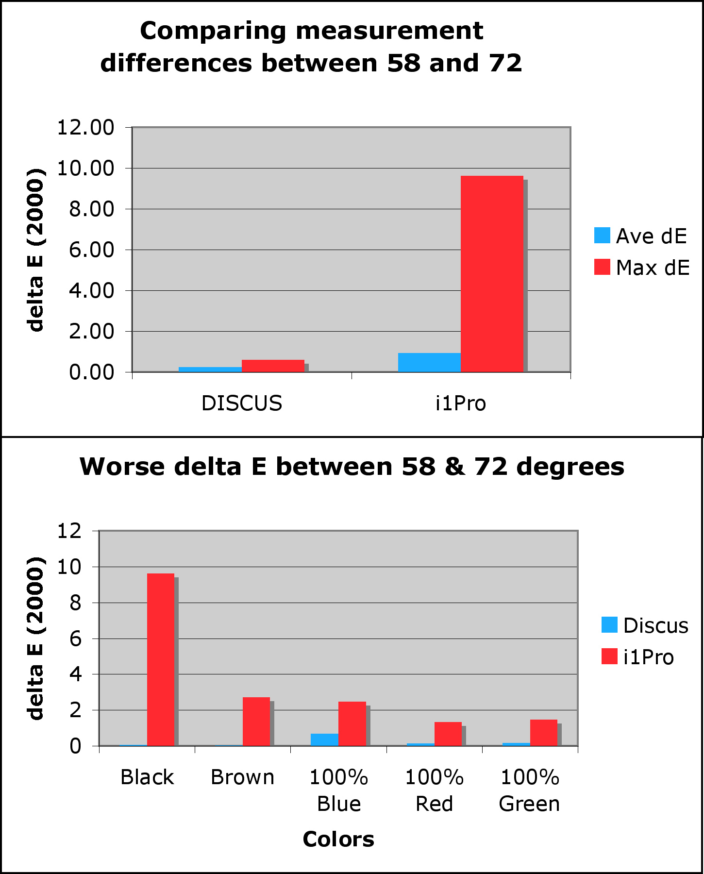