


216 colors (Web Safe) |
|
|||||||||||||||
| See Web-safe colors | ||||||||||||||||
|
See Also
|
||||||||||||||||
b |
|
|||||||||
| b is the axis in the Lab color space which denotes the ?blue-yellow? component of the image. One end of the axis is blue and the other end yellow. Combined with the a axis, you can describe the hue and saturation of a color. | ||||||||||
|
See Also
|
||||||||||
Bit depth |
|
||||||
|
The number of bits which are used to store each pixel in an image. Each additional bit adds twice as many color combinations to the number available. 1 bit (bit-mapped - monochrome), 8bit (indexed color and web-safe color), 16 bit (?thousands of colors?) and 24 bit (?true color?, ?millions of colors?) are common bit depths. Increasing the bit depth can greatly affect the quality and size of your images. |
|||||||
|
See Also
|
|||||||
Bitmap |
|
||||||
| A raster computer image which is monochrome. Each dot can either be on or off and there are no shades or colors available. It is called a bit map because the bits used to store the image map directly to the dots on the screen 1 to 1. | |||||||
|
See Also
|
|||||||
Blackbody, Black Body Radiation |
|
||||||
| A black body is a theoretical object which absorbs all light which strikes it and emits different wavelengths of light depending on the temperature to which it is heated. The color temperatures of 5000 degrees K, 6500 degrees K, etc all refer to the ?color temperature? of a black body heated to that temperature. Kelvin degrees are similar to degrees Celsius but start 273 degrees lower at absolute zero (0 degrees Celsius - freezing - is 273 degrees Kelvin) | |||||||
|
See Also
|
|||||||
Brightness |
|
||||||
|
1) Setting on Monitors - unlike contrast (which should be set to it?s maximum setting in most cases), brightness should be set manually according to your profile software?s instructions. As the phosphors in your monitor fade over time, the amount of light they emit will decrease and you will probably have to turn your brightness up. If you are unable to turn it up to an acceptable level it?s time for a new monitor - give yours to your favorite accountant - they?ll love the size and not care about the color. 2) B component in HSB - The visual attribute by which a color appears to exhibit more or less light. This correlates directly with the amplitude of the light waveform (as opposed to the purity or the wavelength(s)) |
|||||||
|
See Also
|
|||||||
Calibrate, Calibration |
|
||||||
|
Calibration is the act of returning a device to factory, or some other, known specification. It does not characterize the device in the way a Profile does, but calibration should always be performed prior to building a profile. Re-calibrating a device sometime after a profile was built should return the device to the state where the profile is valid and can continue to be used. |
|||||||
|
See Also
|
|||||||
CCD |
|
||||||||||||
| CCD stands for Charge Coupled Device. It is a light sensitive solid-state device that is used in digital cameras, most desktop scanners (and some higher-end ones), colorimeters, video cameras, and other devices. Their dynamic range is improving but is still not up to that of the PhotoMultiplier Tubes used in drum scanners. | |||||||||||||
|
See Also
|
|||||||||||||
CIELab, Lab |
|
|||||||||
|
CIELab is the color space that ICC Profiles and CMMs often use as an intermediary space when converting colors. So a monitor to printer match translates colors from the monitor*s space (RGB) into Lab and then into the printer*s color space (CMYK for example). The L component is the lightness of the color. CIELab, or more correctly CIEL*a*b* is a (mostly) device independent color-space based on the measurements of hundreds of humans the CIE made in 1931 when they created the CIEXYZ color space. In 1976 the CIE created the Lab space to reflect the entire gamut or range of colors the human eye can typically see. The Lab space, unlike other CIE color spaces, is supposed to be perceptually uniform. That is, any movement within the space, in any direction, should result in an equally perceptible color shift. There are many who believe that the Lab space is not perceptually uniform but that is outside the scope of this glossary. LCH is another way of measuring the same color space. (see LCH for more information) The Lab color space is not precisely device independant as it is defined relative to a reference white point. This white point is often based on the whitest point that can be generated by a device or a standard white point (like D50). |
||||||||||
|
See Also
|
||||||||||
Process color |
|
||||||||||||
|
Process color refers to the inks and process used when a wide range of colors are reproduced using a limited number of inks. CMYK is the most common process ink set. Cyan, Magenta, Yellow, and black(Key) inks are combined in varying amounts to produce a reasonably wide range of colors. This is much cheaper than using a different ink for every color required and in the case of continuous-tone images like photographs, makes printing in color possible. |
|||||||||||||
|
See Also
|
|||||||||||||
Profile |
|
|||||||||||||||
| A file containing the colorimetric description of an input or output device in terms useful to a color management system. | ||||||||||||||||
|
See Also
|
||||||||||||||||
Resolution |
|
|||||||||||||||
|
Resolution has at least two meanings. 1) The correct meaning, used by physicists, biologists, and the scientific world in general, refers to the number of objects within a certain defined physical space. So in the publishing world it usually refers to Dots Per Inch (dpi), Pixels per Inch (ppi) , Lines Per Inch (lpi) or some other similar measurement. 2) The incorrect but very heavily used meaning, which is the size of an image or display. To say a display's resolution is 640 pixels by 480 pixels is common, but not really correct. Now if you said it was showing those dimensions at 72dpi, then you'd be correct. Now what is the difference between dpi, ppi and lpi? Dots refer to spots of ink, toner, or some other colorant on a piece of paper. They are the smallest dot that can be applied by that device and are usually monochromatic (they are either there or not, you don't have shades to choose from). Pixels (which is short for "picture element") refers to spots which appear on monitor screens. They can be one of a multitude of shades. What's the difference? Well, a pixel (of many shades) cannot be represented by a dot (of one shade) on a printer. So the printer gathers a whole bunch of dots together into a "cell" and, by varying the number of dots applied in that cell, can simulate a number of shades. If you want to simulate more shades, you need more dots in each cell. The number of cells per inch is called lines per inch (lpi) and is obviously not as many as there are dots per inch. What this means is that if you want your printer to output a continuous-tone image, you are going to have far fewer lines per inch than the say 600 or 1200 dpi you to which you are accustomed. |
||||||||||||||||
|
See Also
|
||||||||||||||||
RGB |
|
||||||||||||
| Red, Green and Blue are additive primary colors. That is, in an imaging system which creates colors by using light (monitors, file recorders), red green and blue can combine in equal quantities to produce white. All the colors the device is able to create (the device?s gamut) are produced by varying the amounts of red, green and blue. | |||||||||||||
|
See Also
|
|||||||||||||
sRGB |
|
||||||||||||||||||
|
sRGB is a ?device independent? RGB space which was proposed and adopted by Microsoft and Hewlett Packard as a standard color space for ?the average user?. It is supposed to represent the gamut of the ?average user?s? monitor. Problems associated with this include: - There is no such thing as an average user - especially with the high-end displays used by graphics professionals sRGB is not all bad. The basic idea of converting images to sRGB which are headed to the web (and when the audience is the general public) makes sense. In many cases, supplying a large profile with each image does not make for a speedy web site. With sRGB, no profile is required and a properly tuned system on the user?s end will display the image correctly. The sRGB also has a gamma of 2.2. This can cause display issues on monitors set to other gammas (like Mac OS systems, which are often set @ 1.8) |
|||||||||||||||||||
|
See Also
|
|||||||||||||||||||
Saturation |
|
||||||
| The colorfulness of a sample compared to its brightness, where colorfulness is defined as lack of white, gray or black components. | |||||||
|
See Also
|
|||||||
Spectrophotometer |
|
||||||||||||
| A device for measuring luminous energy at many frequencies throughout the spectrum. Spectral data can usually be displayed in convenient units such as CMY density, L*a*b* or XYZ. | |||||||||||||
|
See Also
|
|||||||||||||
Spot color |
|
|||||||||
|
Spot color refers to colors in an image which are created with a specific ink formulation rather than a combination of inks like in process color. One of the more popular spot color ink sets is the Pantone Matching System. Pantone has created a series of inks which can be used with high reliability in a projects where you know you have additional plates available to you. (don't try to use spot colors in newspapers for instance, the chances of the press operator loading another plate just for your logo on page 27 is remote indeed) |
||||||||||
|
See Also
|
||||||||||
Stock |
|
||||||
|
The paper stock on which you print can have a major effect on your output. Stock comes in many forms and can range from newsprint all the way to plastic film. How inks are act when applied to paper is a complex issue and worthy of some discussion. There are several points worth considering: Spot Color inks are opaque and Process Color inks are transparent. Ink Absorption and Dot Gain |
|||||||
|
See Also
|
|||||||
Subtractive primaries |
|
|||||||||
|
Cyan, Magenta, and Yellow are subtractive primary colors. That is, in an imaging system which creates colors by using inks or other pigments (printers, presses, some proofing systems), cyan, magenta and yellow can combine in equal quantities to produce black (actually muddy brown in most cases - that's one of the reasons black is usually used). All the colors the device is able to create (the device?s gamut) are produced by varying the amounts of each ink color. Subtractive colors get their name because they are thought of as subtracting light out of an image. Cyan, for instance subtracts (absorbs) red light. If less red is required in a color, more cyan ink is added. |
||||||||||
|
See Also
|
||||||||||
Tri-stimulus, Tristimulus |
|
|||||||||
| Values The quantities of red, green and blue lights of specific wavelengths and bandwidths needed to match a certain color. | ||||||||||
|
See Also
|
||||||||||
UCR |
|
|||||||||
| Under Color Removal. The reduction of CMY percentages in dark pixels to limit the total ink printed in shadows. UCR is set by specifying a "Total Dot Percentage" (TDP) and "maximum black dot" from which UCR is calculated automatically. | ||||||||||
|
See Also
|
||||||||||
Web browsers |
|
|||||||||||||||
|
Web browsers can affect the way color is viewed by your end user. Designed for speedy display, they aren't often optimized for image fidelity. Combine that with web designers who, understandably, squash images to their smallest size and you end up with poor image quality on many web sites. Microsoft's Internet Explorer has supported ColorSync on the Mac since version 4.x. At this time, Netscape still does not support ColorSync (as of version 4.5). This does not mean you cannot manage color going to the web, you just have much less control. To tag images (include profiles) that are going to the web, HTML commands are available. See the following links for more information:
|
||||||||||||||||
|
See Also
|
||||||||||||||||
Web-safe colors |
|
||||||||||||
| There is a pallate of 216 colors which, when used by a designer in graphics intended for display on the Web, should not be dithered, altered, or otherwise screwed up by a Web browser. The 216 color pallete is an 8-bit pallete which has 40 colors reserved for use by both the Mac and Windows operating systems and so has 216 common colors left over. | |||||||||||||
|
See Also
|
|||||||||||||
Wedge |
|
|||||||||
| Not to be confused with Wedgie | ||||||||||
|
See Also
|
||||||||||
White point |
|
|||||||||||||||
|
When you really delve into color you find that there is no such thing as "white". The basic definition of "white is a combination of all wavelengths of light" is more a puzzle than a solution. The human eye has the remarkable ability to adjust to the lightest color in a scene and, barring any saturated tones, consider it white. The only time we realize that what we thought was white was actually say, very light blue, is when we see that color in comparison with another version of white. This then is where the confusion takes place. You can read from a link below about how we measure white in terms of a theoretical body which is heated (black body), and how "white" can range in color from reddish, through yellowish, and finally into blue. With this in mind, imagine the following scenario: You have an image on your computer screen. You have dutifully calibrated the screen to 5000K (which you may know is a yellowish version of white) and profiled the screen properly. You print that image on your carefully profiled printer on paper you consider white and then hold it up next to the computer screen in your office (the nice one you worked so hard to get, with the corner windows). Do they look the same? Probably not. Why? Well, there are tons of possible reasons why they don't look the same but lets stick to the discussion at hand. The whitest point in your image when it is displayed on your monitor will be that 5000K yellowish white. If that was all you had to look at, your visual system would adjust and things would be fine. But, consider the print. The whitest point in your image when printed is a complicated thing. First, there's the paper. It may be a very white paper you purchased but white, when referring to paper, really describes how much of the light striking it gets reflected, and how much absorbed. If the amount reflected is distributed evenly across the visible spectrum, then it will appear to be white. Or will it? It will appear to be close in color to the light striking it. And so enters another part of the riddle. The light striking it (in your nice office) is a mixture of daylight, overhead fluorescent lighting, and that cool designer lamp on your desk. This is the part of the system that you need to control if you want to be able to hold a print up to the screen and see anything resembling similar color.
|
||||||||||||||||
|
See Also
|
||||||||||||||||
X-platform color |
|
||||||
| see Cross-platform color | |||||||
|
See Also
|
|||||||
xyY |
|
||||||
|
The xyY color space is a transformation of the CIE XYZ color space onto 2 dimensions. This allows the illustration of color using a graph like the Chromaticity Diagram and it removes the luiminance component of color. The formulas for determining xyY are as follows: x = X/(X+Y+Z) |
|||||||
|
See Also
|
|||||||
Characterization |
|
||||||
| see Profile | |||||||
|
See Also
|
|||||||
Dot Gain |
|
||||||
|
Ink Absorption and Dot Gain If the stock you are using is absorbent and the inks are liquid (as opposed to wax or toner as in many proofing printers) then the ink will "wick" into the paper as it is applied. This makes the dots fuzzier and larger and is called Dot Gain. For example, if you print a 10% cyan square on the page and then take a reading of the square with a Densitometer, you may find that it is in fact a 15% cyan square. This means your printer or press has a 5% dot gain. What do I do about it? A printer profile should automatically take dot gain into consideration and compensate for it. This is yet another reason to profile for every paper stock you use, as each one will affect ink differently. |
|||||||
|
See Also
|
|||||||
Color Separations |
|
|||||||||
|
When an image is prepared for printing, it is converted from its color space (whatever that may be, often RGB) into the color space of the printing device. When that occurs, a separate image is created for each color ink on the printing device. These are the Separations. For instance, in printing to a CMYK printer your image is split into separate Cyan, Magenta, Yellow, and Black images. Each image corresponds to the amount of ink of each color that the printer requires to reproduce the image in "full" color. (simulate full color by combining the separations). There can be an infinite number of CMYK combinations that will reproduce the image and each group of separations is unique to the specific output device. This makes color separation as much an art as it is a science. |
||||||||||
|
See Also
|
||||||||||
Color Temperature |
|
|||||||||
|
Color Temperature and White Point are, for most purposes, the same thing. It is the color of a monitor?s or other light source?s interpretation of white. Color Temperature is expressed in degrees Kelvin. Kelvin degrees are similar to degrees Celsius but start 273 degrees lower at absolute zero (0 degrees Celsius - freezing - is 273 degrees Kelvin) |
||||||||||
|
See Also
|
||||||||||
LCH |
|
||||||
|
LCH or more correctly CIEL*C*H is the same device-independant color space described by CIELab but using Lightness, Chroma, and Hue. L is lightness, the same as in Lab C is Chroma and represents how far out from the center of the color space (radially) the color lies. The farther out the more saturated the color. H is Hue and represents the angle of the color ?around? the color space. See CIELab for more information about the color space itself. |
|||||||
|
See Also
|
|||||||
ICC - International Color Consortium |
|
||||||
|
Link: http://www.color.org/
|
|||||||
Munsell Color Science Laboratory |
|
||||||
|
Link: http://www.cis.rit.edu/mcsl/
|
|||||||
Absolute Colorimetry |
|
||||||
| Measuring the color performance of a device relative to an "absolute" CIE white (e.g. D50) rather than to the device's natural white point. The natural white point of a printer is the color of the paper or substrate. The natural white point of a color scanner is the clear drum or clear slide holder. | |||||||
|
|
|||||||
Adjustment Profile |
|
||||||
|
A custom adjustment or set of edits that alter image appearance. Typically this profile is an 'abst' or Abstract profile that has Lab or XYZ as its input and output color spaces. |
|||||||
|
|
|||||||
Black Generation |
|
||||||
| The process of creating the black channel and its effect on the color channels when performing a mode-change from RGB to CMYK. | |||||||
|
|
|||||||
Chromaticity |
|
||||||
| The color properties of a sample judged independently of luminance, i.e. in terms of hue and saturation only. | |||||||
|
|
|||||||
CIE Committee Internationale de l'Eclairage (The International Commission on Lighting) |
|
||||||
| The body responsible for recommendations on photometry and colorimetry. The CIE has defined several "color spaces" that describe the range of visible colors in unambiguous numerical terms. | |||||||
|
|
|||||||
CIEXYZ, XYZ |
|
||||||
| A CIE color space defined in the three dimensions; X, Y and Z. The XYZ coordinates are "matching functions" which represent the amounts of theoretical red, green and blue lights necessary to reproduce a certain color. | |||||||
|
|
|||||||
CMS Color Management System |
|
||||||
| A means of controlling color reproduction based on independent calibration of input and output devices and custom or automated "gamut mapping" between devices. CMS components typically include software applications (such as Matchbox Profiler and ColorBlind edit), system-level utilities such as Apple's ColorSync 2.0 (which utilize CMM's) and standardized device description formats such as ICC "profiles". | |||||||
|
See Also
|
|||||||
Kodak IT8 (Q60) Target Data Files |
|
||||||
|
Kodak's IT8 targets (Q60 by their terminology) require the associated target data file (TDF) information if you are to use them for accurate reference or building scanner and camera profiles.
(above links will open in a new browser window)
|
|||||||
|
|
|||||||
Box around pointer on Macs after calibration |
|
||||||
|
Some users have noticed that a small square appears around the pointer on screen after calibration with certain software on newer Macs.
|
|||||||
|
See Also
|
|||||||
Photodisc Test Image |
|
||||||
|
The Photodisc test image is one of the most widely distributed test images available. Getty Images purchased Photodisc and has been distributing the test image until recently. It is no longer available from Getty Images and has been replaced by a new Getty Images test image. |
|||||||
|
|
|||||||
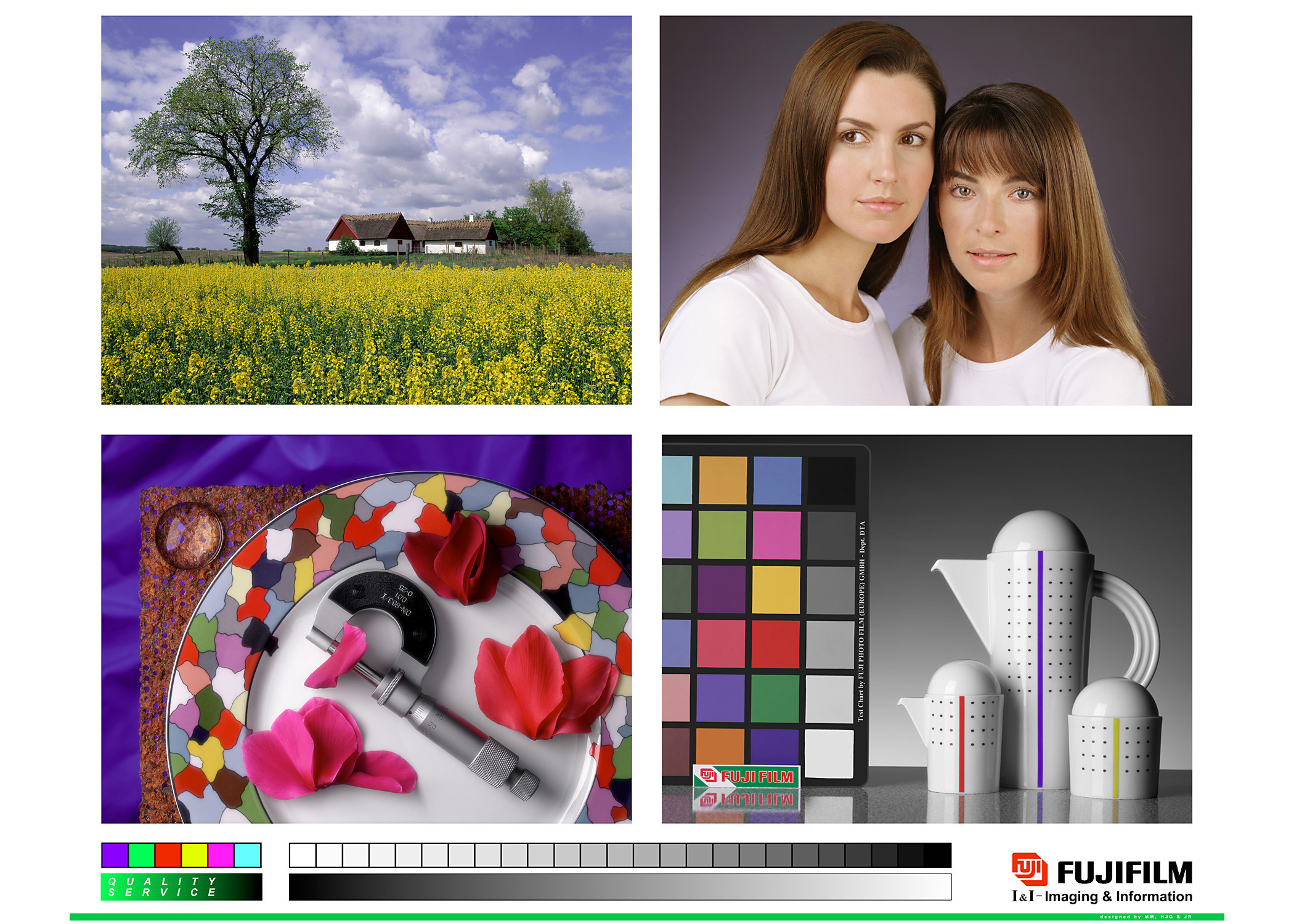
Fuji Test Images |
|
||||||
|
This Fuji test image contains a wide range of colors and subjects include outdoor, people, studio product and neutrals.
|

|
||||||
|
|
|||||||
The Color of Toast |
|
||||||
|
A lot has been written and said about color management in an attempt to describe what it is, what it solves and how it works. Like any discussion about computing, these descriptions often use fancy new terms that effectively confuse and turn off people who just want to understand, well, what it is, what it solves and how it works. An effective and greatly simplified analogy is that of the toaster. Pay attention here because this is one even your clients will understand. Probably not. This is the problem of color management. The settings used on the toaster do not necessarily produce the same colors. As in the toaster, RGB and CMYK values on your computer are also just settings. And, just like the toasters, when they are sent to different devices, they produce different colors! Now if you were a severe toast geek, you would toast 10 pieces of bread in your toaster; one at every setting. Then you would lay them all out in order on your kitchen table, grab the bag of bread and head over to your neighbor's. Avoiding his bewildered stares you would toast 10 pieces of bread in his toaster and take them back to lay on your table beside your toaster's work. Fanning through your "Toasttone" independent toast guide(*) you would decide that "B" was, in fact, the color of toast you prefer. Looking up and down your toaster column you would confirm that yes, indeed, "4" is the setting on your toaster that will get you the color you want - you know this after several mornings of frantically waving smoke away from the alarm on your kitchen ceiling. After looking over your neighbor's toaster column, you note that a setting of "6" is what is needed to get the color you want from his toaster. This, in essence, is what color management is all about. Carefully sampling what a device (monitor, printer, toaster, whatever) will do and then comparing it to an independent guide for actual color. In the case of the toast we used the fictitious Toast Guide and in the case of computers we typically use the Lab color space. Lab is a whole 3D range of numbers across 3 coordinates (L for lightness and a & b for color information). The important thing about Lab is that it is actually COLOR. That is, a number that represents a sensation. Let's take a little reminder on color. Color is a sensation produced by the cooperation of our eyes and our brains in response to mixtures of light. To have color you need 1) light, 2) an object and 3) an observer - for our purposes, a human observer. Without all these components you do not have color. Lab, as mentioned, is a whole range of numbers that are assigned to actual sensations. Each Lab number - like 50, 23, 47 - describes what a certain sample will look like under 5000K lighting (a graphic arts viewing standard in use in most viewing booths) and from a standard distance (creating a specifically sized spot on the retina) to an "average" person. In 1931 a group of scientists sat over 200 people down to perform painstaking color tests to come up with this "average" person and for our purposes it works quite well. Back to the toaster. To get the same color from different toasters, we needed to sample all the colors of toast the lowly machine could produce and then compare them to an independent guide. This lookup table is the equivalent of an ICC profile. To get the same color from different devices - what we are basically trying to do here - we need to sample all the colors that device can produce and setup a table that converts between the device settings - say, a monitor - and the colors it produces at those settings. For a monitor we attach a device to the monitor and then run software that walks through a list of settings,: red (255,0,0), yellow (255,255,0), green (0,255,0), and so forth. At each RGB value, it takes a reading with the instrument and gets a Lab color back. After running through a long list that only a computer should have to suffer, a profile is built for that monitor. If we want to get the same color from our printer as well then we also need to build a profile for it. The same technique applies. We send a file out to the printer that contains a long list of settings - for example: cyan (100,0,0,0), blue (100,100,0,0), magenta (0,100,0,0), and so forth. We then read each patch on the paper with a device like the Eye-One that supplies Lab values for each corresponding set of CMYK settings that were sent. A few calculations and your computer produces a profile for your printer. Great, you think, but how do I use these things? That depends on what you are trying to achieve. A good example is when you want to get the file you print to match the one you see on screen. The file on screen is, by definition, in MonitorRGB and you need to convert it to PrinterCMYK. If you apply the monitor profile to the file, it will convert all those MonitorRGB settings which are unique to your monitor to Lab (remember the toaster). Lab, you will recall, is color - so we are out of the arbitrary world of settings that only work for your monitor and on to something much more useful. Any profile can be applied to those Lab values to get the color you want. In this case, we want the color to go to your printer. When the printer profile is applied it formulates the correct CMYK settings for each color in your file. A good quality profile will do a great job of matching those colors within the abilities of the printer.
(*) totally fictitious but familiar sounding color guide for Toast. |
|||||||
|
|
|||||||
ColorSync on Mac OSX |
|
||||||||||||
|
ColorSync, Apple's system level Color Management System (CMS) has undergone a significant upgrade for Mac OSX For all previous versions of Mac OS, color management and ColorSync did very little for the user until an application was explicitly called on ColorSync to perform color matching tasks.(with the exception of Quickdraw GX, a minimally supported upgrade attempt at QuickDraw). Many Mac users remember the first time they opened their ColorSync control panel, changed some settings and then saw that nothing had changed on screen (again, in most cases). They may have concluded that color management doesn't work and left it behind. Well, with Mac OSX, ColorSync has finally been upgraded to a first-class citizen and is built into the Quartz imaging system at the heart of OS X. This means that if an application simply calls on OS X to display an image, it will be color managed to the best of ColorSync's abilities. At a bare minimum this means that the display profile set in the ColorSync preference pane will be use as the destination for all color heading to screen. Which profile will be used as the source? That depends on the application (which can override ColorSync defaults) and whether or not there is a profile embedded in the image. As the new print paths in OS X are also managed by Quartz, users run a greater chance of liking what they see coming out of their printers. A few other points worth mentioning are
Check back with us regularly for updated notes and links regarding ColorSync 4 on Mac OS X, ICC v4 profiles and other advances and changes in the color management world. In the meantime, pay a visit to the link below for a technote from Apple that starts at a basic overview and moves all the way into the system calls developers can make to ColorSync. Stop reading when your head gets full. Steve Upton |
|||||||||||||
|
See Also
|
|||||||||||||
Apple ColorSync on Mac OSX Technote 2035 |
|
||||||
|
Link: http://developer.apple.com/technotes/tn/tn2035.html
|
|||||||
ColorSync 3.0 APIs - Tech note 1185 |
|
||||||
|
Link: http://developer.apple.com/technotes/tn/tn1185.html
|
|||||||
ColorSync 2.6 APIs - Tech note 1160 |
|
||||||
|
Link: http://developer.apple.com/technotes/tn/tn1160.html
|
|||||||


